I use the term “neighborhood” loosely, primarily because, as I elaborated in Part I, the difference between a “neighborhood” and a “subdivision” often parallels the implied understanding of the distinctions between urban and suburban. Neighborhoods are old, urban, and walkable; subdivisions are newer, suburban, and auto-driven. These gross generalizations unfairly sequester the old and the new into two disparate categories, and the former enjoys a far loftier position in the cultural pecking order than the latter. Virtually everyone living in a reasonably dense residential community would like to claim part of a neighborhood, and civic associations rarely if ever organize themselves as the Highland Park Subdivision Association, for example. They use the word “neighborhood” instead. A realtor is far more likely to promote a home as “being part of a community with a genuine neighborhood feel”, and Mister Rogers immortalized his miniature Pittsburgh with the opening song “It’s a Beautiful Day in the Neighborhood”. These examples may seem facile, but they demonstrate a prevailing aversion to “subdivisions” as anything beyond a clinical term; it is the developer-speak that refers to the initial reorganization of land title through the accrued sale of individually subdivided plats, derived from an initially significantly larger parcel. But a good subdivision almost always strives to shed its tedious image, away from a series of financial agreements into something apparently much more organic—conceived from the aims and values of the people living there, rather than the paper-pushing of a businessperson with eyes on the dollar signs. In short, subdivisions always try to mature into neighborhoods.
This is precisely what has happened with the Garden District in Baton Rouge. As I noted before, an address in this neighborhood ranks among the most prestigious in the metro. But the Garden District didn’t begin with such a distinct identity. In fact, it consists of several smaller districts, which today are on the National Register, but began as subdivisions platted out by a private realty company.
 The area shaded in red is Roseland Terrace, platted in 1911; the region in blue is Drehr Place, a subdivision platted in 1921, while the green rectangle to the south of the other two historic districts is Kleinert Terrace, founded just a few years after Drehr Place. Though the three developments are contiguous, they matured autonomously under these separate names for decades. The Garden District Civic Association relates its origins on the website. Essentially a rezoning hearing in 1976 for a house on the northern edge of Drehr Avenue drew an unexpectedly large number of residents in the vicinity. After learning about their shared interest in its future and well-being, several members decided to form a neighborhood organization. They agreed to bestow upon it the name “Garden District” because of the positive connotations it arose, recalling the prestigious New Orleans neighborhood 80 miles downriver. Within a few weeks, some of these neighborhood activists (many of whom live in the area to this day) had drafted by-laws and elected a president. Thus, the Garden District as a neighborhood name and its respective neighborhood association were born simultaneously. To this day, the Civic Association collects dues, publishes newsletters, runs the adopt-a-tree program for live oaks in common spaces, and maintains the signs and bollards it installed to demarcate the neighborhood’s entrance.
 The original developers had conceived these three early subdivisions—Roseland Terrace, Drehr Place, and Kleinert Terrace—at slightly different time periods. But as they aged comfortably, their residents witnessed new development pushing considerably further to the north and east, and over time the architectural and socioeconomic similarities within the three early subdivisions became more widely visible. The eventual inception of a Civic Association was inevitable. It provided a forum for the transmission of the ideas and collective concerns that could reinforce the identity of a neighborhood. And through these regular meetings, the Association was able to bring to the table some of the technical specifications that the new Garden District was lacking—which, incidentally, happened to include the sort of “place-making” features that were increasingly prevalent in the subdivisions popping up in the outer suburbs. Essentially, the Garden District Civic Association—like so many others—has re-appropriated some of the initial roles of a developer. It clearly establishes cohesiveness to the neighborhood by simplifying the lines of communication. It also has implemented particular street and landscape improvements, which, in this day and age, would take place during the site planning stage, as a subdivision is getting off the ground.
By many standards, the neighborhood’s cohesiveness is patently visible (and no doubt was in 1976 as well). First, the array of housing types, while diverse, comes from a relatively uniform time period. The shared age of the housing mitigates the variety of styles and sizes.

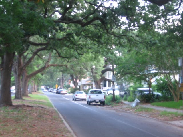
 Secondly, the landscaping follows a certain basic pattern, emphasizing the tremendous tree canopy afforded by live oak trees, both in private property, and—in the wider streets—spaces throughout the broad, grassy medians. If the front yards cannot fit such an expansive tree, they will often host smaller indigenous species, such as the crepe myrtle.

 Thirdly, the three subdivisions share borders, proven by the three colored transparencies on the oft-referenced map.
Fourth, and perhaps the most important for the arguments featured in this half of the blog post, the three smaller subdivisions that make up the Garden District all share the same gridded street network. This shared network affords them a high level of interpenetrability among all the streets that make up the three, as well as—and this is critical—the surrounding neighborhoods.
 The strange brown shape shows the means of accessing the Roseland Terrace and Drehr Place involves nothing more than crossing an intersection. Even more critical is the purple demarcation on the map below:
  That thick purple line essentially separates the affluent sections of this part of Baton Rouge from the poor ones. I hate to make such broad distinctions on something as simple as a street map, but empirical evidence generally supports this. The Garden District occupies the northwestern most portion of a mostly upper-middle class part of town, but directly to the north and west of the neighborhood’s boundaries are considerably poorer districts. Particularly noticeable is the neighborhood west of 18th Street, where the housing more frequently looks like this:
 Simple, unadorned single shotgun houses with virtually no front yard and little foliage.
 Unlike in the Garden District, where cables are either buried or hidden behind back alleys, here they are out front along the streets and sidewalks. And the old commercial buildings along Government Street (the northern boundary to the Garden District) are generally vacant in the area to the west of the affluent neighborhood. Here is the vista at around 16th and Government:
  As Government Street continues toward the wealthier Garden District, the retail landscape is hardly top-tier for the metro, but it is considerably stronger than the virtual abandonment visible in the picture above.
In short, the Garden District—a general term for three old-money subdivisions in inner-city Baton Rouge—sits cheek-by-jowl with one of the poorer old neighborhoods, with not even a major arterial street or the stereotypical railroad track to separate them. For example, at the corner of 18th and Cherokee, on the edge of Roseland Terrace, one sees a typically immaculate house characteristic of the Garden District.
 And just a two blocks to the west, on 16th Street, the view below is not uncommon:
  In all likelihood, the neighborhood to the west of 18th street was not impoverished at the time Roseland Terrace was platted on the site of a former fairground racetrack. It was probably a working class or lower-middle class community. But by the time the Civic Association organized itself and bestowed the name Garden District to these three subdivisions, the fortunes on the two sides of 18th Street had diverged significantly. Forty years later, Old South Baton Rouge remains a largely low-income African American community, while the Garden District is mostly white and virtually devoid of poverty. In an era in which discriminatory redlining, fraudulent blockbusting, and publicly sanctioned segregation (once common in the South) are all illegal, how can two neighborhoods show such significant disparities, with the desirability of the Garden District remaining superlative despite sitting so close to such poverty? The Garden District Civic Association undoubtedly provides many of the answers.
  Aside from organizing a garden club to protect the live oaks, social committees to plan Christmas caroling and ice cream gatherings, or public relations to organize home tours, the Civic Association also has hired a separate security unit on top of the existing Baton Rouge Police Department. (Incidentally, the original Garden District of New Orleans, which sits almost as close to an even more impoverished neighborhood, also hires a plainly visible separate security force.) The association also allows homeowners who will be out of town for a lengthy amount of time to report their unoccupied home for extra monitoring during their absence.
Such actions are hardly unique among urban neighborhood associations, particularly those that are wealthy but remain close to considerably poorer areas. I by no means am attempting to portray the Garden District Civic Association nor the neighborhood’s residents as exclusive or prejudiced. They are reacting in a similar fashion as many other wealthy districts that rest squarely in high-crime cities, and the residents have clearly opted to buy into unity of activities as well as a shared sense of added security by remaining in the neighborhood instead of abandoning it to newer subdivisions out in the suburbs, where they would undoubtedly be far removed from inner-city privations and violence.
What is interesting about this is that, perhaps more powerfully than just signage and tree plantings, the Civic Association is helping to foster the unity an urban neighborhood needs, quite possibly as a compensatory gesture for the fact that its street configuration cannot exclude strangers in any other way. Compare the street grid from the color-coded maps above to the one below, several miles away on Highland Road, one of the wealthiest suburban districts within Baton Rouge city limits:
 Most of the housing around here post-dates the 1960s. Street designers for these subdivisions/neighborhoods have all but abandoned the old grid for a hierarchical design, in which most of the streets terminate in cul-de-sacs. Each individual development usually has only one or two means of ingress, as opposed to the Garden District, which has closer to twenty. The development pattern becomes even more pronounced a few miles further out on Highland Road.
  Here, in the last outskirts of the city and East Baton Rouge Parish, the housing typically post-dates the 1980s and is almost uniformly wealthy. The subdivisions are smaller and even less interconnected. Some of them are gated at the front.
Any elementary student of urban studies has caught on to this long ago; the average layperson can also recognize a change in street configuration from the old inner-city neighborhood and the modern subdivision. What is most striking is how urban neighborhoods have essentially had to co-opt certain features from suburban subdivisions—as well as duplicate basic city services—in order to preserve their desirability. The Garden District in Baton Rouge cannot build gates around every one of its entrances to keep the higher criminal activity at bay that residents might associate with the neighborhood to the west. Instead, the Civic Association must find ways to cultivate unity and inclusivity from within. It uses carrots like the neighborhood picnics, organized garage sales, decorative signage and lighting, and recommended arborists, electricians, or carpenters. It depends upon sticks as well, such as the additional security, stipulations for people who rent out part or all of their property, and a clear line of communication for reporting of city code violations, such as parking in the grass or sweeping debris into the street. Neighborhoods such as the Garden District will depend on a certain capacity to exclude on paper to compensate for the inability to exclude via physical barriers. One may consider this elitist or racist, but neighborhood associations are so prevalent in this day and age that they hardly single out certain segments of society—persons of all strata may find their neighborhood has one, rich or poor, white or black, urban or suburban.
The superficial stereotypes I listed in Part I of this blog post clearly placed neighborhoods into one categorical box and subdivisions into another. I did this ironically, because the old, venerable Garden District neighborhood originated from the subdivision of real estate that followed a similar pattern to the exurban subdivisions of today. Subdivisions and neighborhoods are little more than expressions of individual preferences; the line distinguishing them is impossibly blurry. The biggest difference, of course, is that the old urban subdivisions (which we are more likely to refer to as “neighborhoods”) typically depended upon rectilinear grids with an almost unlimited number of points of entry. Conversely, most contemporary neighborhoods (often referred to as “subdivisions” until they mature and develop something we like to call “character”) employ curvilinear cul-de-sacs that allow for a much clearer monitoring of who comes and goes—which nearly always happens by vehicle instead of by foot. One could argue, as many urbanists do, that the grid is more desirable because it offers a greater freedom of mobility. But the non-gridded subdivision emerged as a reaction to the characteristics that people found least appealing about the historic grid: namely, the ability to restrict who enters, whether it involves speeding cars that cut through or potential ne’er-do-wells from a neighboring community. The Garden District in Baton Rouge has undoubtedly attracted a certain type of resident that consciously eschews the suburban cul-de-sac, but such individuals often find themselves devoting more time and money to retain a certain level of security and privacy that almost everyone hopes to attain. The Civic Association has found a generally benign way of achieving this, keeping a gridded neighborhood safe and attractive as the majority of the population continues to surge toward cul-de-sacs ten miles down the road.




 Posts
Posts


