A few months ago, I was leaving Cleveland, Ohio on
Interstate 71, headed southwestward toward Columbus.

(Yes, that VW Beetle in front of me really is missing its
rear windshield, in 25 degree weather.)
While driving on the freeway, I spotted some unusual signage along the
side of the road. At one point,
between mile marker 244 and 245, a sign indicated that I was leaving Cleveland
city limits and entering a suburb called Brooklyn.

Nothing too remarkable there; I was crossing municipal line. However, I only had to continue driving
for a few seconds before I saw another sign.

Returning to the corporate boundaries of Cleveland. Either Brooklyn, Ohio is that tiny of a
municipality, or I just skirted the very edge of it. It turns out neither is the case. Another few seconds later (going slowly along the shoulder
of the highway), and a new sign:
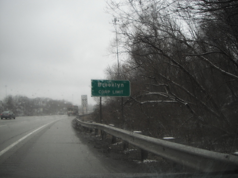

This time, the next municipal boundary sign is plainly
visible, in the photo just to the right of the speed limit sign and a little
further down the road. So,
standing at this point, one could lob a football from the City of Cleveland,
let it soar across Brooklyn, then cross the line again only to land in the Cleveland
end zone. Put a receiver at the
latest Cleveland boundary and it might make a good practice strategy for the
Browns offense. Here is the
previous “Cleveland corp limit” sign, as the motorist is passing it once more.

But it’s not over. This time the duration is a bit longer,
but still less than a quarter of a mile down the road, we cross into Brooklyn yet
again.

That makes a whopping five municipal boundary crossings
between Cleveland and Brooklyn over the course of, at most, one half of a
mile. What’s going on here? The map below should come as no
surprise:

I have circled the area featured in the above photos in blue, and
the Cleveland municipal boundaries are highlighted with a dashed line and pink
transparency. As the map
indicates, Cleveland in this section has what one might call a “sawtooth”
boundary, and, at least at this specific stretch of I-71 (known here as the
Medina Freeway), anything that is not the City of Cleveland is the City of
Brooklyn. The freeway cuts across
this boundary at one of its most irregular locations, and, in order to maintain
the integrity of these actual municipal limits, these signs stand at every change—with
a separate set of signs on the opposite side of this wide freeway. That makes for ten signs.
Not surprisingly, I wasn’t the first to notice this
idiosyncrasy. A friend had already
pointed it out to me, before I decided to chronicle it photographically during
a most recent visit. And John
Horton, a reporter for the Plain-Dealer, noticed it two years ago. Apparently at that point, the Ohio DOT
had just installed them, rectifying a decades-long oversight, because the
state’s traffic manual requires the installation of a municipal marker whenever
a route crosses into new incorporated boundaries. The estimated cost for a sign is $273.63, most likely putting
the total installation cost, when factoring in labor, at well over $3,000.
While I don’t know a great deal about the nuances of
publicly funded signage along interstate highways, I don’t really need to. I can tell that majority of
navigational indicators along roadsides are electives; individual States decide
what they would like to include. For
example, Indiana nearly always features a sign indicating the name of a road
(no matter how minor) that passes either over or under a limited access
highway; Ohio does not.
Conversely, Ohio usually indicates to the motorist when he or she has
entered a new incorporated area, but not Indiana.
Ohio statutes mandate signage every time a limited access
highway passes through a new municipality, even if the freeway provides no exit
ramps for a motorist to access the municipality, as is the case in each of
these segments of I-71 that pass through Brooklyn. Such an initiative casts the
appropriate stewardship of taxpayer dollars into serious doubt. Is it really necessary for motorists to
know each and every time the highway traverses the Brooklyn/Cleveland
boundary? Based on Horton’s
reporting, the two communities find those signs critical in determining which
municipal police force will need to respond to various calls. But a lawyer conducting thorough
cross-examination would not content him or herself with that answer. Don’t most emergency response vehicles
these days have sophisticated enough GPS to render these signs obsolete? Let the lawyer cross-examine the
fictitious witness about the larger issue at hand: what impelled the two
municipalities to share such an irregular border in the first place? According to Horton, once again, the
original boundary made perfect sense: a body of water called the Big Creek
formed a logical demarcation.
However, during the construction of Interstate 71 in the 1960s, the
State relocated the creek, allowing a clean trajectory for the new roadway…but
no one bothered to reconsider or reconfigure the odd (and now inexplicable)
shape of the municipal boundaries.
Over the years, I have referenced other similar instances of
municipalities attaching what one might call a disproportionate amount of
importance to their boundaries.
Incidentally, several situations that I have recognized have taken place
in Ohio, a heavily urbanized state with a statutory culture that does not
mandate incorporation (in contrast with neighboring Pennsylvania and most of
the states of the northeast, which are nearly 100% incorporated). Ohio offers such extreme contrasts
between its industrialized urban centers and agrarian flatlands—the Rust Belt
around Lake Erie and the Appalachia in the southeast—it apparently doesn’t take
much for an agglomeration of houses to organize itself as an incorporated
municipality. Not surprisingly, a
home-rule culture often pervades in municipalities both large and small, with
each seeking to distinguish itself from another. I referenced one example—also in metro Cleveland—where a single road had different
speed limits, depending on which direction a motorists was traveling, due to
the fact that a municipal boundary split the crown of the road across two
towns, each of which passed distinct speed limit laws.
Speed limits may seem like highly fungible context from
which to observe municipal megalomania, but they’re effective because they hit
many people close to home. Viewing
the Cleveland/Brooklyn boundary signs again, one can notice that speed limit
signs accompany a few of them.
That’s right: cars may be forced to accelerate or decelerate to accommodate
shifting speed limit regulations between Cleveland and Brooklyn. But apparently that isn’t the worst of
it. Just a half mile to the east
along the Medina Freeway, motorists will confront yet another municipal boundary: entering the tiny village of Linndale. Unfortunately, I was unable to capture
the predictably unremarkable sign, but Google Streetview offers a good enough representation. Outlined in purple, to the west of the blue circle, are the general boundaries of Linndale.

At only .08 square miles and a little over 100 people, Linndale’s
most distinctive feature is the 200-yard stretch of I-71 that bisects it
completely. As a fairly recent issue of Cleveland Magazine recalls,
the municipality lost half its population when the DOT tore the homes down to
make room for the freeway. Despite
what most would see as an incorrigible setback, Linndale has supported itself
quite comfortably over the ensuing decades. How? You
probably guessed it already: it’s a notorious speed trap, earning approximately
80% of its $1 million municipal budget (a very generous budget for a town of
its size) through citations. The
Village has aggressively and successfully defended its legal right to enforce
the 60 mph speed limit of this segment of I-71 in courtrooms, using the Home
Rule provisions of the Ohio constitution to justify its four full-time and ten
part-time police officers. Locals
know that for the 20 seconds or so that it takes to drive through Linndale on
I-71, they cannot be complacent behind the wheel. But then—with a sigh of relief—they return to comparatively
unregulated Cleveland, thanks to the greeting of yet another municipal sign.

Although Linndale currently appears to thrive, its leaders
may need to read yet another of my blog articles,
to serve as a caveat of what could happen if a subsequent court finds the
village’s leadership is abusing its power. East Cleveland, a much larger nearby suburb, has copious signage
warning motorists using all city arterial, collector, and local roads that the
consequences for speeding are steep; tickets are more or less the only way the
impoverished community has of funding basic services. Meanwhile, metro Columbus offers a scenario that could augur
Linndale’s fate if it isn’t careful: the tiny village of New Rome claimed a
stretch of US Highway 40 on Columbus’s near west side, which it monitored fiercely
as a speed trap to the point of corruption. State Auditor investigations provided inconclusive evidence
that this village had ever even had a mayor in the last thirty years, or that
it offered any real services to the constituents, aside from citing speeding
vehicles passing through. In 2004,
a State judge ruled that New Rome (with a population hovering between 60 and
115) had showed persistent inability to govern itself through the transparent
provision of actual city services, and the judge effectively dissolved the
village into Prairie Township of Franklin County, Ohio. New Rome no longer exists.
Municipal incorporations no doubt reinforce widely embraced
American values of self-determination, but Ohio isn’t alone in revealing how
the practice, when taken to an extreme, turns these fractured fiefdoms into
crucibles of dysfunction. Cuyahoga
County, Ohio’s most populous county (despite decades of population loss),
contains nearly 40 cities and 30 municipalities, yet only a handful of them
gained population between the 2000 and 2010 Census. (Incidentally, Linndale was among the fastest growing,
leading some to speculate if the Village unreasonably enforced US Census bureau
self-reporting to boost population, in order to justify its survival after the
New Rome debacle.) No individual
municipality, not even the mother ship Cleveland, can necessarily claim
responsibility for the post-industrial stagnancy that has afflicted the region
for decades. But piecing together
70 municipal governments calls into question whether the benefits of
self-determination outweigh the costs of unnecessary, redundant public
services, or internecine squabbles between two adjacent towns that cannot put
their differences aside, sometimes over matters as petty as the speed limit on
a shared street.
Cuyahoga County may not be flourishing if, as some have
proposed, the majority of these municipalities consolidated into a
significantly smaller number of city governments, as Metro Louisville did in
2003, merging the city’s borders with Jefferson County. But the dialogue considering such a
radical change is escalating in frequency and intensity, as more people voice
their frustrations toward superfluous signage at the Brooklyn line…or the
ridiculous speed limit enforcement in tiny Linndale, the most well-policed
community in the county. Framing
the debate into an ultimatum between autonomy and efficiency results in an
undeniable oversimplification of the issues at hand, but it’s no less
factitious or loopy than the bizarre boundary between Brooklyn and Cleveland.


