Showing posts with label interiors. Show all posts

Saturday, July 12, 2014

When public spaces reflect modern life--by not reflecting anything at all.

Just over a month ago, the City of Indianapolis eagerly heralded the opening of a new Marsh grocery store downtown—the second within the Mile Square, which has in recent years exploded in apartment construction.  The other, older store still loosely refers to itself under the name of O’Malia’s, a smaller Indianapolis shain bought out long ago by Marsh, though a handful of stores survive today under the O’Malia name.  It’s only about six blocks away, on the edge of the Lockerbie Square neighborhood, in a converted old Sears and Roebuck Department Store building.  The new Marsh occupies two floors and 43,000 square feet, as part of the five-story Axis mixed-use development near the Canal Walk.  Although the Lockerbie Square O’Malia’s has long tried to satisfy the downtown grocery demand, it was much more in keeping with a neighborhood corner grocery store and never had the feel of a regional supermarket.  It was satisfactory but hardly poised keep pace with the rapidly growing downtown population, as well as the increasingly spendy denizens of surrounding gentrifying neighborhoods.  In short, central Indianapolis apparently had far greater income density that the spread of grocery stores would suggest, and it was underrepresented.

Thus, enter the new Marsh.
At the time of these photos, the facility had been open about six weeks, even though the apartments within the Axis building are not yet complete.  I didn’t spend enough time roaming the aisles to get a sense of the quality of its offerings.  But aesthetically, it almost definitely fills a demand niche.
The Marsh’s interior is like slicing open an avocado, and maybe a tomato right next to it. It’s not a bad idea, and those shades of green (and the occasional bright red) certainly seem au courant enough.   Shiny and new is critical, because the Marsh Supermarkets brand has lagged considerably in recent years, though it was once the defining grocery store of the Indianapolis metro.  Former CEO Don Marsh’s opulent life, rumors of mistresses and financial mismanagement escalated from the late 1990s until around 2006; the company inevitably dominated news headlines for all the wrong reasons, and its share of the local grocery market plunged below Kroger, Meijer and Walmart.  Its nadir may have been the late 2006 purchase by Sun Capital, a private equity firm out of Florida.  Whether the new owners successfully re-branded it or its image was strong enough to prevail on its own, Marsh has endured, though still at a shadow of its former self.  It shuttered all of its Illinois locations, reigned in the majority of Ohio stores, discontinued its spin-off brands like LoBills (and most O’Malia’s) and announced another wave of closures at the beginning of this year.  Nonetheless, through the Marsh/O’Malia’s at Lockerbie and this new location, the declining chain dominates Indianapolis’ downtown grocery market, at least for the time being.  And this latest is definitely trying to splash a new coat of paint on the company’s overall image.

The aesthetics of grocery stores is something that I suspect resonates in our unconsciousness, far more than the blogosphere suggests.  After all, supermarkets seem more resilient to the encroaching dominion of online shopping than a lot of other retail.  Sure, some people feel confident ordering groceries online.  (Indianapolis is home to a successful cybergrocer; Green B.E.A.N. Delivery has grown into a multi-state enterprise.) But most people still prefer choosing their own groceries, particularly when it comes to selecting the produce, meats, and baked goods firsthand.  Thus, how a store looks can influence heavily how much people are willing to patronize a store.  And this Marsh looks contemporary—a stark comparison to the surviving Marsh locations in less chic parts of town, most of which have interiors that evoke the 1970s when they were built.  My suspicion is that renovating a grocery store is particularly capital intensive.  And since they sell such a large quantity of non-durable goods, with new shipments arriving daily, it is nearly impossible to upgrade a supermarket and keep it operational for its customers.  And when a location completely closes, even if just for a couple months, most of its clientele will find somewhere else…and they may never return.  Thus, grocery store interiors across the country are particularly likely to remain frozen in time.  Far more likely than, say, apparel stores, which also have to stay fresh to fight off that online competition.

From murals of the soon-to-change Indianapolis skyline to its subtle mezzanine that may go mostly unused, the new downtown Marsh in the Axis is as effective at conveying trendy urban living today is it is likely to look dated in fifteen years.  What seems particularly telling—and most reflective of the importance of novelty in design—are those public restrooms.
The swimming-pool-mosaic look has taken over in recent years, as popular a tactic in domestic kitchens as it is in gym locker rooms.  It will seriously date itself by the year 2020, but doggone it, it looks good right now.  These small, antiseptic restrooms in the new Marsh also reveal a certain feature that may not go out of style quite as soon.
The restroom is more significant for what it lacks: a mirror above the sink.  More and more businesses are opting to exclude mirrors from their restrooms altogether, much to the chagrin of the narcissists out there.  Why?  It could be because of a growing concern for privacy and the use of restrooms for unlawful voyeurism; after all, stories routinely hit the local news about cameras installed in public restrooms to spy on people.  Mirrors only expand the potential lines of sight that peeping toms can exploit.

But the bigger problem with mirrors in public restrooms is, unfortunately, the vandals out there.  This observation is probably axiomatic to anyone who has ever had to use a public restroom in a busy urban setting—which covers the vast majority of the adult population.  Mirrors harbor graffiti and its companion, the scratchitti, in equal measure.  In most restrooms, they’re right behind the interior stalls for suffering from various markings and tags.  Most Marsh locations are much more suburban, whereas this one, occupying the street level of a building with zero setback, is far more likely to receive walk-in pedestrian traffic that exclusively uses the restroom.  Thus, these restrooms will get more users, they’ll be harder to monitor, and the vandals will soon come out of the woodwork.

Or at least they would.  Removing the mirror deprives them of a popular canvas—a small omission that inconveniences a few people while allowing one more safeguard against any chances of diminishing the store’s aesthetic integrity.  Six weeks after its opening, the Indianapolis Marsh remains free of nail polish tags on its mosaic tiles or messages on the men’s room stalls.  And the ambiance of a fresh bowl of guacamole pervades.  Bon appétit.

Wednesday, April 30, 2014

Urban recycling: not a bad (unironic) beer in the box.

-->A recycling station housed in an old factory building might not seem like a novel concept, particularly in a city with a plethora of underutilized or vacant industrial space.  Like Detroit.


And even the appearance of it—a pastiche of industrial chic, street artistry, found objects, and, yes, even a pretty extensive panoply of bins of reusable materials, all monitored by reliably bearded and tattooed staffers—is probably closer to the mental image of what community recycling could, or should, look like.  “Taking out the trash” isn’t just utilitarian and mundane; it’s fashionable, eye-catching and even sorta fun.


Despite my evocation of hipster clichés, Recycle Here! feels like a novelty, at least in part because it’s among the few ways that residents of the Detroit can divert their discarded objects from landfills.  Long notorious as the largest city in the country without a municipal recycling system (both elective and compulsory), Detroit has also striven to find creative ways to curtail the illegal dumping that took place on its copious vacant lots—much of it recyclable material. A group of Wayne State University students founded Recycle Here! in 2005 as a response to the obvious dearth of options serving Midtown, then as today an emerging neighborhood with visible signs of homespun reinvestment.


As smart as the initiative was, it couldn’t easily both fund itself and support a demand that clearly stretched well beyond Midtown.  By 2007, the Greater Detroit Resource Recovery Program (GDRPP) began funding Recycle Here! as the City’s de facto recycling center, all while expanding its outreach by offering additional drop-off days, a broader array of recyclable materials, and satellite locations elsewhere in the city.  In addition, the partnership has allowed curbside recycling pilot programs in three neighborhoods: Rosedale Park, East English Village and Palmer Woods/University District—with intention to grow throughout the city in the long-term.  The Michigan Municipal League website points out some of the other accomplishments: a growth of over 50% each year since opening; a non-profit spin-off called Green Living Science that has educated Detroit Public Schools on recycling initiatives; a for-profit arm called GreenSafe that sells recycled products to major consumption events, like Detroit Lions games. 


Even if it’s essentially an arm of city government, the Recycle Here! facility never for a moment feels like one.  The loudspeakers churn out tunes from a diverse array of genres, no doubt reflective of the eclectic taste of whoever is in charge at that moment.  On the busiest days of operation (typically Saturdays), a local vendor offers cheap French press coffee, and various food trucks tote their comestibles in the outside parking lot.  Another staffer sells screen printed t-shirts, virtually all of them featuring the ingenious and ubiquitous Recycle Here! bumblebee logo, designed by local artist Carl Oxley III:


And the bumblebee receives its share of competition from the other sculptures and murals that form a consistent backdrop to the more utilitarian goings-on up front:


If it isn’t already obvious, Recycle Here! has achieved what it ostensibly needed to do in order to ensure survivability: it evolved into a smartly-branded community gathering place.  And it’s a good thing it works so well: the process of recycling here is far from hassle-free.


Yes, the bins separate Styrofoam peanuts from other types of Styrofoam.  Visitors also have to hold all their plastics up to the light to see if the etching indicates a #1 or #2 (one bin) or #3 through #7 (a separate series of bins).  And cardboard gets separated from office paper, which in turn has a separate bin from newspaper, as well as glossy paper.


And less common materials need separating too.


Clear glass could contain a lot of items: salad dressings, pasta sauce, artichoke hearts, pickled pigs’ lips.  But colored glass usually captures a discrete family of consumable products.


Booze.  These days, varietals of wine do not delineate social strata that easily; even a few highbrow wines might reach the dinner table in a cardboard box.  But it’s very easily to distinguish consumers by the type of beer they drink.  And the beer bottles at Recycle Here! overwhelmingly fit a certain category: the non-corporate.


Whether it’s a microbrew from the Upper Peninsula or a Singaporean IPA, the beers being recycled here are the opposite of what about 85% of America drinks.  No watered-down Coors, Michelob, Budweiser.  The only beers found in the bins that would pass as mainstream working-class Americana are Pabst Blue Ribbon or this Miller High Life, like the one strangely perched, unopened, on the rim of the Clear Glass bin.


In other words, hipster beers.


Probably I’m going out on a limb by making inferences about cultures by the type of beers they consume, but not really, or at least not enough.  I don’t think we witness a dearth of Budweiser bottles because Detroiters simply don’t drink cheap beer.  I think the beers we see in these bins broadly reflects the ethos of people who go out of their way to recycle, and in Detroit, “going out of the way is” precisely what most people have to do.  In short, the act of recycling not only requires the active involvement of driving to the facility (at least for everyone outside those three affluent pilot neighborhoods), it also requires extensive separation once you get there.  If you have two boxes to deposit, it could take you over an hour to get it all done.   The staff at Recycle Here! makes the compelling argument that their approach not only ensures more material gets successfully recycled than if it all gets lumped together, but it also encourages the population to become more invested in the process.  While this may be true, it almost undoubtedly also scares off a huge contingent who simply doesn’t want to be bothered.


Thus, Recycle Here! succeeds because there are enough Detroiters, favorably disposed toward urban living, educated enough to have some disposable income, and predominantly left-of-center, all of whom at least value the idea of sustainability in its various incarnations: locally sourced food, fair trade or free-range growing practices, and non-corporate brews with higher alcohol content (and higher prices).  It fits like a hand in glove, and the fact that quality French press coffee gets served on Saturdays makes as much sense as the absence of a vendor selling McDonald’s, no matter how much Mickey Dee’s coffee has improved in recent years.  Through Recycle Here! and the pilot programs in those selective, higher-income, stable neighborhoods, the Greater Detroit Resource Recovery Program has found the right niche to plant a seed.  It offers a confident start to set the trajectory for a city-wide recycling system.
Now if only they could figure out where all those bottles of Bud Lite are going.


Monday, March 31, 2014

Separate the ersatz and collect up all the cream.

While the interplay between the built and natural environments occupies the bulk of my ruminations, every now and then I can’t help but indulge myself.  And I step fully into the world of pure imagination.  The aisles of a Meijer discount hypermarket store might not be exactly what Roald Dahl had in mind through his chocolate factory (or Leslie Bricusse), but it’s just about as fabricated as a movie set... 

…and that’s not necessarily a bad thing.  For those who live in Michigan, Ohio, Indiana, Illinois or Kentucky, Meijer is as much a part of the shopping landscape as Walmart.  It’s a fierce competitor in these five states, and I have no doubt it continues to frustrate the executives in Bentonville, Arkansas—my suspicion is that Walmart’s market share in this part of the country is lower than it otherwise would be, thanks to this modest chain that germinated just outside of Grand Rapids, Michigan exactly 80 years ago, making it nearly 30 years older than the world’s largest retailer.  But how did Meijer remain confidently ensconced in its Midwestern niche when Walmart dethroned so many others?  (Ames, Pharmor, and Venture went the way of passenger pigeon well over a decade ago, even if some telltale labelscars remain.)

I could expound on how Meijer has effectively cramped Walmart’s style for a few decades now, all while refusing ever to go public.  It avoids far-flung locations like its home state’s Upper Peninsula, no doubt saving it a fortune in logistical costs.  It expands its territory slowly, preferring to densify within its five signature states for the time being; rumors of an inaugural location in Wisconsin have yet to materialize.  It has attempted to broaden its scope through standalone discount department stores (without the groceries), pharmacies, warehouse clubs (like Sam’s Club), and specialty clothing.  None of these concepts proved fruitful, so the home office closed them within a few years.  Yet it continues to flourish in that cluster of great lakes states (and Kentucky).  Last year, Meijer opted to open a store in the Detroit city limits, seen in the photo above--a breakthrough of sorts, since many other major retailers (including the goliath from Arkansas) have shunned the Motor City.  These conservative strategies may have helped Meijer survive the competition that Walmart decimated, but I’d like to think another tactic has helped give the regional chain its edge.

Virtually every Meijer that I’ve seen has an entire row in its well-maintained grocery devoted to ethnic foods.  The specific location often dictates exactly what options it sells, but regardless of the offerings, most evidence suggests that the company has done its research.  Rarely will you see Walmart accommodate an ethnic group (such as Amish buggy parking in Northern Indiana). But online forums like British Expats routinely refer to Meijer—not Walmart—as the go-to for hard-to-find European goodies, and most locations have at least a small but well-stocked British shelves, including the one in the Detroit suburb of Allen Park featured above.  This particular location, with a trade area that includes sizable Mexican, Polish, and Arab populations, not surprisingly offers generous Latino, Eastern European and Middle Eastern sections.  It also distinguishes the Indian subcontinent from the rest of Asia.

But what really caught my attention was the adjective before these regional references.
We see “authentic Italian” followed by “pasta”.  Does this imply that the pasta section, for whatever reason, is otherwise inauthentic?  Or is it pasta from other countries?  Meijer also splits hairs on the other side of the aisle, providing its customers with “authentic Mexican”—
and “Mexican” without the authenticity.
Tex-Mex.  Or American Mexican.  A taqueria versus Taco Bell.  Various studies have shown three ethnic cuisines in the United States consistently vie for the title of most popular—and, not surprisingly, the most ubiquitous.  While the US has more Chinese restaurants than McDonald’s, Italian cuisine has long rated most highly.  But the surge of Mexicans and the cultural influence have elicited a concomitant increase in the popularity of cuisine from south of the border.  Virtually all ethnicities, however, can claim a rise in the popularity of their cuisines.  Thirty years ago, Thai and Indian restaurants were relatively rare outside of the biggest metro areas; now they are fairly easy to find in a small city of 50,000.

The inevitable result of this?  We see more Americanized knock-offs, as well as Meijer’s need to distinguish between the “authentic” (often imported) and the bastardized.  No doubt in another decade, with the ascendancy of falafel, hummus, and shawarma, Middle Eastern cuisine will approach mainstream status, just as it already has in Metro Detroit, home of one of the largest Arab populations outside of ethnically Arab countries.  We already have hummus flavors that would constitute blasphemy in many parts of the world, adulterated to meet mainstream American tastes.  The “authentic” partition in the grocery aisle will soon envelop new nations, impelling greater need to distinguish idiosyncratic, ethnically precise merchandise from its vanilla counterparts…and another opportunity for Meijer to capitalize on something it already does well.

Monday, May 27, 2013

Nordstrom brainstorming.

My latest post is up at Urban Indy, focusing on what we can do with a huge vacant piece of real estate in the heart of Indianapolis' downtown: the Nordstrom space to CIrcle Centre Mall, which vacated in summer of 2011.

Still no plans for this space have materialized.  I recent post from the Indianapolis Busines Journal suggests that, in spite of one of the mall's two department stores remaining vacant, the sales per square foot have actually improved in recent years.  But the occupancy rate is lagging.

This blog post looks at both the positive and negative indicators for the long-term future of the mall, with lots of photos offering empirical indicators of its economic health, which in turn support or challenge the numbers.  Finally, I list a variety of the proposed options for filling the Nordstrom space, while encourage readers to come up with their own.  Even if you aren't from Indy or don't even know it, please feel free to contribute.

Tuesday, May 14, 2013

A room with twice the view.


Downtown hotels seem can’t seem to get a break.  No matter how valiant the effort of local economic development directors in attracting that major chain (Hilton, Marriott, Intercontinental) and no matter how unorthodox the architects’ designs, the closeted coterie of urban advocates never hesitate to lob their Molotov cocktails at the final proposal.   Perhaps it’s the transformative effect a successful hotel can exert on a downtown’s pedestrian activity; perhaps it’s the ex post facto realization that everyone ultimately overhyped that transformative effect.  (Hotels rarely seem to stimulate further activity, nor do they necessary help to fill vacant storefronts of neighboring buildings.) Maybe it’s realization that biggest and most influential hotels nearly always arrive in the form of a multinational chain; maybe it’s resentment that the bland chains most reliable survive the occasional economic downturn.  Maybe the love-hate relationship simply parallels the conflicting emotions that the locals feel toward the typical hotel’s biggest users: the tourists.

Regardless of the final outcome, hotels in urban settings generate simultaneous excitement and derision, often with little consideration for both the complexity of the deal and the hotels’ extreme sensitivity to occasional lapses in tourism, conventions, or optimal climatic conditions. The most common metric in the hospitality industry to gauge overall hotel performance is RevPAR (Revenue Per Available Room), which equates to the hotel’s average daily room rate (ADR) multiplied by its occupancy rate.  Because hotels are widely variable, the analysis of RevPAR is highly sensitive to both seasonal and weekly fluctuations.  Ideally, any RevPAR study for a single hotel will evaluate using a certain benchmark, such as consecutive Fridays over several years.  RevPAR could also determine regional performances, by taking the median RevPAR for all hotels of a certain size within a city across a single year-long duration, then comparing it to peer cities and their respective year-long RevPARs.  Smith Travel Research is the leading agency responsible for assessing general economic trends within the hotel and hospitality industry. 

Most hotels expect to operate at a median occupancy rate of 60%.  Dipping more than 2% below that suggests either a hotel’s poor performance (if it’s an outlier within the region), an oversupply of rooms (if other hotels are suffering the same rates), or a generally struggling local market.  This low elasticity manifests itself for positive hotel performance as well: persistent occupancy rates above 65% will encourage other industry leaders to test their luck in that region.  But, aside from seasonal vicissitudes in tourism, fickle convention business, or over-representation from particular demographics among visitors, most hotels also struggle to keep those RevPARs high because of continually shifting consumer tastes.  Few hotels better demonstrate this struggle to remain viable than Detroit’s Westin Book Cadillac Hotel.

Overlooking the photo’s smudge, even a person completely unfamiliar with this famous hotel can infer that the building stretches far upward beyond the boundaries of the photo.  Constructed during Detroit’s 1920s automotive heyday at $14 million, the Book-Cadillac was the tallest hotel in the world and the city’s biggest skyscraper (32 stories) when completed in 1924.  Through the city’s ups and (particularly after 1960) downs, the 1136-room hotel changed hands multiple times, mostly under other national hotel chains: Sheraton in 1951, then Radisson by 1976.  By 1980, the Book-Cadillac depended upon city subsidies to survive, and a 1983 proposal to convert it to a mixed-use property stalled.  By 1986, the first-floor tenants vacated a building whose hotel function had already ceased two years prior, and it remained shuttered for two decades.

By the time Detroit rung in the 21st century, the Book-Cadillac had suffered years of pillaging, vandalism, and exposure to the elements.  The exterior looked like this; locals have told me that you could through a football cleanly through the buildings many smashed windows.  The interior may have been an even bigger disaster.  Year after year of attempting to find a developer to resuscitate the building failed, and, naturally, over time, the condition of the building posed a greater challenge, amplifying its cost.  At last, in 2006, a Cleveland developer announced a partnership with Westin Hotel to begin a $200 million dollar renovation; the new hotel opened its doors in the fall of 2008.

One of the biggest considerations that had frustrated numerous prior attempts at redevelopment had been the hotel’s configuration; the rooms simply didn’t meet the size standards for today’s hotel patrons, by either a luxury or budget hotel classification.  This situation—coupled with the catastrophic economic decline of Detroit in the second half of the 20th century—killed the hotel’s profitability by the early 1980s and forced developers to question how it could ever return to viability.  Obviously Cleveland’s Kaczmar Architects found a solution, which manifests itself when one investigates the details to the typical room in the renovated Westin.

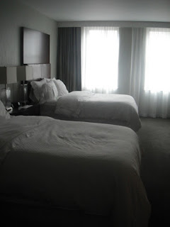
A double at the Westin Book Cadillac looks like the photo above.  Nothing terribly remarkable, featuring a cleanly spartan interior in keeping with modernist revival trends.  Is there anything abnormal, in fact, about the look or shape of the room?  Here’s another angle:
Doesn’t seem to be.  But check out the hallway on that floor of the Westin:
By today’s standards, it appears unusually narrow—almost claustrophobic.  Yet the continuing the unadorned motif almost helps to mitigate the narrowness: if the designer had filled the walls with decorative bric-a-brac, the space would feel cluttered and even constraining.

It doesn’t take any great powers of discernment to determine what has happened here.  The architects and developers decided to sacrifice hallway space in order to make the sleeping quarters larger.  But that still doesn’t explain the considerable decline in the number of rooms at the Book-Cadillac, from more than 1,100 at the time of the hotel’s founding, to a mere 455 rooms today.  Is it possible that rooms also expanded in width?  Reassessing the rooms’ configuration through one of those photos, I don’t see any other way.
The small pair of windows is atypical.  Though I didn’t include the photo, the bathroom lies directly through the wall to the right (behind the dresser and television) is.  But perhaps the Book-Cadillac of the past offered rooms that were essentially squares, with the wall bisecting at the space between the two windows.  Meanwhile the window on the left, sequestered from its neighboring window through a partition, would bring light into a second bedroom whose bathroom would rest to its left, leaving the two windows of the bedroom in the next room to host both a very small bedroom and its respective restroom.  If that sounds confusing, the best way to describe it is that the two rooms of today were big enough to squeeze in three rooms of the Roaring Twenties.  This would result in an essentially one-third decline in the number of rooms—significant, but nothing on par with the 60% actual loss of rooms.

So what accounts for all those other missing rooms in the hotel?  While it’s possible that the Book-Cadillac may have crammed more rooms in by simply offering a single restroom shared by a cluster of rooms (such configuration was still common at that time), my guess is the building lost another share of rooms through space devoted to amenities that most high-end hotel patrons have come to expect: swimming pools, fitness centers, a spa, a breakfast lounge—not to mention over 60 luxury condominiums on the top floors.   Only a handful of these features would contribute to the Westin’s overall revenue stream.  Thus, the real coup for the hotel chain is the comfier rooms accompanied by a smaller overall baseline—that is, denominator in the “available room” quotient used to devise RevPAR.  A smaller city than in 1920, Detroit simply doesn’t need a hotel that big, but Westin sure needs a confident bottom line established by desirable occupancy and RevPAR numbers—exactly the sort of variables that investors seek in Westin’s parent, the publicly traded Starwood Hotels and Resorts Worldwide, Inc.

Older downtown hotels in cities across America have languished due to the lack of marketability of their small rooms, regardless of how winsome or visionary they are.  Developers routinely hesitate to touch such a costly redevelopment, because most hotels have an inordinately high density of plumbing, much of which the construction team will need to reconfigure—or completely extirpate—to accommodate those bigger bedrooms.  The Westin Book Cadillac seems to have found a solution, but there’s nothing to say that cultural shifts in taste for hotel rooms won’t render the existing layout obsolete someday.  In fact, most evidence suggests that precisely this sort of thing could happen.  In contemporary US living, we take for granted the standard of a unique bathroom to every bedroom, but someday in the future, the notion that people at one point had to share ice machines, business centers, or even exercise rooms may seem unthinkable.


Saturday, May 11, 2013

Contemporary infill gentrification.

My latest post is at Urban Indy.  It focuses on two small multi-family apartment developments in Fountain Square and Bates-Hendricks, neighborhoods on the near south side of Indianapolis' downtown that, while still very gritty, have become increasingly trendy in recent years.  Both neighborhoods still have their fair share of dilapidated housing and some vacant lots, but that is quickly changing, thanks in no small part to the initiatives of Southeast Neighborhood Development (SEND), the local CDC.

Here is Phase I of the Carburetor Lofts, in Fountain Square, fully leased:


And here is Phase I of the East Street Flats in Bates-Hendricks, nearing completion:


Most of these units are 120% of AMI, which, for an inexpensive city such as Indianapolis, is more or less a steal.  SEND's goal was to meet some untapped demand for sleek modern architecture in neighborhoods that would support them, but would still offer a much lower price point than northside neighborhoods like Herron-Morton (which is also welcoming its share of much, much pricier contemporary infill housing).  The article reviews each apartment building on its own terms, gauging the success of the urban design and likelihood that they will help sustain each neighborhood's growing viability within the demographic that actively seeks urban living.  Comments are welcome, either here or on the Urban Indy webpage; I will do my best to respond.

Friday, February 22, 2013

MONTAGE: Salvaging a sacred space by expanding its use.


In more than one previous article, I have explored the challenges that urban or inner-city church congregations face.  Their aging buildings are costly to maintain; parking is inadequate in an area where land prices are usually high; the multiple floors and narrow hallways rarely accommodate disabled people; the higher rates of poverty nearby result in elevated crime, which costs more to insure and to install deterrent devices.  But the biggest hurdles are demographic.  More often than not, these churches are Catholic or Mainline Protestant (Lutheran, Episcopalian, Methodist, Presbyterian), a theological branch whose congregants have been steadily shrinking in number for over thirty years.  The resulting population attending these churches is smaller and often older, compounding the strain to budgets, because the members are more likely to depend upon fixed retirement incomes and to demand greater access for wheelchairs.

The church I featured as my archetype for this pervasive problem is First Lutheran in downtown Indianapolis.  When I first covered this church as part of a broader feature on shrinking old Protestant denominations, it was vacant—closed since 2006.  I sharpened my focus on the church a few months later by adding an interview with a former First Lutheran congregant into the whole analysis.  This congregant had come to terms with the fact that it would probably never be a church again; she would have been content watching it evolve into multi-family housing, if it meant salvaging the building.  And that was what the owner at the time had hoped to achieve: after First Lutheran closed, he stripped it of all its carpet and most of the religious accoutrements, then marketed it to developers for a condo conversion project.  But this was 2008, and the housing market in general—and the downtown condo market in particular—went completely bust.  First Lutheran was in limbo.

A recent visit reveals a much more promising future ahead.
Now called The Sanctuary on Penn, it is no longer a church, but it still conveys the historic use of this 140-year-old building well enough that a shrewd entrepreneur recognized its viability as a venue for hosting events.  Built in 1875 as Mt. Pisgah Lutheran Church, it is one of the oldest surviving structures in Indianapolis and is on the National Register of Historic Places.  And, for the past year, First Lutheran has hosted weddings, wedding receptions, banquets, sorority balls, live music/shows, charity fundraisers, corporate parties, and poetry slams.

The current owner bought the property in 2011, at a point when it was sitting in a semi-mothballed state.  It wasn’t in imminent danger of collapse; it wasn’t infested with vermin.  The previous owner had clearly taken just enough care of it with the hope that an entrepreneur would find a new use for it.  Here’s a view of the chancel, which now serves as a stage.

The elegant decay was a conscious decision.  One of the biggest goals of the new owner was to retain (or even enhance) the aged look while returning the old church to basic functionality. 
Prior to the transformation, most of the walls of the main sanctuary were covered with the weathered, discolored drywall visible on the left side of the photo above.  The restoration team stripped most of the drywall, leaving the plaster underneath, which obviously reveals its own fair share of weathering.  When the team achieved the desired patina, it applied a sealant to mitigate against further flaking of the paint and plaster.  At various points, a rudimentary stenciling is still visible on telltale portions of the old wall.
And here’s a view looking from the opposite end of the nave.  The faint stencils sit on the plaster to the right of the opening at the center of this photo.

The renovation of First Lutheran into The Sanctuary on Penn is thorough.  A smaller room once served as a separate chapel directly behind the chancel:

According to the owner, this chapel is the most acoustically perfect room in the building, so he recommends it as the live music space for shows that are particularly small (under 80 people).  Since this has historically been a Lutheran church, wine was a key element of communion.  So it should come as no surprise that it had fully dedicated space for a bar, along with a motorized retractable partition that required considerable refurbishment to make it usable again.  This bar rests along the wall where I stood to take the previous three photos.  Pivoting around and stepping back, I was able to capture the emergence of the bar as the partition came down:
Meanwhile, the loft above offers additional lounge space:

Venturing to the lower floor, the patina continues on the stairwell:
The owner could have easily delegated the expansive undercroft to storage, but instead he took advantage of the garden-level sun exposure and exposed brick by opening the majority of it to the public.  The largest room is another lounge to escape the din of a noisy reception party.
The owner strived to retain as much of the original church that the previous owner hadn’t already removed, so the bar on this level is actually the part of the chancel where parishioners would come to receive communion.
Since the overwhelming majority of clients have used the space to host weddings and the receptions, it was prudent to dedicate the smaller rooms to wedding parties.  The bride and her bridesmaids can claim two rooms in the front of the church:
While the groomsmen get the man cave in the back:
The restrooms also feature some whimsical touches.
The floor consists entirely of old pennies encased in a laminate.
And more medieval stenciling on the original plaster walls:

The exterior may not have consumed the majority of this $400,000 renovation, but it certainly involved the largest amount of new construction.  The exterior fell under greater scrutiny with Indiana Historic Landmarks as well, not only because of the status of First Lutheran Church as a freestanding structure, but because it sits on the southern edge of the St. Joseph Historic District.
Using the appropriate wrought iron and wood to meet IHL’s approval and respect the historic integrity of the building proved a challenge for the owner and his team.  Even the location of the dumpsters elicited dissent; they must sit on the property’s periphery.  But the result is a significant improvement over what had previously been an overgrown dumping ground.  The elevated deck offers respectable views:
And this arrangement raises the critical concern of how this ancient building is accessible persons with access and functional needs, since this consideration undoubtedly led to its obsolescence: the aging congregation at First Lutheran was increasingly wheelchair dependent, and this old church did not accommodate them easily.  The new owner completely refurbished an old ADA-compliant ramp through this back entrance.
The building has no elevators, so access to the undercroft (where the main restrooms are located) is impossible by wheelchair.  But the chancel has a ramp.
Which leads to a small restroom that the renovators added in order to accommodate wheelchairs.

And perhaps my favorite hat-tip to the age and history of this plot of land: at the Pennsylvania Street entrance, in a small anteroom, rests the cornerstone of the original church at this site.
First English Lutheran Church, established in 1854, didn’t survive very long, but the same congregation rebuilt at Mt. Pisgah just twenty years later, under the supervision of architect Peter P. Cookingham.  Stepping outside of this anteroom, the visitor faces the American Legion Mall: another National Historic Landmark and a fantastic site for taking those outdoor wedding photos.  Speaking of photographs, since my own obviously don’t entirely do justice to this shrewd adaptive re-use, I’ll let the website for The Sanctuary on Penn fill in the gaps, including a much better depiction of the space while it is in use and some showing the inclusion of the American Legion Mall for the wedding party.

Lest this article come across as nothing more than a promotion for The Sanctuary on Penn, it’s essential to step back a bit further and evaluate the implications of the owner’s decisions from a historic preservation standpoint.  While a renovation of the exterior would have faced inevitable obstacles from Indiana Historic Landmarks and other preservation advocates, most of the interior was fair game.  After all, the previous owner had largely gutted it.  And most adaptive re-uses require some changes to the interior configuration to allow for the building’s new function.

So what if the new owner had decided for a complete interior renovation, making the church look as if it had been built last year?  Obviously such an approach would have increased the costs exponentially, and it might have attracted a different clientele—those who may find the cracked plaster and exposed brick a bit off-putting.  But at the same time, it could have symbolically tethered the building to its ecclesiastical roots: by suppressing the intrigue elicited by its age, the only other conspicuous point of reference is its “churchiness”.  So, instead, he wisely chose to intensify its ancientness, diluting the allusions to religion: it is first and foremost an old building, and it was at one time a Lutheran church.  By doing this, he opened The Sanctuary up to a much broader audience: it’s not just going to attract Lutherans, or the church-minded (though it certainly won’t repel them either).  Much of this strategy recalls the point made at the beginning of this essay: the majority of Americans no longer attend church in century-old buildings.  While the shrinking Mainlines are more likely to conduct services in an edifice from the 19th century, they too have largely migrated to newer buildings in the suburbs.  Meanwhile, the burgeoning non-denominational churches overwhelmingly meet in new structures, many of which are unadorned.  A conventional old church building like First Lutheran is almost a novelty.  It’s simply a classy relic that now serves as a multi-purpose venue, without the restrictions for hosting exclusively Lutheran weddings that might have stymied it back when it was a church.

The “dechurchification” of this building has clearly expanded its breadth of potential uses.  The smart adaptation warrants one last comparison to a well-regarded Indianapolis venue, the Earth House, which closed operations last summer at Lockerbie Central United Methodist Church.  The Earth House was first and foremost a community non-profit, but hosting live music shows proved quite lucrative and became a primary source of revenue.  However, the fundamental bylaws of the United Methodist denomination forbade the consumption of alcohol within the church buildings, which ultimately could have deterred some musicians from performing there (though it did allow the Earth House to host all-ages shows).  Near the end of the organization’s life, it managed to secure an exemption to the alcohol restriction from the UMC conference, though it still closed within a few months.  Now, the Sanctuary on Penn has begun to fill the void left by the Earth House, but without any restrictions on alcohol.

The minds behind The Sanctuary wisely blended what they knew about historic preservation with just the right interior changes to maximize the building’s fungible character.  First Lutheran still evokes a church, but a quick visit inside shows how well it downplays this history, while still retaining many of the old surviving church references.  The renovation found the perfect compromise, and in a niche market as competitive as event hosting, these aesthetic negotiations should significantly improve its chances of long-term viability—as well as the survival of one of the city’s oldest buildings.