Showing posts with label neighborhoods. Show all posts

Thursday, July 31, 2014

Who knew that the City That Never Sleeps had a narcoleptic neighbor?


As I prepare for some upcoming significant changes to my blog, I provide a sort of “placeholder” article as make the final modifications, which I will soon publicize.  The placeholder motif extends to the content of this blog entry, where a window sign serves much the same purpose within its respective storefront.

It’s simply announcing a lunch special.  The restaurant itself?  As indicated at the top of the sign, it’s Bertucci’s, an Italian chain common in the northeastern US.  Though the restaurant’s target market is consistently suburban middle class, it seems as though Bertucci’s restaurants routinely occupy urban settings, in storefronts that directly face the street, rather than a sizable parking lot.  Such is the case with this location.
The sign itself isn’t really remarkable on its own terms.  The only thing that distinguishes it is a condition that these photographs could not begin to capture: the day of the week.  The advertisement for this lunch special is taking place on a Saturday morning, and it’s a good deal: good enough to suggest that this Bertucci’s is struggling to get people in the door on a quintessential weekend day without some real incentive.

Is there something wrong with this Bertucci’s?  Probably not, at least in terms of management and menu—after all, it’s a chain, and if chains lose their consistency for too long, they croak.  So why is this one deserted?  It might have something to do with its surroundings.
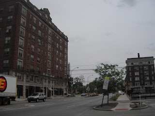
The translucent sheen of the contemporary buildings that flank this Bertucci’s comprises one of the busiest commercial centers in Jersey City, New Jersey—just a stone’s throw across the river from New York City.  The Garden State’s second largest city (just behind Newark), it’s also old, settled as a garrisoned Dutch village in the middle of the 17th century. Yet you’d hardly be able to tell from looking at its coruscating skyscrapers in the Newport neighborhood, seen here in the photos, as well as Exchange Place, directly south of Newport along the waterfront.  It all looks like it could have been built last week.

But the focus for this blog is the larger Newport neighborhood.
Constructed across 600 acres on the old Erie Lackawanna Railway yards, Newport helped galvanize Jersey’s City’s resurgence after its 1986 groundbreaking.  Built as a master-planned, mixed-use community, the intent of its creator, Samuel J. LeFrak of The LeFrak Organization, was to intermingle high-rise residences with office, retail, and entertainment facilities.  The site capitalizes on its pivotal location, adjacent to the Holland Tunnel (with direct vehicular access to Manhattan), as well as I-78 and, not so far away, the New Jersey Turnpike. Newport is also easily accessible by the Hudson-Bergen Light Rail, PATH, New Jersey Transit bus routes, and a ferry service across the Hudson River.

In other words, this is prime grade real estate.  And, by most metrics, it has transformed into a successful locus of commerce, while over a dozen apartment towers house the neighborhood’s approximately 15,000 residents.  By the 25th anniversary of Newport’s establishment, the high density community also boasted a marina, waterfront parks (one with a beach), two hotels, schools,  and the Newport Centre Mall, a regional shopping center whose retail mix ostensibly caters to a broad and diverse socioeconomic base, spread across over 1.1 million square feet and three floors.  This Simon-managed mall also sits squarely within Jersey City’s Urban Enterprise Zone, thereby halving the sales tax rate on goods (only 3.5% instead of 7%) and waiving it altogether for clothing, which no doubt has helped cushion it from the steep decline so many malls across the country have faced.

But for all its amenities, Newport does not seem to have yet mastered the art of fostering a vibrant streetscape.
Sure, there are some people out.  And more people might have been impelled to stroll Washington Boulevard if it weren’t for the blustery conditions on an otherwise mild April morning.  But the fact remains that Newport has metamorphosed into a district with a high concentration of activity in an already active city (Jersey City’s density is well over 15,000 people per square mile, ranking it among the 30 most dense American municipalities).  Nonetheless, this Bertucci’s, sitting right on the neighborhood’s main arterial has to devise special sales to attract visitors to a weekend lunch.  This restaurant’s valiant effort to lure customers only serves to reaffirm what empirical evidence already suggests: that Newport is only lively from 8a to 6pm on Monday for Friday.  Then it hibernates.

The two sons of the late developer Samuel LeFrak strive to continue to his legacy through the family business, but they also hope to improve upon some of the past architectural missteps.  Visual evidence confirms that, aside from the spectacular views of Manhattan from the waterfront, Newport is generally not a terribly desirable setting for people to get out and walk around.  It doesn’t help that ungainly, austere parking garages sit between the occasional storefronts.
Or, for that matter, that one of the primary hotels fronting Washington Boulevard includes a big enough setback to allow for considerable vehicle loading/unloading, as well as some spaces for off street parking.
Obviously, the majority of American hotels—including those in our city centers—include these exact same driver-friendly features.  But the vast majority of American cities cannot boast the sort of multi-modal or mass transit access of Jersey City.  Such a configuration would be virtually unthinkable in Manhattan, and, to this day, even many smaller American cities—often with significantly weaker transit systems—would still include zoning stipulations that vociferously discourage off-street parking lots for hotels within the central business district.

Perhaps, however, the biggest hindrance to Newport ever succeeding as a round-the-clock active urban district is the land use just two blocks away from this photo series.
As Washington Boulevard continues northward of Newport Parkway (the road that rests directly above the Holland Tunnel to Manhattan), the vista changes completely.
Gone are the highrises, replaced by a series of suburban-oriented big box stores (Target, Staples, Best Buy) and replete with off-street parking lots.  The map below shows that this area in Jersey City offers a host of shopping options that one would just as easily expect to see in an automobile-oriented suburb.
Incidentally, this cluster of big box retail sits just south of a huge rail yard, easily visible on the map.  And north of the rail yard is the border for Hoboken, another densely populated waterfront suburb, but one with a vibrant commercial main street, filled with retail and pedestrians at all times of day.
(And, somewhat ironically, Hoboken’s thriving commercial corridor is called Washington Street—a contrast from Jerseys City’s inert Washington Boulevard.)

To be fair, Newport is hardly the alpha and the omega when it comes Jersey City’s retail centers.  The historic downtown to the west of the waterfront consists primarily of two to four-story 19th century buildings, with numerous street-level storefronts along Grove Street and Newark Avenue.  Many blocks in the older, “real” downtown of Jersey City boast an activity level on par with Hoboken.

If anything, the uninspiring streetscapes of Newport most likely reflect the mindset driving development during the time of the district’s founding.  Back in 1986, when the LeFrak family’s vision first started to take root, much of Jersey City was down on its luck, having left the doldrums of the 1970s in its wake—a time when the city lost a staggering 14% of its population.  At that point, this inner-ring suburb of New York City had been shrinking ever since the Great Depression.  Though a far cry from its 315,000 peak, it has posted an increase in population for the last three decades.  But no one could have anticipated that in the 1980s, when The LeFrak Organization took a chance by purchasing land in a district of dilapidated warehouses amidst a field of creaky, neglected railroads.  At a time when even Manhattan’s future appeared murky, suburban living still seemed like the solution, so it comes as no surprise that the land uses surrounding LeFrak’s bold move still reflect the demands of a mostly suburban clientele.  The mall, the bargain department stores, the wide streets, the visible parking lots—all of these in the 1980s seemed like essential gestures to attract a population seemingly incorrigibly averse to urbanism.

The times are changing, but the remaining boxy Staples and Best Buy, monolithic amidst their generous parking lots, feel more like the final unpainted portions of a canvas, rather than a byproduct of lackadaisical urban design.  By this point, Jersey City’s escalating land values promise a higher and better use in the near future, particularly for a struggling national chain like Staples.  If the chain folds, it’s a matter of time before a savvy builder puts something with a higher Floor-Area Ratio in its place—that is, a taller building that yields a higher rate of return.

In the meantime, until the stronger economy forces developers to strategize on their urban design, Newport will continue to limp along.  It’s still a killer place for an office, and I have no doubt that Bertucci’s can fill its tables during a Thursday lunch.  But this abundance of youthful skyscrapers in an environment that remains steadfastly car-centered looks less like a satellite of New York City and more akin to Dubai.  (Or, at least, everything except the historic center of Dubai, which still remains pretty pedestrian friendly.)  No matter how great the density of jobs and residents, no matter how robust the mass transit, the fundamental character of the buildings and streetscape in Newport does not lend itself well to pedestrianism.  What it does yield, however, is a perfectly extreme application of urban transect modeling, in which the form skips several typological layers, going directly from an urban core zone (in the heart of Newport) to a suburban zone north of Newport Parkway, where the Staples first appears.  But Newport’s atypical renaissance places it at odds with most theories on urban form, even if the results are less than meets the eye.  If the developers make sharper decisions as they continue to invest in the area, maybe sometime they’ll be able to promote a level of energy to the streetscape that will convince people to walk around.  And Bertucci’s won’t have to deploy placeholder signage to make up for the sluggish weekend business.

Wednesday, May 7, 2014

When the best preservation efforts go up in smoke.

My latest is up at Urban Indy.  It focuses on a charming Victorian double in the historic neighborhood of St. Joseph, immediately north of downtown Indianapolis, perfectly visible in this Google Streetview image.

At least, that's how it looked in the summer of 2009.  This is what it looks like now:
It's gone.  Demolished.  One could argue that protections for "contributing buildings" in Historic Districts don't give enough teeth to enforce demolition, but that wasn't the problem here.  In the spring of 2010, the building burned to the ground--a fire of undetermined origin.

My research, revealed in full at Urban Indy, determined that it was not a suspicious fire by a landowner who wanted to rid himself of the structural albatross in order to offer the adjacent apartment buildings some quick-and-easy off-street parking.  I actually spoke with the owner of this tragically destroyed home, who made every attempt to save it.  The actual narrative, and the parcel's uncertain future, get full exploration, in an attempt to reconcile the need to preserve the "character" of a historic district (always a fuzzy word) with the understandable aspiration to maximize the marketability of a small, constrained piece of land.  Comments and further observations are strongly encouraged--residents of the St. Joseph neighborhood would certainly appreciate what outsiders might have to say!


Wednesday, September 25, 2013

Testing the mutability of murals.


Urban murals, once a rarity outside of a few pioneering cities such as Philadelphia, have emerged in the last decade or so as a sine qua non for any big-city civic art initiative.  Philadelphia might still be the national (or even global) leader through its Mural Arts Program, but many other cities are trying to give Philly a run for its money.  In recognition of having won the bid for Super Bowl XLVI back in 2012, the City of Indianapolis commissioned a variety of local artists to festoon the sides of various buildings with 46 different murals, significantly boosting its corpus in the process.  Inevitably, these murals vary greatly both in prominence and quality, but some of them have generated significant positive buzz in the last two years.  One of the highest profile (and best-loved) of Indy’s murals is a giant recreation of Kurt Vonnegut, looking about as avuncular one could ever hope from the city’s most lovable curmudgeon.

In fear of seeming like too much of a killjoy, let me defend the mural not just for its great attention to detail, the formidable skill of its creator, and its unquantifiable boost to the city’s self-image by reminding the world that it was the boyhood home of one of the 20th century’s most respected satirists and social critics.  Hopefully Kilgore Trout would approve of my cynicism, though, when I follow this paean with a serious disclaimer.  Doggone it, this mural has Kurt beaming onto a parking lot along Massachusetts Avenue, a fashionable yuppie nightlife corridor that will inevitably turn into a mixed-use development eventually, shrouding the gargantuan Vonnegut into a back alley.  The salience the mural enjoys now from emptiness of the parking lot will eventually lead to its downfall—or, at least, its almost complete concealment when a building sprouts up.  (Then again, Kurt, ever the rake, may just as easily have approved of such a self-defeating gesture.)

But this Vonnegut dilemma hints on a recurring problem with many murals: the conceivers deliberately place them on blank walls that probably wouldn’t exist if it weren’t for the adjacent building the faced demolition years prior.  Such is the case for many of the murals in Philadelphia, as well as this earlier mural (predating the Super Bowl) that I blogged about a few years ago.  Too many murals serve as unintentional placeholders, beautifying a featureless flat surface until something else comes along that is far more likely to stimulate economic activity in the area—and, yes, that “something else” nearly always translates to a new infill development.

Michigan’s largest city can claim its own artistic ammunition, boasting a variety of sculptures and murals, both amateur and professional.  I’m not sure if Detroit’s murals emerged under a centralizing organization in the same way as the murals of Philadelphia or Indianapolis—after all, the city appeared at one time to have a Detroit Mural Factory that trained students in the practice, but I cannot find a centralized webpage with up-to-date information for this Mural Factory.  At any rate, the existing array of murals certainly offers a powerful contrast within a city that, by most empirical assessments, suffers a higher-than-average problem with graffiti, when compared to other American cities.  And though graffiti is far less common place across the American landscape than it is in most other countries, Detroit seems to have more than its fair share, no doubt due to the higher concentration of vacant, neglected or underutilized buildings.

So it is with no small amount of comfort that I recognize a highly effective mural that sits on Woodward Avenue, one of the city’s prime arterials, just south of Warren Street, in the heart of the Wayne State University campus.
Whatever one might think of the mural’s broader aesthetic ambitions, it certainly adds color and texture to an otherwise monochrome flat surface.  It’s big—possibly bigger, all in all, than the lanky Vonnegut in Indianapolis.  But it shares the same predicament: it rests on a blank wall to a building whose kissing cousin came down years ago.  In its place is this big grassy lot.
And the lot is expansive—huge.  Here’s looking at it from the other direction (northward) along Woodward:
And pivoting a little bit to the left, in a northwesterly direction:
Not surprisingly, a city that has suffered as much extensive depopulation and disinvestment as Detroit has more than its share of vacant lots, the verdant reminders of mighty Art Deco buildings that once lined this corridor.  In many quarters of the city, the urban prairies will likely sit there for years to come.

But not here in Midtown, and certainly not on Wayne State’s campus.  Leadership at WSU has pushed significantly to shift its prevailing identity over the years.  Since its founding as a medical school and training college, the university has burgeoned and evolved into Michigan’s third-largest.  But it has rarely (if ever) claimed a significant presence of live-in students.  Long a commuter school, the reputation—particularly in Detroit’s darkest days of crime and disinvestment—was that students at WSU drove to the university from the suburbs, took their classes, and got out by dusk.  Throughout the 1990s, the campus did not even offer dorm living.  Though the transition is undoubtedly a bit more nuanced than I’m portraying here, the University’s leadership and economic development arm realized that the chasm between the school and the surrounding Midtown neighborhood was only growing.  And it certainly wasn’t helping the desirability of being a student at Wayne State.  As a result, the school has engaged in a flurry of both dormitory construction and partnerships with developers to encourage a greater student life around the campus that lingers after hours.  Consequently, Midtown has as bustling pedestrian scene that was scarcely visible 20 years ago.  More eyes on the street translates to greater perception of safety, and the presence of a youth culture with some disposable income has spurred a concomitant college-town retail scene.

This broad scythe at a history of Wayne State’s involvement in Midtown inevitably cuts some corners (pun intended), but in the long and short of it is, it’s only a matter of time before this grassy corner at the intersection of Woodward and Warren will host a new building, if not several.  And it’s equally certain that, in due time, a developer seeking to maximize the FAR (floor-area ratio) on the parcel will want to build in very close proximity to the existing building with the mural.  The developer may even choose to touch the adjacent structure.  Which means that this elegant adornment could fall into oblivion, frustrating not just the artist but also the community support that helped to conceive it.

Fortunately, the minds behind the mural have an ace in their sleeve.
Notice the tiniest shadow at the lower left corner of the mural?  That’s right—it’s not directly painted onto the wall.
It appears to be a sort of canvas that has been stretched to tautness through tying its corners to hooks implanted in the mortar between bricks.  I suppose, if we’re purists, this means that this piece of artwork no longer fits the traditional definition of a mural.  But it will likely fake anyone who isn’t scrutinizing.  And, more importantly, it means that the canvas can come down when a building goes up next door, then get installed somewhere else.

From an artistic standpoint, my suspicion is that this display has lost a bit of credibility.  After all, it didn’t require an artist’s careful assessment of the space, nor the dedication of applying paint to a rough surface from a vertiginous position.  Though clearly “drawn” as an original, it’s quite possible this canvas’s existence depended upon a digital magnification.  So maybe it’s cheating.  But the fact remains that neither WSU, future developers, nor whatever arts program finally implemented the “mural”—none will have to witness the demise of this work of art in a few years.  The same can’t be said about Kurt Vonnegut in Indy, nor the hundreds of murals emblazoned on blank sides of buildings in Philly.  Migrating this canvas to another big wall should seem like a minor effort in comparison, and in a city that has witnessed so much renegade art in the wake of its abandonment, the citizens will finally get to see a painting salvaged, as welcomed new construction fills the void.

Sunday, June 30, 2013

Nudging the ‘urbs in the right direction.


When negotiating the introduction of typically suburban corporate chains in an otherwise urban neighborhood, it typically takes an inordinate amount of fancy footwork.  Most American cities have a “Midtown”—either explicitly or implicitly named—that suffered colossal disinvestment from the 1950s onward, or perhaps even as early as the Depression.  Now, thanks to their proximity to revitalizing downtowns, these Midtowns are lurching back toward relevance, but they come wearing the battle scars of urban renewal.  The pockmarks of parking lots still vaguely remind the older generations of the long-gone architectural marvels that previous civic leaders presumed were obsolete.  Several months ago I explored the Midtown of Birmingham, Alabama, better known as Five Points South, an economically healthy old neighborhood which amidst the handsome century-old buildings, claims its fair share of space devoted to off-street parking.  In recent years, in recognition of the growing attractiveness of the area, newer development has arisen, such as a Chick-fil-A restaurant, taking advantage of the pedestrian traffic by with a structure thrust to the lot lines at one of the most prominent corners.  The parking for this otherwise archetypically suburban restaurant change is tucked on the interior portion of the lot, making it much less conspicuous to general public view.

In more recent month, I learned that my home city of Indianapolis had contended with its own developmental maneuverings a few years ago, when another national brand wanted to build a new structure in its Midtown.  The CVS at 16th and Meridian Streets didn’t get a lot of coverage when the City approved the design and construction began.  My friends at Urban Indy decided not to cover it.  Recently, before I left town for an extended amount of time, I decided to give it another look.
From this angle, it seems like a solid piece of urban infill: massing is in keeping with what one might expect for a commercial building only 1.5 miles from the absolute center of the city.  The edges of the building are more or less flush with the lot lines.  The signage and awnings are nowhere near as ostentatious as one might expect if the majority of passers by were zooming along at over 40 mph in their vehicles.  For the most part, the lettering and iconography generally seem to cater to pedestrians.

But notice all those qualifying adverbs and phrases: “more or less”, “for the most part”, “generally”.  The entire process is riddled with compromises, as manifested by a view of the building from just about any other angle.
At this point, I’m standing along the west edge of the building, looking northward down Meridian Street.  From this vantage point, it still looks like a busy urban street with an entrance to the CVS right next to the bus stop.  But I’ve contrived the perspective to shroud or omit any of the compromises.  Here’s one of them:
The reflection makes it difficult to discern, but this door fronting the east side of the building is false.  In a truly pedestrian-scaled urban environment, this door should serve as the primary entrance, since it faces the sidewalk along a busy street.  But instead, customers to the CVS have to enter on the south side.
Directly abutting a big parking lot.  Fundamentally, this drug store caters first and foremost to the automobile.  It has no real entrances at the corner of Meridian and 16th, visible in that first photo.  In fact, it offers a drive through pharmacy on the east side, just as one would expect in the suburbs.
In short, the CVS achieves just what it needs to assume a basic veneer of urbanity.  And apparently it took a bit of arm-twisting to get there.  A person with detailed knowledge of the development helped shed some light on the process.  The most influential agencies in shaping the design were the City of Indianapolis Department of Metropolitan Development, the Near North Development Corporation, and the CVS developer.  None of them wanted a conventional suburban design.  To their luck, the Walgreens across the street (at the southwest corner of this intersection) exemplified what not to do.
One of the most prominent intersections in Indy’s Midtown loses any sense of urbanism with a building dwarfed by its own parking lot.  If it weren’t for the some of the surrounding context, it would be hard to tell that this Walgreens was even in a city setting.

At the very least, all parties agreed that the new CVS should hug the parcel boundaries at the intersection, like the Chick-fil-A in Birmingham.  Ahead of the first design proposal, the NNDC rep suggested that the developers choose materials and design the structure in keeping with some of the historic apartments in the area; among the most prominent is to the right of the Walgreens in the photo above, just a stone’s throw from this CVS site.  The developer ultimately deployed the CVS “Main Street” standard design, typically used as infill for historic towns in the northeast.

Beyond that, the developer was unable or unwilling to budge on a lot of the other details.  The planners at DMD and NNDC both tried to push the front door to the structure so that it was facing Meridian, forcing pedestrian ingress directly from the sidewalk.  But the developer insisted that the CVS had rigid internal layout requirements, and inverting the conventional position so that a loading dock would abut the alley (the east side of the building) would preclude a functional drive-through pharmacy.  In addition, placing the entrance along the Meridian Street sidewalk would force a yawning distance between the handicapped parking and the front door.  The DMD encouraged a double entrance, so that pedestrians could still access directly from Meridian Street, but CVS shuns the prospect of controlling two doors; having a second access point also robs the interior of several valuable square feet for retail.  Consequently, the door fronting the sidewalk in the above photo is bogus.  The last major compromise, not surprisingly, dealt with parking: the required minimum was a generous 50 spaces, but CVS insisted that it must have more than 70, in order to compete with Walgreens.

To be frank, it is by and large understandable that the resulting edifice manifests some pretty significant compromises from the urban design ideal.  The developers of the CVS couldn’t alienate their car-dependent base, especially since Meridian Street is one of the main arterials leading to the northern suburbs.  It would have been particularly unwise for the developer to employ massing that obscures the parking; such a move would simply impel all those motorists to opt for the Walgreens across the street, where parking is patently obvious from both Meridian and 16th Streets.  This CVS simply cannot expect to flourish if access is less convenient than its neighbor across the street.

Fortunately, in spite of these concessions, the teams at DMD and NNDC were able to wrestle some other smart features in the design.  These “nibbles” include the following: extra sidewalk connection from 16th and Scioto (the alley on the east side of the property) wrapping around to the front south-facing door; more discreet dumpster enclosure locations; a real tree-lawn next to 16th Street, and a bus shelter near the “door” along Meridian, where one previously had not existed.  And, though it really doesn’t count as a nibble, the “Main Street” CVS design (a standardized template) employs two floors; although the windows on the second floor are fake, the building really does have a mezzanine second story in the section of the building fronting 16th Street.  It’s not just a block of Styrofoam.

Though the number of compromises to this CVS stunted the interest of Indy’s urban blogger community when the building opened a couple years ago, it did attract the attention of prominent St. Louis blog NextSTL, whose Alex Ihnen by and large saw it as a significant improvement to similar proposals in one of St. Louis’ more prominent Midtown neighborhoods.  If his description “doesn’t suck” seems like faint praise, this may be time to invoke a timeworn cliché: never let the perfect be the enemy of the good.  Obviously every individual will have a different standard for “good”, but in judging this drugstore development, it is prudent to leave a wide berth that encompasses anything between the worst possible outcome and the ideal.  The effort to achieve optimal urban design in Indy’s Midtown warrants a reflection upon this neighborhood’s struggles over the years.  Most locals apparently remember the structure that preceded this CVS: an International House of Pancakes with—as NextSTL recalls—a dodgy reputation.  And immediately to its south: a blighted, defunct old car-dealership.  For the majority of the last 50 years, the only saving grace to Midtown was its proximity to downtown and accessibility due to major arterials like Meridian Street. What had once hosted the mansions of some of Indianapolis’ elite families devolved into low-rise office complexes (many nonprofit or social services), faded apartment buildings, tawdry nightclubs, and—manifested by the intersection with 16th—national chains with drive-thru options to cater to the suburban commuters.  Much of this segment of Meridian still looks this way.  As this essay has already demonstrated, the south sides of the intersection host a moderately urban CVS and a fully car-oriented Walgreens.  What about the other two corners?

The McDonald’s building is scarcely visible behind the trees, but the surrounding parking lot dwarfs it as well.  It’s indistinguishable from the typical McDonald’s in the suburbs.  And the last corner?
Again, the Chase Bank puts its parking front and center.  Thus, despite its drawbacks and compromises, the CVS reigns supreme at this intersection in terms of the urbanity of its design and configuration.  Looking south down Meridian Street towards downtown demonstrates its superiority, particularly when juxtaposed with the neighboring Walgreens.

The other three buildings at 16th and Meridian owe much of their lack of inspiration to the economic conditions of the neighborhood at the time of their conception.  Neighborhoods to the east, such as the Old Northside and Herron-Morton Place, had not yet achieved a mature level of gentrification that would allow them to rally a strong degree of support—or opposition—to design standards at this intersection.  These days, both neighborhoods claim a quorum of committed citizens who moved to the area because of the attractiveness of the pedestrian-scaled architecture.  These newcomers have both the wherewithal and the psychological commitment to push institutions such as NNDC or DMD to raise the bar.  During the design review process for the CVS featured here, the City was also fleshing out its Urban Design standards and guidelines, which would either persuade or overtly enforce a stronger approach to design in Indianapolis’ region center, an area that includes 16th and Meridian.  Though the approval of a CVS at this location preceded the implementation of these Guidelines, it is obvious that the spirit behind them exerted a fair share of influence on the conception of the CVS.  It’s not fantastic.  But it’s better than anything at the other three corners, and it’s also more in keeping with the urban scale of two neighborhoods immediately to the east, visible in the photo below:
16th Street is the dividing line here, with Old Northside to the right and Herron-Morton Place to the left.  While 16th is an important arterial as well, it doesn’t provide the sort of expansive suburban access that would have made it as attractive of a corridor as Meridian Street for commuter-oriented drive-thrus.  Though the century-old apartment buildings that frame this photo suffered serious decline in the second half of the 20th century, more recent gentrification efforts have stimulated a renaissance at both.  This section of Midtown, particularly in the last few years, has emerged as a fashionable enclave for affluent professionals, with a growing array of locally owned retail to serve them.

The urban form remains a palimpsest--just as it always has.  My prediction is that growing interest in the community will push more developers to adopt the CVS approach to urban design—or something better.  I’m not sure the property value in Indy’s Midtown is going to skyrocket enough that we’ll be seeing high-rise apartments replace the McDonald’s or Chase Bank any time soon.  But I certainly wouldn’t be surprised if it happens eventually.  And if—or when—someone eventually does decide to build at this prominent intersection, he or she will inevitably assume a mentality of “highest and best use”, not just because of city design regulations or the neighborhood arm-twisting, but because the lucrative nature of the real estate here would make it ridiculous to do otherwise.  Why build a single story fast food restaurant when you could comfortably fit eight floors of office and apartments above it, and the neighborhood wouldn’t raise a stink?

If we ever get to that point, mark my word the opposition won’t be a big new apartment building—the nabe will fight the Mickey Dees.

Saturday, May 11, 2013

Contemporary infill gentrification.

My latest post is at Urban Indy.  It focuses on two small multi-family apartment developments in Fountain Square and Bates-Hendricks, neighborhoods on the near south side of Indianapolis' downtown that, while still very gritty, have become increasingly trendy in recent years.  Both neighborhoods still have their fair share of dilapidated housing and some vacant lots, but that is quickly changing, thanks in no small part to the initiatives of Southeast Neighborhood Development (SEND), the local CDC.

Here is Phase I of the Carburetor Lofts, in Fountain Square, fully leased:


And here is Phase I of the East Street Flats in Bates-Hendricks, nearing completion:


Most of these units are 120% of AMI, which, for an inexpensive city such as Indianapolis, is more or less a steal.  SEND's goal was to meet some untapped demand for sleek modern architecture in neighborhoods that would support them, but would still offer a much lower price point than northside neighborhoods like Herron-Morton (which is also welcoming its share of much, much pricier contemporary infill housing).  The article reviews each apartment building on its own terms, gauging the success of the urban design and likelihood that they will help sustain each neighborhood's growing viability within the demographic that actively seeks urban living.  Comments are welcome, either here or on the Urban Indy webpage; I will do my best to respond.

Saturday, April 27, 2013

Salvaging St. Louis, Part II: Planting the seeds for repopulation.

In the previous part to this study, I explored the similar population trends of two major Midwestern cities, St. Louis and Detroit.  Both cities have endured significant losses since their peak in the 1950 census.  Interestingly, Detroit seems to absorb the lion’s share of critical attention for its persistent economic malaise, yet St. Louis has actually suffered a slightly greater loss: 62% within its historic city limits, compared to Detroit’s 61%.  How has St. Louis evaded much of the stigma of decline that persistently dogs Detroit?  I offered a few big-picture speculations in the previous post, not the least of which is that, by and large, the St. Louis Metropolitan Statistical Area (consisting of 15 counties and St. Louis as an excluded city, or 16 counties if one considers the even larger Consolidated Metropolitan Area) has remained stable or grown slightly over the last few decades, while in Detroit, even many of the suburbs are shrinking as well.  In addition, St. Louis does not owe its population explosion to the emergence of a single industry: it began growing into a prominent city decades before Detroit, and for a short time in the mid 19th century, it was the largest city in the Midwest—bigger even than Chicago.  Detroit, meanwhile, was still a humble town in the 1800s; then, after a surge of over 1,000,000 persons from 1910 to 1930 (the fastest growing city in modern history at the time), it enjoyed about 20 more years of unquestioned prosperity.

Most compelling for a person guided by empiricism as I am, St. Louis fundamentally looks better than Detroit.  While it clearly manifests its population loss, particularly in the impoverished northern half of the municipal boundaries, the Missouri city doesn’t harbor nearly as many broad swathes of vacancy as its Michigan counterpart—and the southern half of St. Louis boasts a number of perfectly stable or even fashionable, recently gentrified old neighborhoods. I identified one other major influence that gives St. Louis an edge: its housing stock was older and suffered obsolescence to a greater degree than Detroit.  While this may seem counterintuitive, it indicates that St. Louis owes its population loss much more to a housing typology that fell out of favor—people abandoned housing in St. Louis less because it depended on a collapsing industry and more because of how easy it was to construct a comfortable modern home outside the city limits.  The housing stock in St. Louis is on average much older; when St. Louis began to decline, people were abandoning 80 to 100-year-old brick rowhomes and duplexes because it was easier to start over than upgrade.  Conversely, much of the housing stock in Detroit was only 50 years old when the desertion process began.  While both cities suffered, postwar deindustrialization contributed far more to Detroit’s exodus than it did in St. Louis.

I have no doubt I am going out on a limb on this assertion, especially since St. Louis in particular can currently boast some aged brick attached housing that commands a fairly high price, since a few of these older neighborhoods have enjoyed a recent renaissance.  And, of course, all the industrial cities of the north suffered the same outmigration concomitant with the decline in industry.  But clearly some suffered more than others: in the Northeast, no one would question that Baltimore and Philadelphia’s attached housing stock have proven more prone to complete abandonment than, for example, Boston’s triple-deckers.  The remainder of this article will scrutinize the character of St. Louis’ housing, particularly in light of what I would consider one of the leaders in repopulating disinvested neighborhoods: the firm McCormack Baron Salazar, Inc., a pre-eminent owner and developer of affordable housing.  While every major city claims at least a few prominent affordable housing developers, MBS has almost singlehandedly restored some neighborhoods in St. Louis that otherwise would undoubtedly bear the same devastating scars we can witness in Detroit.  And it consistently ranks as one of the largest affordable housing developers in the country.

Lest this article come across as a promotional campaign for this specific firm, I attest now that I intend merely to use McCormack Baron Salazar as a method of winnowing a reasonable travelogue through the city’s vast and diverse array of housing stock, by directing attention on a handful of the firm’s developments in the city limits.  I intend to evaluate their success at balancing current demands for housing amenities with a respect for St. Louis’ distinctive vernacular architecture—the style that fell so heavily out of favor but now enjoys a palpable if uneven resurgence.  Not surprisingly, a preponderance of the major developments rest in the more devastated northern half of St. Louis.

This first, known as Murphy Park, stretches across several blocks centered at the intersection of Cass Avenue and North 19th Street, just a few blocks west of the former site of Pruitt-Igoe, one of America’s most infamous public housing projects—and among the first to face demolition after persistent failure to offer its low-income residents an adequate quality of life.  To this day, the neighborhood (formerly known as DeSoto-Carr) is overwhelmingly African-American and low-income, though it holds a fraction of the population from its 1950 peak.


Murphy Park replaces Vaughn Towers, another public housing development that had fallen into serious disrepair by the mid 1980s.  Across three phases, MBS built over 400 units of new, low-rise housing, providing individualized entryways and private yard space, along with park facilities, a swimming pool, and a community center.
While it bears the trademarks of relatively new construction through the lack of the patina of “traditional” St. Louis housing expected from this district in the city, it also eschews the suburban multifamily typology, particularly the type one would expect to see in the 1980s.  Notice that the front doors all address the street, rather than turning toward the interior of the block with a centralized parking lot, as one might expect in the suburbs.  MBS did not alter the original grid, as the high-rise public housing developers did in prior decades.  And because different sections of Murphy Park adopt different styles, the community does not look like a development conceived from a uniform source or a single site plan.
Compare the photos above to the neighborhood that surrounds it.  Here’s a photo with some older surviving housing nearby:
And some other new construction in the area, which looks every bit like something one might see in suburbia.
There’s nothing wrong with the housing in the above photo, unless you are vigorously anti-suburb.  (I'm not, if that weren't obvious already.) To be frank, such housing may very well align with what these moderate-income families are seeking, more than the conventionally urban townhome style promoted before.  However, the more authentically urban Murphy Park development shows evidence of greater staying power: it is in consistently good condition.  Meanwhile, some of the suburban stuff has fizzled.
Judging from the grayness of the wood, this conventional house has sat in semi-built limbo for at least a couple years.  Since I don’t know the history behind this development, I will withhold further judgment.

Needless to say, however, the adjacent Murphy Park project shows no evidence of aborted construction; the entire initiative bespeaks of a unified vision that loosely conforms to the archetypes of an urban neighborhood will still providing sophisticated modern housing.  The fact that it displays some stylistic variance helps mitigate the effect of looking “over-planned” or factitious.  The success of Murphy Park ostensibly prompted HUD to conceive of the HOPE VI model for integrating affordable housing into an existing urban neighborhood context, based largely on the design principles applied here.

Approximately the same age as Murphy Park, the Brewery Apartments sit just a few blocks away and apply an entirely different development approach: meticulous historic preservation and adaptive reuse, in order to deliver particularly high-density multifamily housing in a neighborhood that otherwise would be bereft of residents.
The development consisted of the rehabilitation of three buildings that had belonged to the Falstaff Brewing Company, ten rowhomes directly across from 20th Street, and two new infill buildings.  The total complex offers 140 units, with 75% of the units open to households earning less than 60% AMI (Area Median Income).  Here’s a more comprehensive picture of the brewery complex:
And here are the adjacent rowhomes:
And a more distant view, peering through the trees from an intersecting streetscape:
It would take far more scrutiny than I allowed myself in order to identify the two infill buildings, which the development effectively integrates with the much older building stock.  At the time of this publication, leasing rates for the market-rate apartments at the Brewery range from $700 to $940, from one to as many as three bedrooms, though no market-rate three-bedroom units were available.  And it is easy to see why the brewery can lease to a market-rate clientele: redeveloped old breweries have flourished as fashionable residential real estate, especially for the urban young professional population that is less concerned with crime or struggling public schools.  Based on my phone inquiry, the Brewery Apartments rarely struggle to find market rate tenants, indicating their desirability despite the general impoverishment of the neighborhood.  

Most of McCormack Baron Salazar’s other St. Louis developments rest in more economically mixed areas than the aforementioned two.  The Westminster Place Apartments sit squarely in Midtown St. Louis, an area that remained fashionable up through the mid-1960s.  Just a stone’s through away sat Gaslight Square, a hub of taverns, cabarets, and, eventually, St. Louis’ counterculture movement.  But the area declined steadily in the 1970s, and, although never upscale, it fell victim to particularly acute desuetude, to the point that by 1990, the City had demolished virtually all the structures in Gaslight Square.  Westminster Place belongs to a series of public and private initiatives aimed at repopulating the 90-acre area.  Like Murphy Park, it offers a diverse array of housing to accommodate a variety of demographic groups. 
The end result stretches across several blocks in Midtown, with three developmental phases completed from 2007 to 2012, amounting to 392 new apartments and 80 homes.
Note the decorative brick street signs, which distinguish the neighborhood from the more conventional signage in the purlieus.  Westminster Place itself—the actual road—features a mix of townhomes and single-family detached housing flanking a landscaped traffic circle.
Some of the apartment buildings adhere to the same archetype used in Murphy Park.  Though their appearance may deviate from the structures of the Gaslight Square era, they still provide an above-average population density and a pedestrian orientation directly to the street—two characteristics that would be unheard of if MBS had abided by a more suburban vernacular.  Tucked into the heart of the Westminster Place development is McCormack House, an assisted living apartment for low-income seniors, visible in the photo below:
Interestingly, the same block of Olive Street that hosts McCormack House also completely intermingles features more Westminster Place apartments with old commercial/industrial structures that remain largely vacant and decaying.  Here’s one of the standard new buildings:
And here’s a relic from days past just a bit further down:
One of these dinosaurs sits directly across from McCormack House.
I would speculate that the above building is a sheath for concealing a menacing electrical sub-station, if it weren’t for the masonry scar to the building’s right, suggesting that a similarly sized building used to sit immediately adjacent to it.  Who knows what’s going on here?  These aging behemoths could belong to a stubborn landowner refusing to sell until the market it too hot, or it could be part of an eventual adaptive re-use that will attempt to salvage the façades.  Regardless, the juxtaposition of old and new provides a needed anomaly.  Otherwise, far all the artistry involved in integrating a variety of housing styles and types, Westminster Place still looks like exactly what it is: a new development to replace a completely devastated old neighborhood.

In order to avoid this article extending to uncomfortable length, I’m going to push the pause button.  Part III will conclude the essay with an exploration of a few more McCormack Baron Salazar projects, along with a final analysis on the implications for intensive housing provision as a means of inducing repopulation.