Showing posts with label Philadelphia. Show all posts

Monday, January 28, 2013

Reviving with the wave of a wizard’s wand.


Earlier this past fall, I featured the accomplishments of the City of Kokomo, Indiana in reinventing itself over the past few years, after two decades of rust-belt, deindustrialized stagnancy.  Civic leadership successfully elicited a certain degree of buy-in among its constituent, all toward sundry capital improvements, the likes of which most similarly sized cities still only retain on their wish lists.  The results are conspicuous.  Kokomo has made formidable strides in infrastructural improvements, mass transit, downtown revitalization, park expansion, public art, and an ambitious International Baccalaureate exchange program at the public schools—all while maintaining a balanced city budget.  According to some of the city’s cheerleaders for these expenditures, the overall ethos driving the city is far more upbeat than it has been in years, despite the fact that, as recently as 2008, Forbes listed the city as one of America’s fastest dying towns.  Perhaps that article served as a wake-up call, because I’d be hard-pressed to imagine that recent visitors to Kokomo’s downtown would ever see the city as dying—certainly in comparison to dozens of other similarly sized cities across New York, Pennsylvania, New Jersey, Ohio, Michigan, and Indiana that show little to no evidence of revitalization at work.

The combined impact of these upgrades is inspiring.  But none of them (with the possible exception of the International Baccalaureate exchange) is particularly groundbreaking.  Virtually every city these days has attempted revitalization through a certain combination of sculptures/murals, streetscape improvements, heritage pedestrian/bike trails, new parks, et cetera et cetera.  These initiatives seem to come from a City Planning 101 playbook.  It’s as though cities have completely taken the bait from the many national assessment tools created by various urban advocacy nonprofits in order to gauge quality of life.  At the same time, the advisory committees that operate these organizations (and thus create their highly subjective definitions of “quality of life”) consist overwhelmingly of city planners and their lobbyist allies, cajoling municipalities to eat out of their hands in a manner that smacks of self-aggrandizement.  To put it more simply, cities like Kokomo strive for (and ultimately invest in) bike lanes, mixed-use trails, or omnipresent bike racks, all in order to achieve and flaunt that bronze rating from the League of Bicyclists, which in turn wins free publicity for itself in the process.  I cynically alluded to this practice in Baton Rouge a few years ago. 

I’m not trying to undermine or belittle these practices, nor do I mean to pick on the League of American Bicyclists’ worthy mission.  And the initiative that Kokomo has shown these past few years is commendable—and the city has usually implemented these upgrades far more smartly than one might see in a larger city like Indianapolis.  But the standards for what constitutes a “livable” city seem to grow more uniform and homogenized with each passing year that these standard-bearers of good urbanism grow in influence.  The remedy for economic malaise increasingly seems to be the same everywhere, like a doctor who prescribes cod liver oil for both arthritis and malaria.  So it is with no small fanfare that I declare how happy I am that a local entrepreneur in Kokomo has marched alongside the corps of revitalizers, but to his own beat.


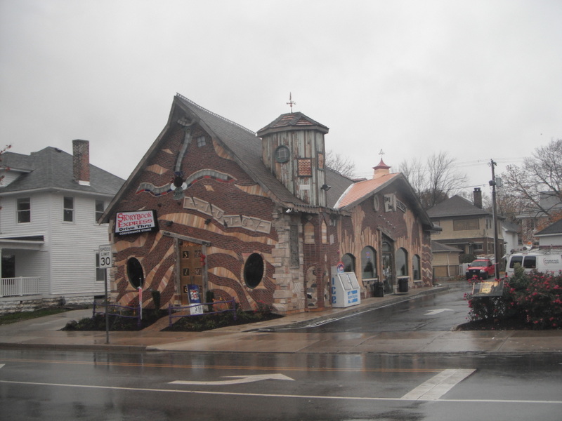
This whimsical structure, known as Storybook Express, opened in 2012 at a long-vacant site at Sycamore Street and Apperson Way, just a few blocks from the Howard County Courthouse.  Although it’s a convenience store, the unconventional, fairytale appearance has prompted locals to christen it the “Harry Potter house”.  Even from a distance, the building’s densely ornamented façade and off-kilter massing and brickwork help distinguish it.
But a closer look reveals the devil-may-care insertion of neglected or discarded antiques into the masonry:
Notice the metal pig’s derriere rammed into the wood just above the transom window.

More often than not, eye-catching façades such as these are a total bust when viewed from less prominent angles.  The designer puts all the mojo in the front view.  But Storybook Express includes just as much eccentric detail on the backside as well:
An old church inscription, a car’s suspension coil, antiquated plumbing, and other unidentifiable bric-a-brac enhance the façade’s visual interest.  Even the relatively conventional brick wall, used to elevate and protect the convenience store’s HVAC equipment, deliberately employs an excessive amount of mortar to enhance the multi-dimensionality.  Look how it oozes from between the bricks.
The western wall is equally whimsical and boasts the added benefit of a drive-thru window, a relatively uncommon feature in convenience stores.
But I have to confess that my favorite detail is the parking lot, mainly because it would be so easy to settle for drab convention.  But the brains behind Storybook Express allowed the whimsy to permeate the entire design.  The retaining wall adheres to the same pastiche as the masonry:
And it takes real chutzpah to employ an unconventional striping for a parking lot, a practice that in many cities would require special approval:

Storybook Express would easily qualify as a great roadside curiosity even if it sat in isolation.  But it is the culminating achievement of Fortune Management, a local real estate development firm with holdings throughout the city, including a few other developments in a similar vernacular.  I found one of these other curiosities on my own, at Markland Avenue and Calumet Street.
This structure, dating from 1999, hosts a nail salon.
Like Storybook Express, it applies the fanciful masonry mixed with assorted folderol on all four sides.
Digging back a bit further in time, Fortune Management adapted some brownfield sites into office space.  The property at Markland and Washington previously hosted a transmission repair shop that had clearly seen better days:
In 1995, Fortune Management transformed it into this:
And the company pioneered this aesthetic with a Shell Station at Sycamore and Washington, way back in 1987.  Before the redevelopment, it looked like this:
And afterwards:
These earlier efforts may appear less ostentatious than the convenience store downtown, but they ascribe to the same spirit in their design.

A recent interview with Fortune Management’s president, Scott Pitcher, helped shed some light on his rationale.  The firm has purchased and renovated over 50 properties in the Kokomo area since its 1982 founding.  Pitcher’s goal, even for the less fanciful redevelopments, has been to employ high-quality materials from the same time period as the original structure.  More often than not, Fortune Management has rescued materials from other buildings under demolition in Kokomo other various Indiana.  Not surprisingly, the Storybook Express convenience store featured in the first photos series was new construction on a lot that the company had held in its portfolio for years.  Although not a renovation, it nonetheless consists primarily of repurposed material, while the customized roof exclusively employed Kokomo craftspeople.
The ostensible “Harry Potter” references are a throwback to a legitimate Storybook architectural style in vogue during the 1920s in Hollywood.  Despite the recession, the time finally seemed right a few years ago for Pitcher to begin developing Storybook Express in order to capitalize on the other revitalization efforts that had taken place in downtown Kokomo.  He partnered with a local entrepreneur who was interested in opening a convenience store at the site, and though it was inevitable that it would require parking, the structure still engages Sycamore Street with a very small setback, allowing the structure to accommodate vehicles and pedestrians in nearly equal measure, as the somewhat blurry photo below still demonstrates:

What motivated Pitcher and his team to try this style?  These sundry developments seem inspired by both a love of vintage Hollywood movie sets as well as the plundering of small-town antique shops, though they have also achieved statewide recognition for persistent use of local material, winning an Indiana Green Business Award in 2010.  At the same time, I see little evidence in Pitcher’s work that he was striving for broader recognition in the architectural or artistic community.  He wasn’t trying to impress the New York art scene; he built this way because he felt like it.  I shy away from the dubious label of “folk art” because it carries with it a whiff of condescension—that folk artists are uncouth autodidacts who remain ignorant of the preferred aesthetic standards and mores of the time.  Pitcher knows exactly what he’s trying to achieve, but Storybook Express and its cousins have flourished despite being untethered to any broader cultural barometer.  For me, the DIY framework by which these buildings came into being can’t help but recall the work of Philadelphia artist Isaiah Zagar, who for decades has charmed his neighborhood through colorful mosaics and found-object installations superimposed onto various buildings.  The vast majority of Zagar’s corpus remains concentrated along South Street and the adjacent blocks, such as the examples below:

Obviously Scott Pitcher and Isaiah Zagar aren’t entirely kindred spirits: Zagar self-identifies as an artist and Pitcher is first and foremost a developer.  And while Zagar’s most widely recognized artistic output polka-dots the various workaday streets of South Philly, his work also sits in the permanent collections of art institutions both inside and outside of metro Philadelphia.  Nonetheless, Zagar has admitted his affinity with folk and visionary artists from across the globe, and he doesn’t hesitate to identify as a “vernacular artist” because the majority of his corpus thrives from decades of embedding himself in the community he loves, rather than responding exclusively to the dictates of specific commissions.  Pitcher, meanwhile, has indicated that any new Storybook project will likely take place far from downtown Kokomo, since he feels a similar edifice will only dilute the impact of Storybook Express (which, not surprisingly, has proven a resounding success as a convenience store).  He hopes to forge his next venture in another smaller Indiana downtown, or perhaps even something in Indianapolis.

What Zagar and Pitcher clearly share is an aesthetic vision divorced from an overt context.  Zagar could have filled his murals with references to Jim Croce or Marian Anderson or Mario Lanza, if he wanted to draw from South Philly’s heritage of vocal musicians.  He could have partnered with a nonprofit to engage in a comprehensive beautification campaign through targeted mosaic design and specific locations.  But the visual evidence suggests neither of these.  Nor does Scott Pitcher seem to care if 1920s Hollywood (or Hogwarts) has anything to do with Kokomo, the City of Firsts.  And therein lies the appeal.  Most of Kokomo’s other revitalization initiatives are sincere attempts to jolt the city out of its multi-decade torpor by massaging the dormant creative economy.  Kokomo hopes to retain its population through compelling quality of life amenities.  But when every small city sees bike lanes and murals as the remedy, couldn’t these urban organisms eventually develop immunity to the treatment?  Sometimes individual ingenuity—the entrepreneurs who swim against the current—can offer more long-term regenerative potential than all the social policies a city council can conceive.  Kokomo’s future success will undoubtedly owes a great deal to committed and talented civic leadership, but its distinctiveness may rely heavily upon a playful little building near downtown called Storybook Express.

Saturday, December 29, 2012

Predicting the future by turning back the clocks.


In an essay from the past, I shamelessly stretched the definition of the term “land banking” to suit my own purposes.  How?  By showing two examples of the deliberate assembly of contiguous parcels with the purpose of building something new, but the problem is, neither attempt at parcel assembly consisted of vacant land, as is the customary use of the term.  The land banking was (as I indicated) retroactive, because the parcels themselves already had structures resting on them.   The owners of contiguous buildings had let the buildings remain vacant, long enough that some were falling into disrepair.  But these two examples were in the heart of walkable downtown Bloomington, Indiana and auto-oriented Greenwood, Indiana—economically healthy environments where it made no sense to abandon the real estate, since the landowners could easily find reliable tenants.  In due time, I knew that these dowdy buildings would get demolished, once parcel assembly was complete, and the developer would ideally rebuild something better than was there before, making a higher and better use of this coveted land.

Well, I was wrong.  I guess I learned my lesson in speculation.  Or did I?  The example in urban Bloomington warranted a follow-up essay about five months later, because the developer, who had hoped to build a large condo building on Kirkwood Avenue on the site of multiple smaller structures, ultimately decided simply to upgrade and improve the appearance of the existing structures when the condo market went bust.  In truth, I wasn’t wrong about the land banking process—it just didn’t work out the way the developer had anticipated.  Meanwhile, the suburban Greenwood example simply foretold the replacement of old retail outparcel buildings (mostly drive thru restaurants) with newer, flashier ones, like a contemporary Chick-fil-A.  So I was wrong on that, but maybe the intention was for a larger retail structure that again flopped, since the economy made it harder to secure financing for more ambitious projects.

Either way, I’m at it again, speculating on another land banking initiative, exploiting the term once more.  I may be wrong once more, but I’m more confident than ever about my guesswork because of the setting: this time it’s in densely populated downtown Philadelphia, usually referred to by the locals as Center City.


By most measurements, the squat, nondescript building in the photo above appears to be in good enough condition, but it sure doesn’t seem to have much luck at securing tenants.  It sits at the intersection of South 15th Street and Walnut Street, and its prime storefront is glaringly vacant:
And the first photo was misleading; it revealed the entire frontage along South 15th Street, but despite the various signs for a coffee shop, hair salon, and Korean restaurant, the reality is far less promising:
The Panache salon has vacated the first group of windows on the photo above, while Elixir Coffee House—
Gone as well, relocated a mere half-block to the west.  Finally, it would appear that Miga, the Korean restaurant at the end, has closed altogether.
However, a small sign in the window indicates that the business hopes to reopen soon…presumably in a new location.  Meanwhile the second floor of the building doesn’t look much more active:
The pictures don’t fully capture this, but in the few places where the curtains are drawn, it is clear that the offices are empty, and the thickness of dust across all the windows suggests that they haven’t been used in quite some time.

The frontage on Walnut Street is no better.
Lush, the upscale purveyor of soap and cosmetics, used to occupy that street-level space in the adjacent two-story building, but it has apparently relocated as well.  And a bit further down the street, the furniture rental store has also relocated, in yet another low-rise structure.
The first floor apparently used to contain a Rite Aid Pharmacy, but it too has terminated its lease.  In short, the building appears to be completely vacant.  The absence of pedestrian traffic along 15th Street only confirms the building’s lack of appeal.  An outsider might draw the conclusion that this is succumbing to blight and disinvestment, but anyone remotely familiar with Philly would know otherwise.  15th and Walnut just blocks from the heart of Rittenhouse Square, long Central City’s most vibrant park space and the name of the prestigious surrounding neighborhood.
Meanwhile, Walnut Street is the most heavily-trafficked retail corridor, widely sought after by national upscale brands.  If anything, it seems a bit strange that a low-end furniture rental company would voluntarily pay the exorbitantly high rents along Walnut Street, especially considering that directly across the street from this building is the following tenant:
It’s hard to think of many retailers choosier than Armani Exchange.

In short, this group of three vacant buildings in a posh part of town bespeaks the quiet transfer of titles among speculators who no doubt believe this corner deserves a higher and better use.  The tenants didn’t depart because the location was bad.  A Google Streetview from reveals that both the 15th Street segment and the WalnutStreet cluster of three façades were fully tenanted as recently as August of 2009.  More likely than not, the owner(s) did not allow them to extend their leases into a new term.  In this case, the land speculator has assembled multiple adjacent parcels with the hopes of building something with potential to earn greater income, no doubt benefiting from a higher Floor Area Ratio (FAR) than the meager two and three stories that the current buildings offer.  In order to build anew, this developer will need to demolish the existing structures; in order to demolish, he or she will obviously have to vacate.

I have based this entire essay on a hunch that I barely noticed in passing through the city briefly one afternoon, in which I guessed what was about to happen by peeling back the layers, thereby figuring out the current phase of an ongoing development trajectory.  I was first taken by the conspicuous absence of pedestrian traffic around the building fronting 15th Street—
—particularly in comparison to all the streets around it, or even the opposite side of 15th:
Moments later, it occurred to me that most if not all of the storefronts were vacant, despite the signage.  Then I noticed the architectural details of this building, or the lack thereof.  I’m hardly the most well versed architectural historian, but usually I can at least approximate the date of a building from its appearance.  Not this time.  It almost seemed as though the designer had eschewed any ornamentation (or even a deliberate absence of ornamentation, which can be an enhancement in itself) that could give it away or distinguish it.  The landlord even let Miga, one of the former tenants, paint its section of the façade black.
Ugly ugly ugly.  My suspicion is that this building comes from a time when the economy of urban Philadelphia was so feeble that even Rittenhouse Square was struggling, and the risk-averse developer chose unimaginative and low-slung construction, because that was all the weak market could support.  The 1970s or early 1980s, perhaps?  Since that time, Rittenhouse has reclaimed most if not all of its luster, and the time is right to build bigger and better.  Am I right?  Will these buildings soon face demolition?

A modest bit of internet research vindicated my suspicions: all those other tenants left because these buildings will soon come down.  The replacement?  A four-story mega-structure, with each floor devoted to a separate retail tenant.  The buzz on the Naked Philly website reveals, not surprisingly, a fair amount of disappointment: a premier corner such as 15th and Walnut could easily support a 16-story mixed-use building, octupling the FAR rather than merely doubling it.  But we are still in the midst of lean economic times, forcing developers and their equity partners into far more modest decisions than they otherwise would make.  At the very least, this latest example of “retroactive land banking” demonstrates that the machinations of a relatively unregulated land market are helping new construction to chug along, against all odds.  If a blighted blemish sits squarely in a sheet of polished platinum, rest assured that someone with deep pockets has already pounced on the disparity, ready to invest in a way that could level the playing field…even if only aesthetically.

Saturday, December 8, 2012

A signal to turn.


My apologies for this latest dry spell in postings.  While I am still working on a large essay that has taken me several weeks (actually, over two months) to assemble, I recently took on a new professional assignment that forced me back to 60+ hour work weeks, giving me a lot less time to devote to the blog.  My posts may be a bit less frequent over the next few months, but I won't be retiring any time soon.  While more substantive posts await, I can whet my readers’ appetites with this oddity:


Due to my new assignment, this photo offers a hint of a region that should be featured much more heavily in my blog posts over the next few months.  Yes, it’s my favorite northeastern city, Philadelphia, with its lovably scruffy dysfunctionality in full display.  Check out the signage attached to that vintage street lantern: a lane devoted exclusively to turning right, and yet, immediately below it, another sign strictly forbidding right turns.  While it’s possible that the lower sign forbidding turns is temporary—after all, construction was taking place on the intersecting street—notice in the background and to the right, attached to the traffic light, another sign indicates that the cross street is one way, going only to the left.  Business as usual in Illadelph?  At least this likely act of public sector ineptitude helps foster a friendlier pedestrian environment, albeit unintentionally.

Saturday, September 29, 2012

A sign for the ages or a sign of the times?


A few years ago, I surveyed storefronts across the downtown of Cambridge, Massachusetts, interpreting their various placard signs as a proxy for the evolution of a city whose demographics and character have changed significantly over the years.  As Cambridge has morphing from a tired, intermittently gritty bohemian college town into an upscale tourist destination, the few local establishments that have clung to their now primo locations stand out like “a Chevy Malibu parked among all the Volvos and Audis”, to use my apt analogy from a few years ago.  Many of Cambridge’s retail newcomers have been national upscale chains like Talbot’s or Crate and Barrel.  As a contrast, the remaining local stores have ardently retained their aging faded signs as an icons of distinction, no doubt hoping to inspire a particular reaction among visitors to Cambridge: “That place must me a local institution; look how old the sign is!”

I would never claim to say that Cambridge’s transformation is complete or fully-realized.  Cities are perpetually volatile, and its next phase may invoke something that no one can anticipate, reflecting the tastes of a consumer contingent that does not yet exist.  Whatever the future of Cambridge, its gentrification is unambiguously more pronounced than East Passyunk, the South Philadelphia neighborhood featured in this blog post. 
Long a stronghold of the region’s Italian-American community, South Philly has evolved considerably over the last three or four decades—from an overwhelmingly working and lower-middle class stronghold of the region’s Italian-American community to a patchwork of varied demographics: impoverished African American and southeast Asian neighborhoods, Mexican vendors in the formerly exclusively Italian market, a small (and shrinking) Irish enclave clinging valiantly to survival along the Delaware River, a tsunami of young professionals surging from the north, and, yes, quite a few squares in the quilt that remain resolutely blue-collar Italian.  When I lived in Philadelphia in 2004, the East Passyunk corridor was one of them.  Just a few blocks away from the economically disadvantaged Point Breeze neighborhood on the other side of Broad Street, East Passyunk no doubt looked very much the same as it did in the 1950s.  The storefronts featured family-run dry cleaners, hardware, bakeries, tailoring, convenience stores, and so forth.

Not anymore.  In the ensuing eight years, the infantry of yuppies that had aready stormed the affluent Bella Vista neighborhood decided to push their front line further south.  They probably found East Passyunk more affordable, more relaxed, maybe a tiny bit easier to park the cars.  Home values have tripled in the last decade, and quite a few of those mom-and-pop establishments I recognized have morphed into fair trade coffee shops, pilates studios, sushi bars—you know the drill.
Interestingly, several of the standby Italian eateries remain in the neighborhood but have themselves gentrified, offering a few more gourmet menu options as a response to the more moneyed demographic (or, more likely, the same beloved specialties as before but at a higher price).  Take this one, for example, which I don’t believe is anything fancy, but apparently it recently spruced itself up considerably:
Some of these old standbys now offer valet parking, which would have seemed ridiculous along East Passyunk twenty years ago, but again demonstrates both a response to a clientele that is not only more likely to own cars, but they would also have no qualms shelling out an extra Andrew Jackson to shift the burden of parking that vehicle onto someone else.

Many of the long established Italian-American families remain, and not all of the traditional retail has fled or capitulated to yuppie encroachment.  A quick scan across the commercial corridor at any point reveals the bifurcated income levels, and all it takes is a look at those signs.  Take, for instance, this very typical view along the sidewalk at a more southerly portion of East Passyunk Road:
And the storefront on the opposite side of the street:
In contrast with downtown Cambridge, I cannot detect very much conscious interplay between the old and new signage here.  The old signs in East Passyunk offer less untapped semantic content than the vintage marquees of Harvard Square; the elder businesses here in South Philadelphia don’t need to distinguish themselves from upmarket national chains, because, at this point, virtually nothing in the neighborhood is a chain.  So in East Passyunk, the age of signs connotes one obvious distinction: income.  Old signs equate to old businesses, which are the domain of the working class families who have lived here for generations.  Only very recently have these households sat cheek-by-jowl in rowhomes filled with affluent professionals.

The income/education disparity manifested by these signs does not at this point seem like a heated kettle ready to boil over.  They seem to co-exist peacefully in general.  But one sign in particular demonstrates the chasm in consumption patterns between neighbors better than any of the others.
It’s hard to find an online reference to King of Jeans that doesn’t feature such adjectives as “iconic”, “landmark”—even “spectacular”. The size of the sign doesn’t hurt.  As the woman in pink at the lower-right of the photo indicates, it’s huge—it spreads across three full stories and a cladding that conceals four buildings cobbled together.  But the content of the sign is what makes it truly irresistible for some.  Part roller disco, a little greaser-rebel, a soupcon of S&M, and a healthy dose of now broadly-known Guido culture, the sign’s ability both to bewilder and offend has elevated it to the level of a South Philly meme.  If King of Jeans intends to evoke something, the owner sure ain’t telling, but that’s part of its mystique.  In fact, the owner might not be doing much besides fighting his or her way through court: evidently King of Jeans is seriously tax delinquent, which may explain why the conspicuously old-time vendor (confirmed by the signage) is closing the store after so many years.  Is the inevitable demise of King of Jeans a further symptom of considerable gentrification?  Perhaps the combination of low sales (shrinking old-school South Philadelphian clientele) and high costs (more taxes due to escalating property values) stymied the long-profitable business.

The real indicator of things to come: a local developer hasbought the property and has proposed to transform it into apartments, offices, and retail.  Now the East Passyunk fan base has begun rallying behind that sign.  While everyone seems to concede that it can’t remain at its current location—a building whose upper-level fenestration got sheathed decades ago (just as it did across American commercial districts in the 1950s, and I blogged about it recently http://dirtamericana.blogspot.com/2012/08/nostalgic-for-future.html) --most agree that it should never leave Philadelphia.  The developer has agreed to salvage it, and ideally it will remain in South Philly.  But all this buzz merely demonstrates the polyphony of taste cultures who ostensibly feel a certain degree of stewardship over neighborhood relics such as King of Jeans.  Nobody who patronizes the street’s new sushi bars and acupuncture studios genuinely believe the sign is awesome or spectacular.  Rather, the yuppie/hipster denizens (whose consumer tastes merge more often than either constituent is willing to admit) share a fondness for irony, which does not preclude them from mocking the potentially more lowbrow tastes of the working-class families who’ve lived in the neighborhood for decades.  Yet the swirl of opinions and emotions surrounding this simultaneously sleazy/kitschy sign is more complicated than this, because no evidence exists that the long-established Italian American families cherish the sign or the establishment any more than the yuppies do.  Sure, the two stakeholders here might find common ground at a quality, long-familiar restaurant or bakery, but tastes in apparel are simply too ephemeral and too demographically precise for a store such as this to adapt very easily.  Restaurants often suffer if they deviated from long-proven model; clothing stores will die if they fail to change.  It’s likely that the King of Jeans was ready to descend from his throne, regardless of tax delinquent status.

One final rumor further beclouds any further analysis of the-sign-that-nobody-loved-until-now: several native Philadelphians can attest that it isn’t even that old.  Thirty years tops, but possibly only twenty.  Nowhere near as old as some of the legitimate institutions that have survived the encroachment of the creative class on East Passyunk.  If the rumors are true, the sign for the King of Jeans warrants an entirely new aesthetic reconciliation.  Did the proprietor deliberately design it to look old and faded, so it would appear as old as some of the mom-and-pops nearby?  Were the owner’s promotional sensibilities so tongue-and-cheek that he could anticipate a market hungry for ironic cultural references, for cheesy vintage signs?  Was the owner trying to stimulate nostalgia among the working class Italian American demographic that exclusively lived there at the time, or is the sign merely trying to provoke them?

More likely than not, I’m imposing a level of consciousness into this collision of cultures by interpolating a conflict that doesn’t actually exist.  In a matter of weeks, King of Jeans will be gone, and the building that houses it will undergo a complete facelift.  No doubt the first floor will eventually house a slow food kitchen, a Cambodian gastropub, designer apparel for dogs, vegan cheesesteaks, or similarly themed retail catering to the neighborhood’s cadre of bourgeois bohemians.  All with brand-new signage further shifting the old-to-new balance in favor of the latter.  Unless these stores’ proprietors choose a deliberately old-fashioned, outdated, or unfashionable type of signage (I’m thinking tungsten filament lightbulbs—not green but still worth as a retro hat-tip) to meet the newcomers’ insatiable appetite for cheeky irony.  And the appreciation and commodification of irony—more than educational attainment, income levels, or number of children—may ultimately prove the wedge that divides the two camps here in Philadelphia’s least heated class war.