Showing posts with label naming. Show all posts

Thursday, April 11, 2013

When a "road diet" removes not just the fat but the bone.

Long perceived as one of the most automobile-dependent major cities in the country, Houston has made considerable strides in recent years toward diversifying its transportation options. The METRORail line, first proposed (and rejected) in 1983, took decades to develop, largely due to persistent political opposition.  However, with a 2001 groundbreaking, the 7.5-mile line, spanning from the University of Houston’s downtown campus toward Fannin South, opened on the first of the year in 2004, relieving Houston of its dubious distinction of being the largest city in America lacking a rail system.

The double-tracked, standard-gauge line operates using infrastructure that adheres to most contemporary light-rail standards; the entire route runs on city streets.  For downtown visitors, the most widely visible segment of the route stretches the full downtown length of Main Street, one of the primary north-south corridors bisecting the innermost of Houston’s three-tiered interstate loops.  By most observations, the physical system appears as slickly contemporary one would expect given its age—at least in consideration of this country’s extremely modest standards for mass transit.

To elaborate further on the trains themselves would be disingenuous of me.  During my latest, brief visit to the city, I confess that I didn’t even ride the line.  But I did walk much of its length through downtown, and I was particularly intrigued by the method by which engineers utilized part of the old vehicular right-of-way along Main Street for the at-grade placement of the track.  
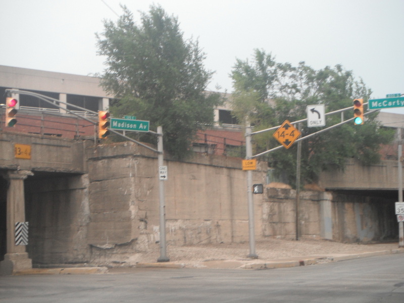
The photo below, from just south of the intersection with Dallas Street and looking northward, offers a good example:
I was standing on the side of the street that hosts southbound traffic, and the narrow lane next to me features minimal separation between pedestrian, vehicle, and train.  Small bollards separate the rail from the traffic, and a minor grade change distinguishes the sidewalk.  There’s nothing wrong with this per say, since it allows the ROWs for vehicles and rail to cross one another at conventional intersections with no inherent impingement upon their respective levels of service.  But check the other side of the street, where a few pedestrians are standing in the distance: it hosts the train platforms where the vehicular lane would otherwise be, then transitions directly into a generous sidewalk.  This condition means is that, although the METRORail clearly is bidirectional, Main Street is only one-way southbound.

But is it?  Here’s a view in the opposite direction, looking southward toward Main Street’s intersection with Polk Street, the next block down.
The pedestrians enjoy a spacious walking environment on the opposite side of the street, complete with generous landscaping.  But on the far right of the photograph, south of the intersection with Polk, notice a vehicle (partially obscured by a traffic light) stopped at the intersection, resting on the ROW of Main Street—northbound.  Though my photo does not indicate it, the northbound cars can travel on the block of Main Street from between Polk and Dallas, but north of Dallas, it becomes one-way southbound.

After crossing to the opposite side of Main Street and continuing northward, I discovered that the dedicated ROW for vehicles reveals further eccentricities in the layout.
Midway between Lamar Street and McKinney Street, the ROW for the light rail dominates the overall streetscape, and the tracks themselves merge with a reflecting pool, which in warmer weather (when the pool is full) looks like this.  Here’s a more direct view of the Main Street streetscape looking southward, at a point just south of its intersection with McKinney.
As the photograph proves, Main Street here is a complete pedestrian zone on both sides of the street.  But, on the north side of McKinney, vehicular access resumes.
The grade change between sidewalk and street, coupled with the bollards separating the cartway from the rail, indicates another narrow lane for vehicular access.  But this time, Main Street is only open to northbound traffic, while the METRORail platforms occupy the former southbound ROW.  A block further, north of Main Street’s intersection with Walker Street, the division of roadway uses changes yet again—back to a street with rights-of-way in both directions.  North of Texas Avenue, in the Main Street/Market Square Historic District (and once again on the southbound side of the street), the streetscape looks like this:

While Main Street continues to offer bi-directional vehicular travel all the way to its northern terminus at the downtown campus of the University of Houston (and beyond), it still pulls a few sneaky tricks on the unsuspecting driver.  Looking laterally at the Main Street bridge over the Buffalo Bayou, the configuration is fairly straightforward:
I’m standing in the pedestrian right of way, then comes the southbound rail, then northbound rail, then southbound vehicle, then northbound vehicle, then the opposing sidewalk.  But a southward view of this same street segment (on the bridge) reveals that the pattern shifts.
Notice the dark vehicle stopped in the foreground (near the left of the photo).  It is headed southward, and both sets of tracks are to its right.  But, on the other side of the intersection, the same southbound lane continues on the other side of each of the tracks (where an SUV is turning, partially blocked by a man in a blue shirt).  So, as Main Street passes through the heart of downtown, its order is as such: northbound vehicle, northbound train, southbound vehicle, southbound train.  And if the vehicle on the north side of this intersection (with Commerce Street) were to continue straight ahead, it would directly confront traffic.  It has to veer sharply right, then veer left again almost immediately in order to continue on southbound Main Street.

If that sounds confusing based on my description, you can imagine what it would be like to a driver unfamiliar with the city.  In fact, records show that, despite a year-long education campaign prior to the METRORail’s opening, the line’s crash record measured at over 20 times the national average per track mile, helping the system to earn the nickname of “Wham Bam Tram” among mass transits most ardent opponents.  It would be unfair for me to delve any further into the politics that had long delayed the development of this train, and I have to measure my words even on the critique of the infrastructure, since my knowledge does not extend much beyond the research I have included in this essay.  But the majority of people navigating through Houston’s downtown, by foot, wheel, or rail, will form judgments empirically.  Bearing in mind how few people possess enough transportation engineering wherewithal, the executive decision on how to thread this bidirectional rail line across Main Street seems baffling.  If my photos didn’t get the job done, perhaps this Google Map can better demonstrate the confusion.
The street of focus runs from a southwestern to northeasterly direction, in keeping with the general orientation of downtown Houston’s grid.  If it’s still unclear, my altered version of the map reveals northbound (or northeastern-bound) traffic flow in a purple line, with southbound (or southwestern-bound) traffic in red.
Thus, between Dallas Street and Walker Street, three blocks of Main Street offer a mix of vehicular traffic patterns: one-way north, one-way south, or none (pedestrian and train only), all on a street which through the remainder of its downtown trajectory is two-way.

This ROW strategy effectively diffuses the primacy of this north-south artery in the city’s downtown.  How long would it take even for locals to grow accustomed to these quirks?  While most of the research on METRORail collisions over the years reveals that they have been due to error of private vehicle drivers (not the train operators), it is impossible to know whether the profound problem the system has had is due to a motorist culture unacquainted with maneuvering around trains (as many have understandably asserted) or if the system itself is inherently confusing.  While Houston is hardly the first city in America to remove vehicular rights-of-way in order to provide at-grade light rail, its choice of which lanes to remove seems particularly capricious.  The problem only appears more salient when one views Main Street in the full context of its downtown surroundings:
It’s not particularly easy to tell, but within the general downtown area (framed on three sides by limited access highways and by Buffalo Bayou to the north), the city has virtually no other two-way streets.  Parallel to Main, only Bagby Street on the far west and, to the east, Avenida de las Americas and a segment of Jackson Street share this distinction.  Perpendicular to Main, only part of Commerce Street along Buffalo Bayou is two-way.  None of these streets completely transects downtown.  No streets in the central portion of Houston’s approximately 200-block downtown—aside from Main Street—in are two-way.  Thus, the city’s engineers have ostensibly gelded the only two-way axis, all during a mere three-block segment.

Perhaps the road’s width varied from block to block, and this method proved the only way to introduce light rail and the requisite downtown embarkation platforms without sacrificing critical pedestrian space.  Perhaps the goal (particularly on the vehicle-free Lamar-to-McKinney block) was to foster the pedestrian mall culture prominent throughout European cities, and that the presence of light rail would adequately substitute for the absence of cars.  Perhaps it was purely due to the lobbying of the property owners of the skyscrapers that front these segments of Main Street.  I’m hardly one to denigrate any city for finding ways to calm traffic in what should be the pedestrian-rich downtown.  And frankly, if a city is intending to integrate an urban rail transit system at street level, superfluous car lanes are usually the first that should go. Regardless of the intents, after nearly ten years in operation, the foot traffic along Main Street on a typical weekday afternoon in the early spring scarcely portends an up-and-coming commercial, retail, or entertainment corridor.  It has moments of discernible energy, but large expanses of vacant real estate linger.

Regardless of the propensity for collisions, few outside of the diehard partisans are condemning METRORail’s ability to meet long-term transit goals.  Overall usage has generally met or exceeded expectations: the line achieved its 75 millionth boarding in December of 2010, four years ahead of scheduleAnd, after the completion of a 5.3-mile extension of the existing line, coupled with the introduction of two new lines, the Metropolitan Transit Authority of Harris County will have an identifiable, multi-axis system.  At that point in time (estimated 2015), the system will start adopting colors for the routes (red, purple, green) and distinct names to the new stations, as recommended by the public Superficial as they seem, these naming strategies are helpful in asserting the rail network’s identity as a uniform brand, which in turn can only escalate its aggregate visibility.  And visibility may remain the single strongest argument favoring a fixed-rail system over something more malleable like buses: the permanent presence of rails and catenaries offers a bold signal announcing TRANSIT for even the most unacquainted. (This explains why visitors to a large city will always gravitate toward both above and underground train systems before they will seek out a bus route.)  Clean, lucid visuals may in turn help to bolster passenger use even further on the METRORail (future Red Line), helping to downplay the symbolic clutter fostered by those shifting rights-of-way.

Thursday, July 19, 2012

Gateway to navigational confusion.

In recent years, the various public and private agencies in Indianapolis have collaborated on the commissioning of public art projects in what would appear to many to be unlikely places: off the side of some the region’s busiest interstate highways.  The most prominent location for these installations is along the I-70 corridor connecting the Indianapolis International Airport to downtown, with the goal of providing a colorful, idiosyncratic greeting to people arriving by plane to the city and traveling to the most likely destination: the city center.  But why build a sculpture in an area in which people will most likely be zipping by, and newcomers will probably be more concerned about finding their way than a cluster of many have called (somewhat pejoratively) giant gumdrops?  In some cases, the installations no doubt attempt to divert attention from economically distressed neighborhoods that the interstates transect, just as the many murals disguise the otherwise blank walls induced from a demolition in previous years of the adjacent building--a blog topic of mine from the past.  City leadership amplified the public art initiative in the months preceding Super Bowl XLVI, in which the nation’s eyes would hone in on the host city.  Ostensibly the mentality behind the public art was to engage in as multifaceted of a campaign as possible.

I can hardly criticize the welcome mat that the city rolled during the Super Bowl: not only was I not living in the US at the time, but virtually every international media source I scanned (and I surveyed many) formed a conclusion of the city’s hosting ability that was overwhelmingly positive.  But I have noticed that, after approaching the city center by car from a number of directions, one of the most prominent gateways—the city’s welcome mat to wheeled vehicles—is also among the least satisfactory.  When approaching downtown after getting off the I-70 interchange at Meridian Street, this is what a motorist will encounter at the first stop light intersection with McCarty Street:


I have little complaints with the sign; it’s utilitarian, inoffensive, and widely reproduced at various entrances throughout the city, both at egress points from the downtown interstate system and when entering the city from a municipal boundary.  But isn’t an essential aspect of downtowns—of urbanism in general—missing?


I confess, I’m caviling about a sidewalk, yet again.  During a block-long stretch of Madison Avenue, it is missing completely, on both sides of the street.  It picks up again at the next intersection (the stoplight in the distance of the above photo), where it intersects with a small stub of Merrill Street.  By any metric, it’s a strange oversight I’m hoping the City corrects in the near future, since, once a car travels north of McCarty Street, it has left the exit ramp and is fully integrated in the urban environment.  (The City and various nonprofits have thoroughly mapped sidewalk deficiencies in central Indianapolis  in the recent past.)  But this stretch of the street still functions as a through-way for vehicles only; not only is it impractical for pedestrians to walk here safely, it is virtually impossible.


Landscaping and street trees hug the curb, leaving little room for pedestrians even to walk through the grass.  Granted, this 1.5-block stretch of Madison Avenue offers little attraction for pedestrians: virtually all buildings have backs turned away from to the road, giving little incentive for a person to access by foot.  Meanwhile, the parallel streets to Madison to either the east (Pennsylvania Street) or west (Meridian Street) offer perfectly acceptable sidewalks and better access to any buildings.  So why does this stretch of the Madison Avenue entrance to downtown Indy exist under these conditions?

The streetscape across approximately a one-quarter square mile stretch on the immediate south side of downtown Indianapolis has changed dramatically over the past twenty years.  While the high-profile construction of Lucas Oil Stadium involved some changes in the right-of-way—including the elimination of two blocks of Merrill Street, indicated by the blue line—the source of the most significant alterations is the Fortune 500 to the stadium’s southeast: Eli Lilly and Company’s corporate headquarters.  The pharmaceutical giant has played such a pivotal role in the growth and prosperity of Indianapolis that it is understandable that it should leverage changes to the road network as the needs for its campus grows.  (Lilly also helped to fund a considerable amount of the city’s public art along the I-70 corridor coming from the airport.) The markings I made on the Google Map below shows the current street configuration:


The first major transformation during my lifetime involved the removal of a segment of McCarty Street in the late 1980s.  The street used to extend from Delaware Street to East Street, linking the Babe Denny/Pogue’s Run neighborhoods with Holy Rosary and Fletcher Place, but Lilly purchased that three-block right-of-way and developed it, indicated by the red line I’ve drawn on.

The modifications most relevant to the above photos (the gateway without a sidewalk) took place in the late 1990s, commensurate with Lilly’s development of the Faris Campus.  This complex stretches across multiple city blocks, engulfing several streets in the process.  Among the largest segments to undergo the axe were two more segments of the aforementioned Merrill Street, which, these days, is literally mere fragments of what it was 25 years ago.  Back then, Merrill ran perfectly parallel to McCarty Street and stretched about the same length, from Kentucky Avenue to Virginia Avenue, so well over a mile long.  However, while McCarty earns its prominence by being the first general-access roadway parallel to the I-70 interstate—the presumptive east-west gateway to the broader downtown area—Merrill Street was never more than a modestly trafficked local road with just a couple stop lights.  Very few addresses fronted Merrill Street; it was little more than an ancillary entrance.  Even a portion of Merrill between Delaware and New Jersey streets is now a private road, owned and fenced in by Lilly.  Although the elimination of a segment of McCarty Street in the mid-1980s precipitated a significant change in traffic patterns for the area, the complete fragmentation of Merrill into a few stubs and two-block fragments barely raised an eyebrow.  Lately, the City has commenced a fully pedestrianized segment on the block of Merrill between Pennslvania and Delaware streets, under the train viaduct:


Beyond the near-complete elimination of this reasonably lengthy street, Lilly’s Faris Campus instigated other modifications to the southside of downtown that have irrevocably changed the transportation network.  The welcome sign in the first photo from this blog posting comprises the culminating point of this reconstructive surgery.  In the past, Meridian Street’s diversion north of McCarty was much more straightforward.  Traveling northward from the intersection, a fork in the road gave motorists and pedestrians two options: a northwesterly bound Russell Avenue provided quick access to the north-bound arterial Illinois Street, while Meridian Street diverged to a northeast bound two-way collector stub (also named Meridian Street) that again became prominent when it merged with Madison Avenue at the approximate intersection with South Street.  The block long green line in the Google Map shows the previous configuration to Meridian Street.

I did not live in Indianapolis at the time of the Faris Campus construction, so I don’t know if it aroused controversy, but the changes have proven significant.  Meridian Street between McCarty and South streets no longer provides direct access…to itself.    At the McCarty Street divergence, where Meridian starts moving northeastward, it devolves to a quiet, little-used segment.

After just three blocks on this segment of Meridian, motorists/pedestrians must turn onto the local road called Henry Street, where Meridian terminates.  The termination is below, but notice that it's still easy to see the Soldiers and Sailors Monument in the distance.

This T in the road at Meridian and Henry is apparently obscure and sparsely traveled enough to merit nothing more than a stop sign.  By comparison to the “Welcome to Indianapolis” sign gateway, it’s also quite pedestrian friendly.  But it's a strange treatment for a street that, just a few blocks further south, promised a direct connection to the absolute center of the city; it is the city's meridian, after all.  And here it ends at dinky two-lane Henry Street.  Then, after just one hundred or so feet on Henry Street, the motorist/pedestrian must turn left (at a stop light) on that same gateway section of Madison Avenue in order to continue downtown.

Here’s another view of that intersection, looking toward downtown, where Madison Avenue meets with the unremarkable Henry Street, which, I reiterate, has become a quiet temporary terminating point for what is otherwise the city’s most prominent north-south road.


At this point, after traveling a block further northward toward South Street, Madison Avenue changes names as it once again becomes the arterial, north-bound portion of Meridian that continues toward the Soldiers and Sailors Monument.  Here’s looking south from the Meridian-Madison-South intersection:

Just beyond that conical sculpture, the interrupted path of Meridian Street is visible in the distance. Meridian Street therefore now falls under a permanent detour.

Meanwhile, the naming scheme of Madison Avenue embodies what the US military would politely label a “Charlie Foxtrot” (for those not aware of this term, look it up).  Technically, the Madison Avenue arterial that stretches all the way toward the southern suburbs of Indianapolis comes to an end when the street forks into northbound Delaware Street and Southbound Pennsylvania Street.  However, a small five block stub of Madison Avenue between I-70 and South Street has existed for as long as I can remember, even though it is completely non-contiguous with the 12-mile remainder of Madison Avenue.  I have shaded this Madison Avenue extension with a pinkish transparency in the map.

How does this stub fit in to the big picture?  Without digging into old Public Works records or archival maps from the 1960s and 70s (okay, I confess, I dug a little bit), my interpretation is it is a leftover fragment that was made discontiguous when the City converted Pennsylvania and Delaware Streets to complementary one-way arterials that forked outward from Madison Avenue.  The turquoise diagonal dashed line just north of McCarty indicates the original path of Madison Avenue.  But the pinkish highlighted area—the sidewalkless gateway from the interstate exit ramp--has essentially evolved into an orphan street segment, and while it is obvious from a map how it might have met with the primary arterial of the Madison Avenue that sprawls southward, it is not necessarily so easy to understand for those unfamiliar with the city—namely, the visitors the city is trying to attract with public art, signage, and a walkable downtown area.  Essentially, two contiguous intersections have the same street name, visible from the photos below.  The first shows the intersection labeled with a big purple 1 on the map, on McCarty Street looking westward:


The second intersection, labeled with a purple 2 on the map, is on that stretch of Madison right as it has stopped being called Pennsylvania, looking southeastward:


So essentially, two parallel streets at two adjacent intersections on McCarty both have the name “Madison Avenue”.  It proves even more of a problem for motorists leaving the interstate from the I-65/I-70 arterials and entering through the southside of downtown, the region I have highlighted with a green transparency. Look at how the signage first tells drivers they are disembarking at Meridian Street:


And then, as the exit 79B meets the southside gateway to downtown, McCarty Street, look at the various options:


And the conventional street signs tell motorists that they are on this street—
--even though the interstate exit told them they were disembarking onto Meridian Street.

Continuing northward on this Madison Avenue orphan stub, it remains a prime arterial for reaching the city’s absolute center at Monument Circle, but a visitor would have no way of knowing this until the intersection with South Street into the Wholesale District (marked on the map by a purple number 3), when…
…Madison Avenue Orphan Stub changes name again back to Meridian Street.

The radical improvements of navigational technology over the last decade have palliated this problem significantly; most people these days can just check their GPS to figure out how the roads here function.  But GPS will save them in spite of the signage, not because of it.  Other cities which I know well (New Orleans comes to mind) have equally confusing entrances from the exit ramps, in which navigation falters from a morass of modified streets, name changes, stubs that go nowhere, and unexpected interruptions to the conventional grid.  The near-southside of Indianapolis is probably no worse than a number of cities, but the initiative for a solution at this point seems elusive.  The confusion induced from this street-grid palimpsest does not affect the locals, who know the area like the back of their hand.  Visitors eventually figure it out, and probably without much of a headache if they have GPS.

But a stretch of Madison Avenue Orphan Stub/Meridian Street Access/whatever-you-want-to-call-it remains without sidewalks, and the only affirming, conclusive sign when exiting the interstate is that “Welcome to Indianapolis”.  Is this tangle of street segments severe enough to warrant another round of surgery from the DPW?  Absolutely not.  But Lilly may grow again in a better economy, another major employer may expand, or the moderately deflated real estate of the area may encourage the construction of a similar mega-attraction like Lucas Oil.  The existing confusion isn’t going to heal into scar tissue any time soon.

A much cheaper solution than further alteration of the right-of-ways could involve two primary steps: 1) eliminate the orphan street status; 2) place pedestrian and motorist navigability on equal footing.  Merrill Street and McCarty Street are reasonably straightforward—they terminate and reintegrate at fixed latitudes.  Madison Street is a mess, but a simple renaming of the stub could easily forge a separate identity that makes it less confusing on the signs as well as a birds-eye view from maps.    Perhaps this stub could be renamed after a major civic leader from the past?  While it would necessitate the cost for replacing road signs on both the interstate and the conventional streets, the shortness of Madison Avenue Orphan Stub means the cost shouldn’t be as great as renaming the orphaned stub of Meridian Street (of course), and it will allow for a more clear-cut terminus to Madison Avenue where it forks into Delaware and Pennsylvania Street.  The cost incurred to businesses will also be minimal, since very few businesses front this stretch of Madison Avenue—it is essentially an extension of the exit ramp that eventually provides access to Meridian Street at South Street.  The most plausible means of assuaging businesses frustrated by a name change would be to remind them how the renaming will relieve much of the confusion when trying to explain the street network to visitors—no more double Madison Avenues. 

Signage improvements would fall under the category of streetscape enhancements, which effectively transitions the discussion to the second corrective measure: equalizing navigability for pedestrians and motorists.  Both could benefit from signage that helps clarify this network, and the pedestrians will earn the accommodation they need with installation of 4-foot wide sidewalks on the margins.  While this may require the sacrifice of streetscape improvements (trees, shrubs) currently at the curbs, it will involve little to no sacrifice to any privately owned parcels, since no buildings front the Madison Avenue Stub, nor will parking lots shrink as a result.  If this Madison Avenue Orphan Stub receives a renaming after a famous Indianapolis figurehead, the streetscape improvements could include plaques or memorials addressing the dedicatee.  Eventually, I would hope the City might improve the clarity of the Henry/Madison/Meridian intersection, so that the north-south artery regains the importance it deserves instead of tapering off into virtually nothing.  But that would probably involve some heavy surgery toward existing traffic patterns.

Obviously this remedy is not terribly high on the City of Indianapolis’ to-do list; it probably isn’t even up there at all.  I’m even willing to concede that I just identified a solution in search of a problem, mostly out of my frustration of seeing a block-long gateway to the city without any sidewalks.  But we could also analogize the south side’s thirty-year incremental changes to a frog slowly getting boiled without realizing the temperature is rising.  Clearly the signage and pedestrian infrastructure here is imperfect.  How much worse does it have to get before it results in an civic contretemps?  More than anything, it could integrate into a balletic political maneuver—a means of bringing a solution to the forefront the next time the city does want to dedicate a road to a great former leader.  “Hey—there’s that confusing stretch of Madison Avenue right when you get off the interstate.  Lots of people travel it but it doesn’t make sense because the rest of Madison Avenue continues a half block away.  What about renaming it and improving it with some real sidewalks?”  Legitimate problem is solved—so long as the City finds a more reputable dedicatee than Mr. Charlie Foxtrot.

Sunday, June 20, 2010

There goes the neighborhood, Part II: When a Name is More Powerful Than a Fence.

An unusually intense period at work reduced my blogging activity to a few uninspired posts these past few weeks, but at long last I can return to the second part of my study on the application of labels such as “neighborhoods” and “subdivisions” to sub-districts within a larger metropolitan area. In the first part, I focused on the moneyed Garden District in Baton Rouge, which, in a city which is dominated by automobile-driven development patterns, emerges as one of the city’s most successful walkable, urban neighborhoods.

I use the term “neighborhood” loosely, primarily because, as I elaborated in Part I, the difference between a “neighborhood” and a “subdivision” often parallels the implied understanding of the distinctions between urban and suburban. Neighborhoods are old, urban, and walkable; subdivisions are newer, suburban, and auto-driven. These gross generalizations unfairly sequester the old and the new into two disparate categories, and the former enjoys a far loftier position in the cultural pecking order than the latter. Virtually everyone living in a reasonably dense residential community would like to claim part of a neighborhood, and civic associations rarely if ever organize themselves as the Highland Park Subdivision Association, for example. They use the word “neighborhood” instead. A realtor is far more likely to promote a home as “being part of a community with a genuine neighborhood feel”, and Mister Rogers immortalized his miniature Pittsburgh with the opening song “It’s a Beautiful Day in the Neighborhood”. These examples may seem facile, but they demonstrate a prevailing aversion to “subdivisions” as anything beyond a clinical term; it is the developer-speak that refers to the initial reorganization of land title through the accrued sale of individually subdivided plats, derived from an initially significantly larger parcel. But a good subdivision almost always strives to shed its tedious image, away from a series of financial agreements into something apparently much more organic—conceived from the aims and values of the people living there, rather than the paper-pushing of a businessperson with eyes on the dollar signs. In short, subdivisions always try to mature into neighborhoods.

This is precisely what has happened with the Garden District in Baton Rouge. As I noted before, an address in this neighborhood ranks among the most prestigious in the metro. But the Garden District didn’t begin with such a distinct identity. In fact, it consists of several smaller districts, which today are on the National Register, but began as subdivisions platted out by a private realty company. The area shaded in red is Roseland Terrace, platted in 1911; the region in blue is Drehr Place, a subdivision platted in 1921, while the green rectangle to the south of the other two historic districts is Kleinert Terrace, founded just a few years after Drehr Place. Though the three developments are contiguous, they matured autonomously under these separate names for decades. The Garden District Civic Association relates its origins on the website. Essentially a rezoning hearing in 1976 for a house on the northern edge of Drehr Avenue drew an unexpectedly large number of residents in the vicinity. After learning about their shared interest in its future and well-being, several members decided to form a neighborhood organization. They agreed to bestow upon it the name “Garden District” because of the positive connotations it arose, recalling the prestigious New Orleans neighborhood 80 miles downriver. Within a few weeks, some of these neighborhood activists (many of whom live in the area to this day) had drafted by-laws and elected a president. Thus, the Garden District as a neighborhood name and its respective neighborhood association were born simultaneously. To this day, the Civic Association collects dues, publishes newsletters, runs the adopt-a-tree program for live oaks in common spaces, and maintains the signs and bollards it installed to demarcate the neighborhood’s entrance.
The original developers had conceived these three early subdivisions—Roseland Terrace, Drehr Place, and Kleinert Terrace—at slightly different time periods. But as they aged comfortably, their residents witnessed new development pushing considerably further to the north and east, and over time the architectural and socioeconomic similarities within the three early subdivisions became more widely visible. The eventual inception of a Civic Association was inevitable. It provided a forum for the transmission of the ideas and collective concerns that could reinforce the identity of a neighborhood. And through these regular meetings, the Association was able to bring to the table some of the technical specifications that the new Garden District was lacking—which, incidentally, happened to include the sort of “place-making” features that were increasingly prevalent in the subdivisions popping up in the outer suburbs. Essentially, the Garden District Civic Association—like so many others—has re-appropriated some of the initial roles of a developer. It clearly establishes cohesiveness to the neighborhood by simplifying the lines of communication. It also has implemented particular street and landscape improvements, which, in this day and age, would take place during the site planning stage, as a subdivision is getting off the ground.

By many standards, the neighborhood’s cohesiveness is patently visible (and no doubt was in 1976 as well). First, the array of housing types, while diverse, comes from a relatively uniform time period. The shared age of the housing mitigates the variety of styles and sizes. Secondly, the landscaping follows a certain basic pattern, emphasizing the tremendous tree canopy afforded by live oak trees, both in private property, and—in the wider streets—spaces throughout the broad, grassy medians. If the front yards cannot fit such an expansive tree, they will often host smaller indigenous species, such as the crepe myrtle. Thirdly, the three subdivisions share borders, proven by the three colored transparencies on the oft-referenced map.

Fourth, and perhaps the most important for the arguments featured in this half of the blog post, the three smaller subdivisions that make up the Garden District all share the same gridded street network. This shared network affords them a high level of interpenetrability among all the streets that make up the three, as well as—and this is critical—the surrounding neighborhoods. The strange brown shape shows the means of accessing the Roseland Terrace and Drehr Place involves nothing more than crossing an intersection. Even more critical is the purple demarcation on the map below: That thick purple line essentially separates the affluent sections of this part of Baton Rouge from the poor ones. I hate to make such broad distinctions on something as simple as a street map, but empirical evidence generally supports this. The Garden District occupies the northwestern most portion of a mostly upper-middle class part of town, but directly to the north and west of the neighborhood’s boundaries are considerably poorer districts. Particularly noticeable is the neighborhood west of 18th Street, where the housing more frequently looks like this: Simple, unadorned single shotgun houses with virtually no front yard and little foliage. Unlike in the Garden District, where cables are either buried or hidden behind back alleys, here they are out front along the streets and sidewalks. And the old commercial buildings along Government Street (the northern boundary to the Garden District) are generally vacant in the area to the west of the affluent neighborhood. Here is the vista at around 16th and Government: As Government Street continues toward the wealthier Garden District, the retail landscape is hardly top-tier for the metro, but it is considerably stronger than the virtual abandonment visible in the picture above.

In short, the Garden District—a general term for three old-money subdivisions in inner-city Baton Rouge—sits cheek-by-jowl with one of the poorer old neighborhoods, with not even a major arterial street or the stereotypical railroad track to separate them. For example, at the corner of 18th and Cherokee, on the edge of Roseland Terrace, one sees a typically immaculate house characteristic of the Garden District. And just a two blocks to the west, on 16th Street, the view below is not uncommon: In all likelihood, the neighborhood to the west of 18th street was not impoverished at the time Roseland Terrace was platted on the site of a former fairground racetrack. It was probably a working class or lower-middle class community. But by the time the Civic Association organized itself and bestowed the name Garden District to these three subdivisions, the fortunes on the two sides of 18th Street had diverged significantly. Forty years later, Old South Baton Rouge remains a largely low-income African American community, while the Garden District is mostly white and virtually devoid of poverty. In an era in which discriminatory redlining, fraudulent blockbusting, and publicly sanctioned segregation (once common in the South) are all illegal, how can two neighborhoods show such significant disparities, with the desirability of the Garden District remaining superlative despite sitting so close to such poverty? The Garden District Civic Association undoubtedly provides many of the answers. Aside from organizing a garden club to protect the live oaks, social committees to plan Christmas caroling and ice cream gatherings, or public relations to organize home tours, the Civic Association also has hired a separate security unit on top of the existing Baton Rouge Police Department. (Incidentally, the original Garden District of New Orleans, which sits almost as close to an even more impoverished neighborhood, also hires a plainly visible separate security force.) The association also allows homeowners who will be out of town for a lengthy amount of time to report their unoccupied home for extra monitoring during their absence.

Such actions are hardly unique among urban neighborhood associations, particularly those that are wealthy but remain close to considerably poorer areas. I by no means am attempting to portray the Garden District Civic Association nor the neighborhood’s residents as exclusive or prejudiced. They are reacting in a similar fashion as many other wealthy districts that rest squarely in high-crime cities, and the residents have clearly opted to buy into unity of activities as well as a shared sense of added security by remaining in the neighborhood instead of abandoning it to newer subdivisions out in the suburbs, where they would undoubtedly be far removed from inner-city privations and violence.

What is interesting about this is that, perhaps more powerfully than just signage and tree plantings, the Civic Association is helping to foster the unity an urban neighborhood needs, quite possibly as a compensatory gesture for the fact that its street configuration cannot exclude strangers in any other way. Compare the street grid from the color-coded maps above to the one below, several miles away on Highland Road, one of the wealthiest suburban districts within Baton Rouge city limits: Most of the housing around here post-dates the 1960s. Street designers for these subdivisions/neighborhoods have all but abandoned the old grid for a hierarchical design, in which most of the streets terminate in cul-de-sacs. Each individual development usually has only one or two means of ingress, as opposed to the Garden District, which has closer to twenty. The development pattern becomes even more pronounced a few miles further out on Highland Road. Here, in the last outskirts of the city and East Baton Rouge Parish, the housing typically post-dates the 1980s and is almost uniformly wealthy. The subdivisions are smaller and even less interconnected. Some of them are gated at the front.

Any elementary student of urban studies has caught on to this long ago; the average layperson can also recognize a change in street configuration from the old inner-city neighborhood and the modern subdivision. What is most striking is how urban neighborhoods have essentially had to co-opt certain features from suburban subdivisions—as well as duplicate basic city services—in order to preserve their desirability. The Garden District in Baton Rouge cannot build gates around every one of its entrances to keep the higher criminal activity at bay that residents might associate with the neighborhood to the west. Instead, the Civic Association must find ways to cultivate unity and inclusivity from within. It uses carrots like the neighborhood picnics, organized garage sales, decorative signage and lighting, and recommended arborists, electricians, or carpenters. It depends upon sticks as well, such as the additional security, stipulations for people who rent out part or all of their property, and a clear line of communication for reporting of city code violations, such as parking in the grass or sweeping debris into the street. Neighborhoods such as the Garden District will depend on a certain capacity to exclude on paper to compensate for the inability to exclude via physical barriers. One may consider this elitist or racist, but neighborhood associations are so prevalent in this day and age that they hardly single out certain segments of society—persons of all strata may find their neighborhood has one, rich or poor, white or black, urban or suburban.

The superficial stereotypes I listed in Part I of this blog post clearly placed neighborhoods into one categorical box and subdivisions into another. I did this ironically, because the old, venerable Garden District neighborhood originated from the subdivision of real estate that followed a similar pattern to the exurban subdivisions of today. Subdivisions and neighborhoods are little more than expressions of individual preferences; the line distinguishing them is impossibly blurry. The biggest difference, of course, is that the old urban subdivisions (which we are more likely to refer to as “neighborhoods”) typically depended upon rectilinear grids with an almost unlimited number of points of entry. Conversely, most contemporary neighborhoods (often referred to as “subdivisions” until they mature and develop something we like to call “character”) employ curvilinear cul-de-sacs that allow for a much clearer monitoring of who comes and goes—which nearly always happens by vehicle instead of by foot. One could argue, as many urbanists do, that the grid is more desirable because it offers a greater freedom of mobility. But the non-gridded subdivision emerged as a reaction to the characteristics that people found least appealing about the historic grid: namely, the ability to restrict who enters, whether it involves speeding cars that cut through or potential ne’er-do-wells from a neighboring community. The Garden District in Baton Rouge has undoubtedly attracted a certain type of resident that consciously eschews the suburban cul-de-sac, but such individuals often find themselves devoting more time and money to retain a certain level of security and privacy that almost everyone hopes to attain. The Civic Association has found a generally benign way of achieving this, keeping a gridded neighborhood safe and attractive as the majority of the population continues to surge toward cul-de-sacs ten miles down the road.