Showing posts with label civic art. Show all posts

Wednesday, April 30, 2014

Urban recycling: not a bad (unironic) beer in the box.

-->A recycling station housed in an old factory building might not seem like a novel concept, particularly in a city with a plethora of underutilized or vacant industrial space.  Like Detroit.


And even the appearance of it—a pastiche of industrial chic, street artistry, found objects, and, yes, even a pretty extensive panoply of bins of reusable materials, all monitored by reliably bearded and tattooed staffers—is probably closer to the mental image of what community recycling could, or should, look like.  “Taking out the trash” isn’t just utilitarian and mundane; it’s fashionable, eye-catching and even sorta fun.


Despite my evocation of hipster clichés, Recycle Here! feels like a novelty, at least in part because it’s among the few ways that residents of the Detroit can divert their discarded objects from landfills.  Long notorious as the largest city in the country without a municipal recycling system (both elective and compulsory), Detroit has also striven to find creative ways to curtail the illegal dumping that took place on its copious vacant lots—much of it recyclable material. A group of Wayne State University students founded Recycle Here! in 2005 as a response to the obvious dearth of options serving Midtown, then as today an emerging neighborhood with visible signs of homespun reinvestment.


As smart as the initiative was, it couldn’t easily both fund itself and support a demand that clearly stretched well beyond Midtown.  By 2007, the Greater Detroit Resource Recovery Program (GDRPP) began funding Recycle Here! as the City’s de facto recycling center, all while expanding its outreach by offering additional drop-off days, a broader array of recyclable materials, and satellite locations elsewhere in the city.  In addition, the partnership has allowed curbside recycling pilot programs in three neighborhoods: Rosedale Park, East English Village and Palmer Woods/University District—with intention to grow throughout the city in the long-term.  The Michigan Municipal League website points out some of the other accomplishments: a growth of over 50% each year since opening; a non-profit spin-off called Green Living Science that has educated Detroit Public Schools on recycling initiatives; a for-profit arm called GreenSafe that sells recycled products to major consumption events, like Detroit Lions games. 


Even if it’s essentially an arm of city government, the Recycle Here! facility never for a moment feels like one.  The loudspeakers churn out tunes from a diverse array of genres, no doubt reflective of the eclectic taste of whoever is in charge at that moment.  On the busiest days of operation (typically Saturdays), a local vendor offers cheap French press coffee, and various food trucks tote their comestibles in the outside parking lot.  Another staffer sells screen printed t-shirts, virtually all of them featuring the ingenious and ubiquitous Recycle Here! bumblebee logo, designed by local artist Carl Oxley III:


And the bumblebee receives its share of competition from the other sculptures and murals that form a consistent backdrop to the more utilitarian goings-on up front:


If it isn’t already obvious, Recycle Here! has achieved what it ostensibly needed to do in order to ensure survivability: it evolved into a smartly-branded community gathering place.  And it’s a good thing it works so well: the process of recycling here is far from hassle-free.


Yes, the bins separate Styrofoam peanuts from other types of Styrofoam.  Visitors also have to hold all their plastics up to the light to see if the etching indicates a #1 or #2 (one bin) or #3 through #7 (a separate series of bins).  And cardboard gets separated from office paper, which in turn has a separate bin from newspaper, as well as glossy paper.


And less common materials need separating too.


Clear glass could contain a lot of items: salad dressings, pasta sauce, artichoke hearts, pickled pigs’ lips.  But colored glass usually captures a discrete family of consumable products.


Booze.  These days, varietals of wine do not delineate social strata that easily; even a few highbrow wines might reach the dinner table in a cardboard box.  But it’s very easily to distinguish consumers by the type of beer they drink.  And the beer bottles at Recycle Here! overwhelmingly fit a certain category: the non-corporate.


Whether it’s a microbrew from the Upper Peninsula or a Singaporean IPA, the beers being recycled here are the opposite of what about 85% of America drinks.  No watered-down Coors, Michelob, Budweiser.  The only beers found in the bins that would pass as mainstream working-class Americana are Pabst Blue Ribbon or this Miller High Life, like the one strangely perched, unopened, on the rim of the Clear Glass bin.


In other words, hipster beers.


Probably I’m going out on a limb by making inferences about cultures by the type of beers they consume, but not really, or at least not enough.  I don’t think we witness a dearth of Budweiser bottles because Detroiters simply don’t drink cheap beer.  I think the beers we see in these bins broadly reflects the ethos of people who go out of their way to recycle, and in Detroit, “going out of the way is” precisely what most people have to do.  In short, the act of recycling not only requires the active involvement of driving to the facility (at least for everyone outside those three affluent pilot neighborhoods), it also requires extensive separation once you get there.  If you have two boxes to deposit, it could take you over an hour to get it all done.   The staff at Recycle Here! makes the compelling argument that their approach not only ensures more material gets successfully recycled than if it all gets lumped together, but it also encourages the population to become more invested in the process.  While this may be true, it almost undoubtedly also scares off a huge contingent who simply doesn’t want to be bothered.


Thus, Recycle Here! succeeds because there are enough Detroiters, favorably disposed toward urban living, educated enough to have some disposable income, and predominantly left-of-center, all of whom at least value the idea of sustainability in its various incarnations: locally sourced food, fair trade or free-range growing practices, and non-corporate brews with higher alcohol content (and higher prices).  It fits like a hand in glove, and the fact that quality French press coffee gets served on Saturdays makes as much sense as the absence of a vendor selling McDonald’s, no matter how much Mickey Dee’s coffee has improved in recent years.  Through Recycle Here! and the pilot programs in those selective, higher-income, stable neighborhoods, the Greater Detroit Resource Recovery Program has found the right niche to plant a seed.  It offers a confident start to set the trajectory for a city-wide recycling system.
Now if only they could figure out where all those bottles of Bud Lite are going.


Wednesday, April 23, 2014

Who initiated the scrawled controversy? We know (k)nothing.


In a city as replete with illicitly painted buildings as Detroit, it isn’t hard to find graffiti in which the subject matter both polarizes and fully illustrates the ongoing debate between two parties.  In some parts of the country, these polemics rarely stray outside of the stalls of men’s restrooms.  They’re low-key and almost private.  But in Detroit, the debates can take place in the great wide open, on the walls of buildings, lampposts, trashcans, or even the side of a water tower, as I noted a few months ago when I witnessed how one artist transformed the raised fist of solidarity into the heavy metal “sign of the horn”, thereby deflating its potentially incendiary political implications.

But you don’t always have to look at the horizon line for inspiration.
The Addison Building on Woodward Avenue, originally designed by “the architect of Detroit” Albert Kahn around 1905 and restored as market-rate apartments, offers an interesting point-counterpoint at the storefront level.
Scrawled in what appears to be a thick Sharpie is some artless text in all caps:

It says—or at least appears to say—“VOTE NOPE”, which doesn’t convey any precise political directive.  But it’s actually a loosely modified variant of a more common graffiti trope found throughout the Motor City.  Here, on a building at that same intersection as the Addison, is the more common wording.
It clearly says “Vote NCP”.  And the tag shows up all over the place.  Again, the meaning isn’t necessarily clear, unless you know what the acronym NCP stands for.  And most people, it seems, do not.  It was a mystery when I arrived in Detroit last summer; it took some real detective work to draw any conclusions.  The most thoughtful discussion came from a DetroitYES! forum, where a number of participants offered their ideas.  One of the most likely contenders is the New Century Party, a PAC run on the west side, but its hard to reconcile this recent and short-lived organization with the general observation that these scribblings have been around for awhile.  And why wouldn’t a registered political organization choose a more legitimate (and legal) way to promote its cause?

Thus, the word on the information superhighway is that NCP stands for “No Colored People”—about as overtly racist of a statement as one can expect to see, except, of course, that it isn’t particularly overt at all.  Anything less ambiguous would probably attract local media attention, but this branding has never amounted to much of anything, despite the fact that it’s everywhere in downtown and Midtown: buildings, awnings, trashcans, billboards.  The general penmanship is always the same, so a graphologist might be able to determine if it all belongs to the same person: a solitary, cowardly, anonymous provocateur.  I can vouch from experience that, until recently, the tag on the Addison building said “Vote NCP” like all the others. A closer look at the lettering shows how someone else has modified what used to be the letter C into an O, filled the void with a sad face, then added an E to the bottom.
So it appears another vandal has attempted to douse the fire by undermining the implicit racial hostility of the original message.  “VOTE NOPE” conveys apathy at the very least—far more preferable than racism.

But that’s not all: another clown made a separate contribution to this aesthetically challenged palimpsest.  In faint green ink, just above the “N” from “NOPE” is another letter.
It’s a “K”, spelling “KNOPE”, or “VOTE KNOPE” in totality—an obvious hat-tip to Leslie Knope from NBC’s Parks and Recreation, a show whose devoted, cult-like fan base (and this cult’s ability to extract memes from the show’s script and characters) has helped it overcome lackluster Nielsen ratings.  It doesn’t seem that our crusading anti-racist gigglefritzes made it too far though; virtually all of the other “VOTE NCP” tags downtown have retained the vitriol of the original message.

Whether 30 feet tall on a water tower or 18 inches near a storefront window, graffiti’s intrinsic deviant and anti-establishment nature effectively smashes through any constraints imposed by artistic license.  It involves unsanctioned self-expression that doesn’t violate the First Amendment because of the disregard to private property embedded in the expressive act.  Beyond the commission of a property crime, the only true boundaries to graffiti artists are an individual’s creative limitations and the laws of physics.  Because a vandal cannot litigate if someone else defaces his or her art, anything is fair game.  Thus, in terms of intellectual property, the hastily scribbled rants on a public restroom stall are semantically no more or less powerful than a lovingly-conceived fist of solidarity, or a cryptically racist chant that achieves visibility through its ubiquity.  Virtually any provocative message on men’s room walls will eventually elicit an equally inflammatory anonymous response directly below it.  The “VOTE KNOPE” and “sign of the horn” involve the same ethos as the tit-for-tat near the gas station toilet, only the respondents have more time on their hands, a lot more ink, or much less fear of getting caught.  But then, can’t we say the same about even the most widely admired graffiti?

Monday, October 21, 2013

Movable, misunderstood apparitions.


In certain subcultures, it’s become a meme.  But it took me a little while to catch on. Only after driving past this curiosity for three consecutive days did I realize what it was.  It’s not exactly showy, but that’s the point.  Look slightly to the left of the center of this photo, and it should be clear what I’m referring to. 

Since it really doesn’t jump out, a different angle and better weather might help.


Yes, it’s a fairly standard ten-speed, only painted all in white.  It’s a ghost bike—a spartan memorial to someone who was killed or severely injured while bicycling. According to the Ghost Bikes nonprofit site, St. Louis christened the first ghost bikes back in 2003, but it has spread to hundreds of locations all across the world, nearly always as a tribute to someone struck by a car.  Usually the accident took place at or near the location where the memorial stands, and frequently the dedicators deploy an already damaged bike, to intensify the mangled effect of the collision.  Sometimes the installers remove the tubes from of the tires in order to deter theft.  In this Detroit example, the bike leans against a traffic sign on Grand River Avenue and Temple Street, right in front of the Motor City Casino.


As is the case with many ghost bikes, other passers-by have inserted flowers and scribbled messages onto the enamel.


And, not surprisingly, I’m not the first to capture this discovery.  One of the more prominent local urban advocacy websites seems to have taken notice just a day or two after the installation.  Hub of Detroit created the memorial to honor Hal Williams, who died last month following a hit-and-run collision, purportedly along the same segment of Grand River Avenue as the site of this memorial.  Incidentally, a Detroit City Councilman’s son was hit on his bike at this exact intersection in 2010.  Though the councilman’s son did not sustain life-threatening injuries (not doubt abetted by the solicitude of the driver, who stopped that time around), the fact that multiple accidents have taken place along this stretch of Grand River prompts one to question the overall safety level for bicycles at this part of town, or this intersection in particular.


Even a Google Maps view suggests that this intersection is a doozie.


It’s essentially three-way, except that the bi-directional John C Lodge Service Drive straddles both sides of a below-grade State Highway 10 (M-10), which operates as a limited-access freeway throughout the Detroit city limits.  And Temple Street is particularly confusing: contrary to the appearance on the map, the motorists traveling eastbound from the west side of M-10 can fully cross, but those on the west side of Temple heading eastward (toward the Motor City Casino) cannot completely traverse this intersection.  A good portion of the traffic uses this intersection as ingress or egress from M-10 (Lodge Freeway), and an additional service ramp loops across (parallel to Temple Street) cutting through the intersection in an opposite flow that one would expect (the left side of the road) in order to continue access on the south side of the portion of Temple separated by a median.  If this description seems baffling, one can imagine how it would appear to any bicyclist or motorist unfamiliar with the intersection.  The photo below at least provides a hint of the sort of “Charlie Foxtrot” situation that this intersection inflicts upon its users.


Ghost bikes could serve as a sobering reminder to passers-by of the risks that bicyclists assume when maneuvering in urban environments with fast-moving automobile traffic.  They could prove particularly effective in reminding motorists to proceed with caution in already complicated, high-traffic intersections like Temple and Grand River.  But unfortunately my inner grammarian impels me to use epistemic modal verbs in the previous two sentences, because I don’t yet think ghost bikes are achieving their goal.  They could someday.  But if a website exists to track them, they clearly aren’t that widespread.


Sure, we don’t have nearly as many bicyclist fatalities as we do of motorists; after all, not very many people ride bicycles in the US.  But one far bigger hindrance to the visibility and viability of ghost bikes is that they rarely survive long.  Floyd Reeser of Bike Saviours, a nonprofit community bicycle education center in Tempe, observed that ghost bikes rarely last more than a week, while officials in the Arizona city were finalizing a measure limiting the placement of roadside memorials in the public right of way to 90 days following a fatal accident.  Tempe officials agreed in June to work on a relocation of two ghost bikes, divorcing them from the accident sites but preserving their commemorative integrity.  Meanwhile, the New York City Sanitation Department announced that the “eyesores” had to come down after receiving numerous complaints about the ghost bikes, though the department is giving families of loved ones a 30-day grace period—25 days more than typical abandoned and derelict bikes receive. For those who think this callousness is stereotypically American, the City Council recently ordered a family to remove a ghost bike in Hackney, UK.  And a ghost bike just north of Dupont Circle in Washington DC managed to survive a year as a tribute to a young woman hit by a garbage truck in 2008.  This particular episode amplifies the poignancy of ghost bikes for me.  I remember this accident, since I biked across the exact same intersection and through the often-terrifying Circle every day on my way to work in Georgetown that year. 


These interventions are among the more courteous.  Most cities remove the ghost bikes with little to no notice.  The only reason this might attract greater attention is because the public sector usually accords another grassroots memorial much greater respect.  We’ve all seen wooden crosses or miniature gravestones along the road to commemorate a life lost in an automobile accident.  Ghost bikes are little more than a semantic subset, specifically indentifying individuals killed while bicycling.  But to remove a wooden cross—or even to complain about it—borders on blasphemy, while petitioners routinely campaign for the successful removal of ghost bikes.  What’s the difference?


I attribute it to several factors.  Obviously bicycles are much larger, and they can legitimately impede a right-of-way in a manner that few roadside graves ever will.  Ghost bikes are far more likely to inhabit urban settings, where the higher population density engenders a higher propensity toward complaints.  But neither of these excuses is entirely fair to ghost bikes, since other memorial graves can be large and ostentatious; meanwhile, ghost bikes could just as easily commemorate an accident in a rural setting.


My suspicion is that the multitude of implied uses to bicycles serves as a liability to the proliferation of ghost bikes.  Obviously the most common function of a bike is as a means of transportation.  So when one remains planted at one site for weeks or months at a time, the public often draws the conclusion that it is abandoned, regardless of an alabaster coating.  Meanwhile, grave markers serve a discrete semiotic purpose: to memorialize—nothing else that I’m aware of.  We see a wooden cross or a flower-embellished placard along the road and we know exactly what it means.  No one has the gall to refer to them as “eyesores” because they fundamentally cannot become abandoned, no matter how aged and deteriorated they might be.


The connotations to a long-parked bicycle are never quite so clear, and ghost bikes suffer as a result.  Since they’re a relatively new phenomenon, maybe time will grant them the same respect that wooden roadside graves enjoy. But the need for widespread public education on ghost bikes references something far more critical: a superior public understanding of how vehicles and bicycles can safely co-exist on roads both urban and rural.

Monday, September 30, 2013

Water tower repartee.

Even if it’s not a commissioned piece like the mural from my previous post, the landscape of artistic expression in Detroit is rich.  Since such a huge portion of it comes in the form of graffiti—which is almost always by definition an act of vandalism—it’s understandable that my opening sentence might carry a whiff of irony.  But any city that loses nearly 70% of its population will inevitably contain within its jurisdiction a large amount of unmaintained space.  In Detroit, such space includes both raw, formerly developed land as well as vacant structures.  Abandoned buildings may comprise the most conspicuous acts of graffito, but sometimes one can find it in unexpected places, like this water tower.
Pondering it a little more deeply, it’s no surprise that the tank became a canvas.  It presides over a difficult-to-access, largely depopulated neighborhood near the intersection of Dequnidre Road and the Davidson Freeway.  Typically, the area probably doesn’t receive a great deal of monitoring, so it would be easy to sneak around and make it up the ladder to the tank.  In addition, the tank stands only a few hundred feet away from a very prominent location, the I-75 corridor, so thousands of motorists pass by it daily.  For a typical vandal, this tower is a dream come true: a clandestine site for execution that will offer a big payoff in terms of visibility.  But what about the artwork itself?

It looks like a monochrome hand in a popular gesture, in which the thumb holds down the ring and middle finger, while the pinky and index finger remain elevated—the sign of the horn.  While it carries many other connotations, from warding off bad luck to cuckoldry, the most common and enduring connotation in the United States is a sort of good-natured expression of solidarity within heavy metal and headbanging subcultures—certainly the more likely implication in a northern industrial city like Detroit, when compared with its other well-known signifier, the “hook ‘em horns” rally at University of Texas at Austin.

A closer look, however, suggests that the painting wasn’t always so whimsical.
Someone painted over the upper half of the middle and ring finger, using an almost identical color to the tank of the water tower, thereby more or less blotting them out.  What this means is the original gesture was a raised fist.  And though it, too, carries a variety of implications, nearly all of them include a degree of political protest—a gesture of collective revolt against an oppressive authority.  By “whiting out” the original graffito, the second vandal muted and, by large extent, trivialized the original message.  If the original full fist embodied the iconic “black power” salute, it is possible that the actions of the second vandal is demonstrating a counter-protest toward black power, which, by nature of reducing it to a adrenaline-fueled rally for “rock ‘n roll!”, some might construe as belittling racism.  Simultaneously, others perceive the defiance implied by the black power raised fist to perpetuate racial differences that are inherently prejudicial and divisive in nature.

I’m not going to fan the flames any further, because I can’t begin to know what the original intent was, nor that of the palimpsest the followed.  While it could demonstrate the broader implications of racial tension in Detroit, it might simply reveal little more than two graffiti artists who had differing visions for a water tower.  Since neither artist had any vested right to paint this tower, it’s always fair game for another person to destroy the original aesthetic message, and it’s possible that someday a third will recover the original of solidarity in political protest—or turn it into something unrecognizable.  That at least two artists treated the tower as their canvas has less to say about the content than about the level of supervision over this part of town.  It’s not that common to find vandalized water towers, because in most places you simply couldn’t get away with it.  Detroit is clearly different in that regard.  And while Detroit’s distinction might not say much about the City’s prevailing ability to fight property crime, it certainly punctuates the landscape visually with a density of self-expression we’re not so likely to see in, say, Disneyland—or Manhattan, for that matter.

Wednesday, September 25, 2013

Testing the mutability of murals.


Urban murals, once a rarity outside of a few pioneering cities such as Philadelphia, have emerged in the last decade or so as a sine qua non for any big-city civic art initiative.  Philadelphia might still be the national (or even global) leader through its Mural Arts Program, but many other cities are trying to give Philly a run for its money.  In recognition of having won the bid for Super Bowl XLVI back in 2012, the City of Indianapolis commissioned a variety of local artists to festoon the sides of various buildings with 46 different murals, significantly boosting its corpus in the process.  Inevitably, these murals vary greatly both in prominence and quality, but some of them have generated significant positive buzz in the last two years.  One of the highest profile (and best-loved) of Indy’s murals is a giant recreation of Kurt Vonnegut, looking about as avuncular one could ever hope from the city’s most lovable curmudgeon.

In fear of seeming like too much of a killjoy, let me defend the mural not just for its great attention to detail, the formidable skill of its creator, and its unquantifiable boost to the city’s self-image by reminding the world that it was the boyhood home of one of the 20th century’s most respected satirists and social critics.  Hopefully Kilgore Trout would approve of my cynicism, though, when I follow this paean with a serious disclaimer.  Doggone it, this mural has Kurt beaming onto a parking lot along Massachusetts Avenue, a fashionable yuppie nightlife corridor that will inevitably turn into a mixed-use development eventually, shrouding the gargantuan Vonnegut into a back alley.  The salience the mural enjoys now from emptiness of the parking lot will eventually lead to its downfall—or, at least, its almost complete concealment when a building sprouts up.  (Then again, Kurt, ever the rake, may just as easily have approved of such a self-defeating gesture.)

But this Vonnegut dilemma hints on a recurring problem with many murals: the conceivers deliberately place them on blank walls that probably wouldn’t exist if it weren’t for the adjacent building the faced demolition years prior.  Such is the case for many of the murals in Philadelphia, as well as this earlier mural (predating the Super Bowl) that I blogged about a few years ago.  Too many murals serve as unintentional placeholders, beautifying a featureless flat surface until something else comes along that is far more likely to stimulate economic activity in the area—and, yes, that “something else” nearly always translates to a new infill development.

Michigan’s largest city can claim its own artistic ammunition, boasting a variety of sculptures and murals, both amateur and professional.  I’m not sure if Detroit’s murals emerged under a centralizing organization in the same way as the murals of Philadelphia or Indianapolis—after all, the city appeared at one time to have a Detroit Mural Factory that trained students in the practice, but I cannot find a centralized webpage with up-to-date information for this Mural Factory.  At any rate, the existing array of murals certainly offers a powerful contrast within a city that, by most empirical assessments, suffers a higher-than-average problem with graffiti, when compared to other American cities.  And though graffiti is far less common place across the American landscape than it is in most other countries, Detroit seems to have more than its fair share, no doubt due to the higher concentration of vacant, neglected or underutilized buildings.

So it is with no small amount of comfort that I recognize a highly effective mural that sits on Woodward Avenue, one of the city’s prime arterials, just south of Warren Street, in the heart of the Wayne State University campus.
Whatever one might think of the mural’s broader aesthetic ambitions, it certainly adds color and texture to an otherwise monochrome flat surface.  It’s big—possibly bigger, all in all, than the lanky Vonnegut in Indianapolis.  But it shares the same predicament: it rests on a blank wall to a building whose kissing cousin came down years ago.  In its place is this big grassy lot.
And the lot is expansive—huge.  Here’s looking at it from the other direction (northward) along Woodward:
And pivoting a little bit to the left, in a northwesterly direction:
Not surprisingly, a city that has suffered as much extensive depopulation and disinvestment as Detroit has more than its share of vacant lots, the verdant reminders of mighty Art Deco buildings that once lined this corridor.  In many quarters of the city, the urban prairies will likely sit there for years to come.

But not here in Midtown, and certainly not on Wayne State’s campus.  Leadership at WSU has pushed significantly to shift its prevailing identity over the years.  Since its founding as a medical school and training college, the university has burgeoned and evolved into Michigan’s third-largest.  But it has rarely (if ever) claimed a significant presence of live-in students.  Long a commuter school, the reputation—particularly in Detroit’s darkest days of crime and disinvestment—was that students at WSU drove to the university from the suburbs, took their classes, and got out by dusk.  Throughout the 1990s, the campus did not even offer dorm living.  Though the transition is undoubtedly a bit more nuanced than I’m portraying here, the University’s leadership and economic development arm realized that the chasm between the school and the surrounding Midtown neighborhood was only growing.  And it certainly wasn’t helping the desirability of being a student at Wayne State.  As a result, the school has engaged in a flurry of both dormitory construction and partnerships with developers to encourage a greater student life around the campus that lingers after hours.  Consequently, Midtown has as bustling pedestrian scene that was scarcely visible 20 years ago.  More eyes on the street translates to greater perception of safety, and the presence of a youth culture with some disposable income has spurred a concomitant college-town retail scene.

This broad scythe at a history of Wayne State’s involvement in Midtown inevitably cuts some corners (pun intended), but in the long and short of it is, it’s only a matter of time before this grassy corner at the intersection of Woodward and Warren will host a new building, if not several.  And it’s equally certain that, in due time, a developer seeking to maximize the FAR (floor-area ratio) on the parcel will want to build in very close proximity to the existing building with the mural.  The developer may even choose to touch the adjacent structure.  Which means that this elegant adornment could fall into oblivion, frustrating not just the artist but also the community support that helped to conceive it.

Fortunately, the minds behind the mural have an ace in their sleeve.
Notice the tiniest shadow at the lower left corner of the mural?  That’s right—it’s not directly painted onto the wall.
It appears to be a sort of canvas that has been stretched to tautness through tying its corners to hooks implanted in the mortar between bricks.  I suppose, if we’re purists, this means that this piece of artwork no longer fits the traditional definition of a mural.  But it will likely fake anyone who isn’t scrutinizing.  And, more importantly, it means that the canvas can come down when a building goes up next door, then get installed somewhere else.

From an artistic standpoint, my suspicion is that this display has lost a bit of credibility.  After all, it didn’t require an artist’s careful assessment of the space, nor the dedication of applying paint to a rough surface from a vertiginous position.  Though clearly “drawn” as an original, it’s quite possible this canvas’s existence depended upon a digital magnification.  So maybe it’s cheating.  But the fact remains that neither WSU, future developers, nor whatever arts program finally implemented the “mural”—none will have to witness the demise of this work of art in a few years.  The same can’t be said about Kurt Vonnegut in Indy, nor the hundreds of murals emblazoned on blank sides of buildings in Philly.  Migrating this canvas to another big wall should seem like a minor effort in comparison, and in a city that has witnessed so much renegade art in the wake of its abandonment, the citizens will finally get to see a painting salvaged, as welcomed new construction fills the void.

Monday, January 28, 2013

Reviving with the wave of a wizard’s wand.


Earlier this past fall, I featured the accomplishments of the City of Kokomo, Indiana in reinventing itself over the past few years, after two decades of rust-belt, deindustrialized stagnancy.  Civic leadership successfully elicited a certain degree of buy-in among its constituent, all toward sundry capital improvements, the likes of which most similarly sized cities still only retain on their wish lists.  The results are conspicuous.  Kokomo has made formidable strides in infrastructural improvements, mass transit, downtown revitalization, park expansion, public art, and an ambitious International Baccalaureate exchange program at the public schools—all while maintaining a balanced city budget.  According to some of the city’s cheerleaders for these expenditures, the overall ethos driving the city is far more upbeat than it has been in years, despite the fact that, as recently as 2008, Forbes listed the city as one of America’s fastest dying towns.  Perhaps that article served as a wake-up call, because I’d be hard-pressed to imagine that recent visitors to Kokomo’s downtown would ever see the city as dying—certainly in comparison to dozens of other similarly sized cities across New York, Pennsylvania, New Jersey, Ohio, Michigan, and Indiana that show little to no evidence of revitalization at work.

The combined impact of these upgrades is inspiring.  But none of them (with the possible exception of the International Baccalaureate exchange) is particularly groundbreaking.  Virtually every city these days has attempted revitalization through a certain combination of sculptures/murals, streetscape improvements, heritage pedestrian/bike trails, new parks, et cetera et cetera.  These initiatives seem to come from a City Planning 101 playbook.  It’s as though cities have completely taken the bait from the many national assessment tools created by various urban advocacy nonprofits in order to gauge quality of life.  At the same time, the advisory committees that operate these organizations (and thus create their highly subjective definitions of “quality of life”) consist overwhelmingly of city planners and their lobbyist allies, cajoling municipalities to eat out of their hands in a manner that smacks of self-aggrandizement.  To put it more simply, cities like Kokomo strive for (and ultimately invest in) bike lanes, mixed-use trails, or omnipresent bike racks, all in order to achieve and flaunt that bronze rating from the League of Bicyclists, which in turn wins free publicity for itself in the process.  I cynically alluded to this practice in Baton Rouge a few years ago. 

I’m not trying to undermine or belittle these practices, nor do I mean to pick on the League of American Bicyclists’ worthy mission.  And the initiative that Kokomo has shown these past few years is commendable—and the city has usually implemented these upgrades far more smartly than one might see in a larger city like Indianapolis.  But the standards for what constitutes a “livable” city seem to grow more uniform and homogenized with each passing year that these standard-bearers of good urbanism grow in influence.  The remedy for economic malaise increasingly seems to be the same everywhere, like a doctor who prescribes cod liver oil for both arthritis and malaria.  So it is with no small fanfare that I declare how happy I am that a local entrepreneur in Kokomo has marched alongside the corps of revitalizers, but to his own beat.


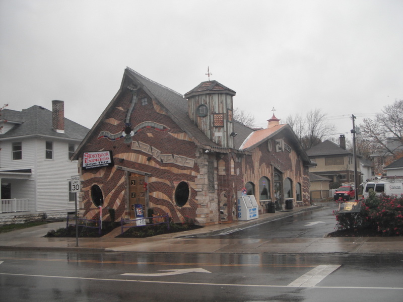
This whimsical structure, known as Storybook Express, opened in 2012 at a long-vacant site at Sycamore Street and Apperson Way, just a few blocks from the Howard County Courthouse.  Although it’s a convenience store, the unconventional, fairytale appearance has prompted locals to christen it the “Harry Potter house”.  Even from a distance, the building’s densely ornamented façade and off-kilter massing and brickwork help distinguish it.
But a closer look reveals the devil-may-care insertion of neglected or discarded antiques into the masonry:
Notice the metal pig’s derriere rammed into the wood just above the transom window.

More often than not, eye-catching façades such as these are a total bust when viewed from less prominent angles.  The designer puts all the mojo in the front view.  But Storybook Express includes just as much eccentric detail on the backside as well:
An old church inscription, a car’s suspension coil, antiquated plumbing, and other unidentifiable bric-a-brac enhance the façade’s visual interest.  Even the relatively conventional brick wall, used to elevate and protect the convenience store’s HVAC equipment, deliberately employs an excessive amount of mortar to enhance the multi-dimensionality.  Look how it oozes from between the bricks.
The western wall is equally whimsical and boasts the added benefit of a drive-thru window, a relatively uncommon feature in convenience stores.
But I have to confess that my favorite detail is the parking lot, mainly because it would be so easy to settle for drab convention.  But the brains behind Storybook Express allowed the whimsy to permeate the entire design.  The retaining wall adheres to the same pastiche as the masonry:
And it takes real chutzpah to employ an unconventional striping for a parking lot, a practice that in many cities would require special approval:

Storybook Express would easily qualify as a great roadside curiosity even if it sat in isolation.  But it is the culminating achievement of Fortune Management, a local real estate development firm with holdings throughout the city, including a few other developments in a similar vernacular.  I found one of these other curiosities on my own, at Markland Avenue and Calumet Street.
This structure, dating from 1999, hosts a nail salon.
Like Storybook Express, it applies the fanciful masonry mixed with assorted folderol on all four sides.
Digging back a bit further in time, Fortune Management adapted some brownfield sites into office space.  The property at Markland and Washington previously hosted a transmission repair shop that had clearly seen better days:
In 1995, Fortune Management transformed it into this:
And the company pioneered this aesthetic with a Shell Station at Sycamore and Washington, way back in 1987.  Before the redevelopment, it looked like this:
And afterwards:
These earlier efforts may appear less ostentatious than the convenience store downtown, but they ascribe to the same spirit in their design.

A recent interview with Fortune Management’s president, Scott Pitcher, helped shed some light on his rationale.  The firm has purchased and renovated over 50 properties in the Kokomo area since its 1982 founding.  Pitcher’s goal, even for the less fanciful redevelopments, has been to employ high-quality materials from the same time period as the original structure.  More often than not, Fortune Management has rescued materials from other buildings under demolition in Kokomo other various Indiana.  Not surprisingly, the Storybook Express convenience store featured in the first photos series was new construction on a lot that the company had held in its portfolio for years.  Although not a renovation, it nonetheless consists primarily of repurposed material, while the customized roof exclusively employed Kokomo craftspeople.
The ostensible “Harry Potter” references are a throwback to a legitimate Storybook architectural style in vogue during the 1920s in Hollywood.  Despite the recession, the time finally seemed right a few years ago for Pitcher to begin developing Storybook Express in order to capitalize on the other revitalization efforts that had taken place in downtown Kokomo.  He partnered with a local entrepreneur who was interested in opening a convenience store at the site, and though it was inevitable that it would require parking, the structure still engages Sycamore Street with a very small setback, allowing the structure to accommodate vehicles and pedestrians in nearly equal measure, as the somewhat blurry photo below still demonstrates:

What motivated Pitcher and his team to try this style?  These sundry developments seem inspired by both a love of vintage Hollywood movie sets as well as the plundering of small-town antique shops, though they have also achieved statewide recognition for persistent use of local material, winning an Indiana Green Business Award in 2010.  At the same time, I see little evidence in Pitcher’s work that he was striving for broader recognition in the architectural or artistic community.  He wasn’t trying to impress the New York art scene; he built this way because he felt like it.  I shy away from the dubious label of “folk art” because it carries with it a whiff of condescension—that folk artists are uncouth autodidacts who remain ignorant of the preferred aesthetic standards and mores of the time.  Pitcher knows exactly what he’s trying to achieve, but Storybook Express and its cousins have flourished despite being untethered to any broader cultural barometer.  For me, the DIY framework by which these buildings came into being can’t help but recall the work of Philadelphia artist Isaiah Zagar, who for decades has charmed his neighborhood through colorful mosaics and found-object installations superimposed onto various buildings.  The vast majority of Zagar’s corpus remains concentrated along South Street and the adjacent blocks, such as the examples below:

Obviously Scott Pitcher and Isaiah Zagar aren’t entirely kindred spirits: Zagar self-identifies as an artist and Pitcher is first and foremost a developer.  And while Zagar’s most widely recognized artistic output polka-dots the various workaday streets of South Philly, his work also sits in the permanent collections of art institutions both inside and outside of metro Philadelphia.  Nonetheless, Zagar has admitted his affinity with folk and visionary artists from across the globe, and he doesn’t hesitate to identify as a “vernacular artist” because the majority of his corpus thrives from decades of embedding himself in the community he loves, rather than responding exclusively to the dictates of specific commissions.  Pitcher, meanwhile, has indicated that any new Storybook project will likely take place far from downtown Kokomo, since he feels a similar edifice will only dilute the impact of Storybook Express (which, not surprisingly, has proven a resounding success as a convenience store).  He hopes to forge his next venture in another smaller Indiana downtown, or perhaps even something in Indianapolis.

What Zagar and Pitcher clearly share is an aesthetic vision divorced from an overt context.  Zagar could have filled his murals with references to Jim Croce or Marian Anderson or Mario Lanza, if he wanted to draw from South Philly’s heritage of vocal musicians.  He could have partnered with a nonprofit to engage in a comprehensive beautification campaign through targeted mosaic design and specific locations.  But the visual evidence suggests neither of these.  Nor does Scott Pitcher seem to care if 1920s Hollywood (or Hogwarts) has anything to do with Kokomo, the City of Firsts.  And therein lies the appeal.  Most of Kokomo’s other revitalization initiatives are sincere attempts to jolt the city out of its multi-decade torpor by massaging the dormant creative economy.  Kokomo hopes to retain its population through compelling quality of life amenities.  But when every small city sees bike lanes and murals as the remedy, couldn’t these urban organisms eventually develop immunity to the treatment?  Sometimes individual ingenuity—the entrepreneurs who swim against the current—can offer more long-term regenerative potential than all the social policies a city council can conceive.  Kokomo’s future success will undoubtedly owes a great deal to committed and talented civic leadership, but its distinctiveness may rely heavily upon a playful little building near downtown called Storybook Express.