Sunday, July 29, 2012

Domestic spelunking.

Residential real estate lingo evolves with the changing of seasons and is no different from architecture, fashion, wellness, or anything else that owes much of its visibility to popular culture—and that “anything else” is just about everything, as boundaries between them all continue to fade.  I haven’t lived in the US for much of the last couple years, so maybe I’m behind the times, but this is the first time I’ve seen a homeowner this up-front about a feature of his house:
I’m usually not gender-specific, but I think it’s safer than ever to assume that some XY chromosomes can claim this home.  Seeing “man cave” promoted as such instead of what I’d expect (“home entertainment center”), gives the sign a sort wink-nudge character, from one guy to another.  The fact that the sign is printed and not homemade suggests that it comes from a stock supply, meaning “man cave” has officially crossed into mainstream territory.  As for the home itself?
A tidy little 1,000 square footer from probably around 1960, from the south side of Indianapolis.  My biggest question, of course, would be how much of the man cave can legitimately come “with the house” as the sign claims; after all, when stripped down to the cabinetry, carpets and wall outlets, how many can the place be?  To which Jason Segel (or the like) would probably retort, “Once a man cave, always a man cave.” 

Tuesday, July 24, 2012

Enticing visitors downtown…and then incarcerating them.

As much as street-level engagement for large projects in city centers should, by this point, seem like a foregone conclusion, it continues to amaze how many big ticket items—in cities of widely varying size—either engage in terpsichorean negotiations around it or neglect it completely.  When developers confront a zoning ordinance or design guideline that insists on activating the sidewalks with retail, commercial, residential, or offices, they might challenge the requirement through a number of arguments: the development itself is too small, the street is not prominent enough, the economy for retail is particularly soft.  If the public-sector approving agency for the development fears that the proposal will collapse without kowtowing to the developer’s demands, chances are likely it will pass, therefore lacking that street-level engagement otherwise mandated by code.

But what about when it is a big-ticket item, partly or even completely funded by public dollars?  A case in point is the Greater Columbus Convention Center in the capital city of Ohio:
Constructed by Peter Eisenmann in 1993 and expanded six years later, the façade details arouse widely varying reactions, judging from opinions on consumer rating sites.  Many think it’s faded and ugly; others respect its idiosyncrasy.  While the Easter egg color palette obviously evokes the time period of construction, I don’t usually like to criticize particularly time-sensitive architectural gestures, since it is inevitable that the appeal of a stylistically distinct building will wax and wane on the general cultural radar.  If this convention center seems outmoded now, it’s only a matter of time before the taste cultures shift and it falls squarely into retro 1990s chic.

The problem here is the programming of the building within these walls.  Why so much blankness?  Why so few windows?  Couldn’t the urban design have allowed passers-by to engage with it by providing something to do, let alone something to see?  The criticism here would be more of a stretch if the convention center sat in a forlorn and otherwise overlooked corner of downtown Columbus.  But it doesn’t.  The photo above depicts frontage on North High Street, the most vibrant commercial corridor in the entire metro.  The convention center links the fashionable Short North, an array of mostly locally owned establishments along High Street that connect The Ohio State University campus to downtown; this stretch of the artery represents the southern end of the Short North, right before it continues southward into the central business district of the city.  In other words, it should be bustling, but this side of the street really isn’t.  And the other?


The photo above (taken by Jung Won Kim) reveal that not only does this convention center façade extend in much the same fashion for several blocks, but the other side of the street, featuring an array of historic commercial buildings alternating with smartly integrated infill, is among the deadest on the entire stretch of North High Street.  I hope to replace this Google Streetview with some actual footage over the next couple weeks that will better demonstrate this distinction.  While most of High Street to the north of the convention center ranks among the most desirable commercial and retail real estate in the region, this section has struggled to secure very many stable tenants over the years.  It’s not completely desolate, but certainly not surging: a visit last December revealed that it was actually a bit blighted, which would be unheard of just three blocks north.  The forthcoming completion of a new Hilton in the parcel immediately south of this cluster of commercial buildings (and therefore west-southwest of the Convention Center) may help stimulate some pedestrian traffic.  Here's a view of the nearly finished Hilton looking northward, with the aforementioned block of commercial buildings in the distance.  Directly across from this is the Convention Center.

And here's a view of the Hilton looking southward.  Directly to the right of the photo is the underinvested block in question. Both photos are again courtesy of Jung Won Kim.

Thanks to the presence of both the Convention Center and the hotel, short-term visitors from out of town will dominate this block of High Street.  Unfortunately, tourists staying in hotels are not historically huge supporters of the local establishments that boosters of Short North aim to recruit.  However, given this segment’s recurrent struggles, if these storefronts eventually attract Starbucks, Noodles and Company, Chipotle, or even something surprising like Payless Shoes, it would be a welcome, stable improvement over the limbo that these old buildings have suffered for far too long.

Meanwhile, the Short North portion of High Street, particularly north of Goodale Street just blocks away, bustles—at least by the standards of a Midwest city of Columbus’ size and density:
Plenty of shops, plenty of cars, and (particularly during the school year) lots of pedestrians.  The conditions here beggar the question: why design the Convention Center in such a cold, alienating fashion?  By almost every estimate, it was a shrewd location: when stepping out these doors, a convention-goer is blocks from the Statehouse and the heart of downtown to the left, and visually linked to the best of Columbus’ university-driven nightlife to the right.  While I strongly suspect that some historic building stock (of similar appearance to the buildings across the street) met the wrecking ball in order to clear the room for the hulking Convention Center, the idea of a mega-attraction might at the time have seemed like a stimulus for an area that suffered huge disinvestment up until urban living evolved into an overt 1990s fashion statement.

But structures like Greater Columbus Convention Center pervade across the country: arenas, stadia, performance halls, or convention centers.  We continue to build most of them this way.  When they are “in session”—when an event is taking place within their doors—they attract a higher density of people at one time than all but the most successful museums, malls, or urban mixed-use districts (i.e. Short North).  But most of them are only active for a fraction of the week, and regardless of whether the interiors are buzzing or quiet, the exteriors of these hermetic, self-referential monoliths offer little to attract the outside world.  Their visual contribution to the surrounding urban environs involve little more than blank walls.

I would never question the economic development benefits of these attractions for their respective downtowns; aside from revenue generated in both property taxes and direct consumer spending, they bring throngs of people to one place for a limited time—something most downtowns for the past fifty years could never otherwise achieve.  But the design of these structures all too often seems to treat this as a virtue in and of itself—not a means to something even better through a symbiotic relation with the often much more pedestrian-scaled context.  With convention centers and arenas, the multiplier effect is a foregone conclusion.  But where’s the spinoff activity going on North High Street in Columbus?

The biggest offenders in this case are, incidentally, the ones closest to downtowns—the airplane hangars that displaced an assortment of smaller, aging, potentially obsolescent buildings that housed smaller-scale commerce quite easily, back when technological limitations mandated that four-story structures remain the status quo.  Long the Mother of them All, Chicago’s McCormick Place convention center is a minimal offender, since Lake Shore Drive separates it from most of the urban fabric—in this case, the near-southside neighborhood of Chinatown—obviating the destruction of many (or any) historic buildings.  At the same time, virtually no other city has perceived of Chicago’s convention center as a model of site selection, because its non-intrusive location along Lake Michigan, far from the Loop, also failed to link the throngs of visitors to the central business district.

Thus, we instead have witnessed an escalating tendency to push these hulks right into the heart of the city, with practically no other street-level storefronts, offices, or visual stimuli.  I pointed out the inclusion of a new arena in Evansville a few years ago that sacrificed a full block of century-old buildings.  While I’m certain there are others, the only exception to this that comes easily to mind is in Indianapolis’ Bankers Life Fieldhouse, which has one small storefront at its northwest corner, visible on Google Streetview.  (It hosted a Starbucks at the time of the Google photos; today it is a Dunkin Donuts.)  But arenas and stadia are not the most egregious urban design offenders: to some extent, their absence of retail storefronts is justifiable because of their erratic levels of activity.  Either they pull out all the stops to host an event, or they are completely empty.  Rarely do those key events take place during conventional business hours, the time when most retailers prefer to operate, so they are not a reliable generator of activity, even if they typically lure sell-out crowds.  It’s a bit surprising that even a Starbucks or Dunkin Donuts would prefer to locate in an arena, despite the fact that essentially in the heart of Indy’s downtown.

Regardless of the weaknesses of major sporting or performance venues, the convention center still wins the urban underachiever award.  The configuration of most centers can accommodate multiple events simultaneously, and these events normally take place during the heart of the business day.  But the designs of the buildings practically never attempt any engagement with the surrounding downtown.  In fact, they do the exact opposite: most of them contain interior eateries, some have their own souvenir shops, and (particularly in the cold climates) a network of skyways connects them to adjacent hotels and parking garages.  An out-of-town convention-goer could spend three days in the host city without ever stepping foot on a downtown street or sidewalk.  But the biggest embarrassment? Public monies fund most or all of these developments!  The convention and tourism bureaus often spearhead the construction or expansion initiatives, and yet by commissioning designs that sequester the buildings from their surroundings, they are squandering many of their own efforts to get people to spend their money downtown—all at taxpayers’ expense.  I can conjure mental images of several downtown convention centers—Indianapolis, New Orleans, Baton Rouge, Jackson, MS, Philadelphia—only the last one offers any exterior storefronts, and that contribution is only a twentieth (at best) of the overall frontage.  The others offer occasional windows to break up the blank walls—just like Columbus.

Nothing this article explores is novel within the world of urban design, but it warrants extra consideration because, even as many cities are catching on to strong street-level engagement with other publicly funded ventures, they continue to get convention centers wrong.  Civic leaders across the country learned a lesson from the relative isolation of Chicago’s McCormick Place, but it’s the wrong lesson.  Rather than taking a cue that its isolated position estranged it from the hotels and the attractions of downtown Chicago, other cities have imitated its hulking architecture while displacing the buildings that originally helped a central business district become a locus of all kinds of activity.  Columbus still boasts a fantastic asset in the Short North district that extends for well over a mile across North High Street, but it is just a few blocks less of an asset than it could have been, thanks to the pastel Styrofoam toy blocks that hug the east side of the street…otherwise known as the Greater Columbus Convention Center.


Thursday, July 19, 2012

Gateway to navigational confusion.

In recent years, the various public and private agencies in Indianapolis have collaborated on the commissioning of public art projects in what would appear to many to be unlikely places: off the side of some the region’s busiest interstate highways.  The most prominent location for these installations is along the I-70 corridor connecting the Indianapolis International Airport to downtown, with the goal of providing a colorful, idiosyncratic greeting to people arriving by plane to the city and traveling to the most likely destination: the city center.  But why build a sculpture in an area in which people will most likely be zipping by, and newcomers will probably be more concerned about finding their way than a cluster of many have called (somewhat pejoratively) giant gumdrops?  In some cases, the installations no doubt attempt to divert attention from economically distressed neighborhoods that the interstates transect, just as the many murals disguise the otherwise blank walls induced from a demolition in previous years of the adjacent building--a blog topic of mine from the past.  City leadership amplified the public art initiative in the months preceding Super Bowl XLVI, in which the nation’s eyes would hone in on the host city.  Ostensibly the mentality behind the public art was to engage in as multifaceted of a campaign as possible.

I can hardly criticize the welcome mat that the city rolled during the Super Bowl: not only was I not living in the US at the time, but virtually every international media source I scanned (and I surveyed many) formed a conclusion of the city’s hosting ability that was overwhelmingly positive.  But I have noticed that, after approaching the city center by car from a number of directions, one of the most prominent gateways—the city’s welcome mat to wheeled vehicles—is also among the least satisfactory.  When 
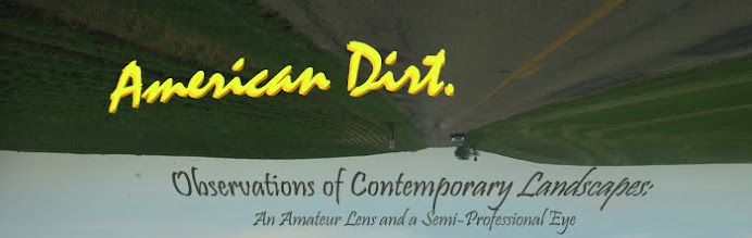
approaching downtown after getting off the I-70 interchange at Meridian Street, this is what a motorist will encounter at the first stop light intersection with McCarty Street:


I have little complaints with the sign; it’s utilitarian, inoffensive, and widely reproduced at various entrances throughout the city, both at egress points from the downtown interstate system and when entering the city from a municipal boundary.  But isn’t an essential aspect of downtowns—of urbanism in general—missing?


I confess, I’m caviling about a sidewalk, yet again.  During a block-long stretch of Madison Avenue, it is missing completely, on both sides of the street.  It picks up again at the next intersection (the stoplight in the distance of the above photo), where it intersects with a small stub of Merrill Street.  By any metric, it’s a strange oversight I’m hoping the City corrects in the near future, since, once a car travels north of McCarty Street, it has left the exit ramp and is fully integrated in the urban environment.  (The City and various nonprofits have thoroughly mapped sidewalk deficiencies in central Indianapolis  in the recent past.)  But this stretch of the street still functions as a through-way for vehicles only; not only is it impractical for pedestrians to walk here safely, it is virtually impossible.


Landscaping and street trees hug the curb, leaving little room for pedestrians even to walk through the grass.  Granted, this 1.5-block stretch of Madison Avenue offers little attraction for pedestrians: virtually all buildings have backs turned away from to the road, giving little incentive for a person to access by foot.  Meanwhile, the parallel streets to Madison to either the east (Pennsylvania Street) or west (Meridian Street) offer perfectly acceptable sidewalks and better access to any buildings.  So why does this stretch of the Madison Avenue entrance to downtown Indy exist under these conditions?

The streetscape across approximately a one-quarter square mile stretch on the immediate south side of downtown Indianapolis has changed dramatically over the past twenty years.  While the high-profile construction of Lucas Oil Stadium involved some changes in the right-of-way—including the elimination of two blocks of Merrill Street, indicated by the blue line—the source of the most significant alterations is the Fortune 500 to the stadium’s southeast: Eli Lilly and Company’s corporate headquarters.  The pharmaceutical giant has played such a pivotal role in the growth and prosperity of Indianapolis that it is understandable that it should leverage changes to the road network as the needs for its campus grows.  (Lilly also helped to fund a considerable amount of the city’s public art along the I-70 corridor coming from the airport.) The markings I made on the Google Map below shows the current street configuration:


The first major transformation during my lifetime involved the removal of a segment of McCarty Street in the late 1980s.  The street used to extend from Delaware Street to East Street, linking the Babe Denny/Pogue’s Run neighborhoods with Holy Rosary and Fletcher Place, but Lilly purchased that three-block right-of-way and developed it, indicated by the red line I’ve drawn on.

The modifications most relevant to the above photos (the gateway without a sidewalk) took place in the late 1990s, commensurate with Lilly’s development of the Faris Campus.  This complex stretches across multiple city blocks, engulfing several streets in the process.  Among the largest segments to undergo the axe were two more segments of the aforementioned Merrill Street, which, these days, is literally mere fragments of what it was 25 years ago.  Back then, Merrill ran perfectly parallel to McCarty Street and stretched about the same length, from Kentucky Avenue to Virginia Avenue, so well over a mile long.  However, while McCarty earns its prominence by being the first general-access roadway parallel to the I-70 interstate—the presumptive east-west gateway to the broader downtown area—Merrill Street was never more than a modestly trafficked local road with just a couple stop lights.  Very few addresses fronted Merrill Street; it was little more than an ancillary entrance.  Even a portion of Merrill between Delaware and New Jersey streets is now a private road, owned and fenced in by Lilly.  Although the elimination of a segment of McCarty Street in the mid-1980s precipitated a significant change in traffic patterns for the area, the complete fragmentation of Merrill into a few stubs and two-block fragments barely raised an eyebrow.  Lately, the City has commenced a fully pedestrianized segment on the block of Merrill between Pennslvania and Delaware streets, under the train viaduct:


Beyond the near-complete elimination of this reasonably lengthy street, Lilly’s Faris Campus instigated other modifications to the southside of downtown that have irrevocably changed the transportation network.  The welcome sign in the first photo from this blog posting comprises the culminating point of this reconstructive surgery.  In the past, Meridian Street’s diversion north of McCarty was much more straightforward.  Traveling northward from the intersection, a fork in the road gave motorists and pedestrians two options: a northwesterly bound Russell Avenue provided quick access to the north-bound arterial Illinois Street, while Meridian Street diverged to a northeast bound two-way collector stub (also named Meridian Street) that again became prominent when it merged with Madison Avenue at the approximate intersection with South Street.  The block long green line in the Google Map shows the previous configuration to Meridian Street.

I did not live in Indianapolis at the time of the Faris Campus construction, so I don’t know if it aroused controversy, but the changes have proven significant.  Meridian Street between McCarty and South streets no longer provides direct access…to itself.    At the McCarty Street divergence, where Meridian starts moving northeastward, it devolves to a quiet, little-used segment.

After just three blocks on this segment of Meridian, motorists/pedestrians must turn onto the local road called Henry Street, where Meridian terminates.  The termination is below, but notice that it's still easy to see the Soldiers and Sailors Monument in the distance.

This T in the road at Meridian and Henry is apparently obscure and sparsely traveled enough to merit nothing more than a stop sign.  By comparison to the “Welcome to Indianapolis” sign gateway, it’s also quite pedestrian friendly.  But it's a strange treatment for a street that, just a few blocks further south, promised a direct connection to the absolute center of the city; it is the city's meridian, after all.  And here it ends at dinky two-lane Henry Street.  Then, after just one hundred or so feet on Henry Street, the motorist/pedestrian must turn left (at a stop light) on that same gateway section of Madison Avenue in order to continue downtown.

Here’s another view of that intersection, looking toward downtown, where Madison Avenue meets with the unremarkable Henry Street, which, I reiterate, has become a quiet temporary terminating point for what is otherwise the city’s most prominent north-south road.


At this point, after traveling a block further northward toward South Street, Madison Avenue changes names as it once again becomes the arterial, north-bound portion of Meridian that continues toward the Soldiers and Sailors Monument.  Here’s looking south from the Meridian-Madison-South intersection:

Just beyond that conical sculpture, the interrupted path of Meridian Street is visible in the distance. Meridian Street therefore now falls under a permanent detour.

Meanwhile, the naming scheme of Madison Avenue embodies what the US military would politely label a “Charlie Foxtrot” (for those not aware of this term, look it up).  Technically, the Madison Avenue arterial that stretches all the way toward the southern suburbs of Indianapolis comes to an end when the street forks into northbound Delaware Street and Southbound Pennsylvania Street.  However, a small five block stub of Madison Avenue between I-70 and South Street has existed for as long as I can remember, even though it is completely non-contiguous with the 12-mile remainder of Madison Avenue.  I have shaded this Madison Avenue extension with a pinkish transparency in the map.

How does this stub fit in to the big picture?  Without digging into old Public Works records or archival maps from the 1960s and 70s (okay, I confess, I dug a little bit), my interpretation is it is a leftover fragment that was made discontiguous when the City converted Pennsylvania and Delaware Streets to complementary one-way arterials that forked outward from Madison Avenue.  The turquoise diagonal dashed line just north of McCarty indicates the original path of Madison Avenue.  But the pinkish highlighted area—the sidewalkless gateway from the interstate exit ramp--has essentially evolved into an orphan street segment, and while it is obvious from a map how it might have met with the primary arterial of the Madison Avenue that sprawls southward, it is not necessarily so easy to understand for those unfamiliar with the city—namely, the visitors the city is trying to attract with public art, signage, and a walkable downtown area.  Essentially, two contiguous intersections have the same street name, visible from the photos below.  The first shows the intersection labeled with a big purple 1 on the map, on McCarty Street looking westward:


The second intersection, labeled with a purple 2 on the map, is on that stretch of Madison right as it has stopped being called Pennsylvania, looking southeastward:


So essentially, two parallel streets at two adjacent intersections on McCarty both have the name “Madison Avenue”.  It proves even more of a problem for motorists leaving the interstate from the I-65/I-70 arterials and entering through the southside of downtown, the region I have highlighted with a green transparency. Look at how the signage first tells drivers they are disembarking at Meridian Street:


And then, as the exit 79B meets the southside gateway to downtown, McCarty Street, look at the various options:


And the conventional street signs tell motorists that they are on this street—
--even though the interstate exit told them they were disembarking onto Meridian Street.

Continuing northward on this Madison Avenue orphan stub, it remains a prime arterial for reaching the city’s absolute center at Monument Circle, but a visitor would have no way of knowing this until the intersection with South Street into the Wholesale District (marked on the map by a purple number 3), when…
…Madison Avenue Orphan Stub changes name again back to Meridian Street.

The radical improvements of navigational technology over the last decade have palliated this problem significantly; most people these days can just check their GPS to figure out how the roads here function.  But GPS will save them in spite of the signage, not because of it.  Other cities which I know well (New Orleans comes to mind) have equally confusing entrances from the exit ramps, in which navigation falters from a morass of modified streets, name changes, stubs that go nowhere, and unexpected interruptions to the conventional grid.  The near-southside of Indianapolis is probably no worse than a number of cities, but the initiative for a solution at this point seems elusive.  The confusion induced from this street-grid palimpsest does not affect the locals, who know the area like the back of their hand.  Visitors eventually figure it out, and probably without much of a headache if they have GPS.

But a stretch of Madison Avenue Orphan Stub/Meridian Street Access/whatever-you-want-to-call-it remains without sidewalks, and the only affirming, conclusive sign when exiting the interstate is that “Welcome to Indianapolis”.  Is this tangle of street segments severe enough to warrant another round of surgery from the DPW?  Absolutely not.  But Lilly may grow again in a better economy, another major employer may expand, or the moderately deflated real estate of the area may encourage the construction of a similar mega-attraction like Lucas Oil.  The existing confusion isn’t going to heal into scar tissue any time soon.

A much cheaper solution than further alteration of the right-of-ways could involve two primary steps: 1) eliminate the orphan street status; 2) place pedestrian and motorist navigability on equal footing.  Merrill Street and McCarty Street are reasonably straightforward—they terminate and reintegrate at fixed latitudes.  Madison Street is a mess, but a simple renaming of the stub could easily forge a separate identity that makes it less confusing on the signs as well as a birds-eye view from maps.    Perhaps this stub could be renamed after a major civic leader from the past?  While it would necessitate the cost for replacing road signs on both the interstate and the conventional streets, the shortness of Madison Avenue Orphan Stub means the cost shouldn’t be as great as renaming the orphaned stub of Meridian Street (of course), and it will allow for a more clear-cut terminus to Madison Avenue where it forks into Delaware and Pennsylvania Street.  The cost incurred to businesses will also be minimal, since very few businesses front this stretch of Madison Avenue—it is essentially an extension of the exit ramp that eventually provides access to Meridian Street at South Street.  The most plausible means of assuaging businesses frustrated by a name change would be to remind them how the renaming will relieve much of the confusion when trying to explain the street network to visitors—no more double Madison Avenues. 

Signage improvements would fall under the category of streetscape enhancements, which effectively transitions the discussion to the second corrective measure: equalizing navigability for pedestrians and motorists.  Both could benefit from signage that helps clarify this network, and the pedestrians will earn the accommodation they need with installation of 4-foot wide sidewalks on the margins.  While this may require the sacrifice of streetscape improvements (trees, shrubs) currently at the curbs, it will involve little to no sacrifice to any privately owned parcels, since no buildings front the Madison Avenue Stub, nor will parking lots shrink as a result.  If this Madison Avenue Orphan Stub receives a renaming after a famous Indianapolis figurehead, the streetscape improvements could include plaques or memorials addressing the dedicatee.  Eventually, I would hope the City might improve the clarity of the Henry/Madison/Meridian intersection, so that the north-south artery regains the importance it deserves instead of tapering off into virtually nothing.  But that would probably involve some heavy surgery toward existing traffic patterns.

Obviously this remedy is not terribly high on the City of Indianapolis’ to-do list; it probably isn’t even up there at all.  I’m even willing to concede that I just identified a solution in search of a problem, mostly out of my frustration of seeing a block-long gateway to the city without any sidewalks.  But we could also analogize the south side’s thirty-year incremental changes to a frog slowly getting boiled without realizing the temperature is rising.  Clearly the signage and pedestrian infrastructure here is imperfect.  How much worse does it have to get before it results in an civic contretemps?  More than anything, it could integrate into a balletic political maneuver—a means of bringing a solution to the forefront the next time the city does want to dedicate a road to a great former leader.  “Hey—there’s that confusing stretch of Madison Avenue right when you get off the interstate.  Lots of people travel it but it doesn’t make sense because the rest of Madison Avenue continues a half block away.  What about renaming it and improving it with some real sidewalks?”  Legitimate problem is solved—so long as the City finds a more reputable dedicatee than Mr. Charlie Foxtrot.

Friday, July 13, 2012

The emperor might have beautiful clothes, but what about the shoes?

By 21st century standards, it would seem like a moot point that buildings in high density downtowns would attempt to have at least some street level engagement, meaning that the ground floor offers something for passers-by to look at beyond a mere blank wall.  Usually this translates to a large window for a display that correlates to the activity inside, and since most people in big cities do not want their private lives to be a stage, residential uses on downtown ground floors are not typically very desirable.  However, most businesses—particularly retail—find it not only desirable but advantageous that pedestrians and motorists can easily peer into their establishments: the only thing better than a good window is an equally conspicuous door nearby.  Thus, many buildings that may otherwise house residences, offices, or even covered parking on the upper levels will still have a gregarious ground floor that establishes a dialogue with the street.  Sometimes the “foot” of the building is the most heavily ornamented, while all the other floors between the foundation and the cornice are a bit more austere or conventional.

A survey of any older downtown district confirms this phenomenon, such as the photo below from Roanoke, Virginia:


This perfectly conventional building from, most likely, the latter half of the 19th century was ubiquitous across American cities up until around 1960.  The dichotomy of large, retail-oriented windows on the ground floor and smaller, more private fenestration on each upper level was a standard building typology of that time.

But it all changed concurrent with the decentralization of American cities after World War II.  Automobile ownership was already advancing rapidly beforehand, with the brief exception of the first few years of the Depression (and after 1933, vehicles per capita in the US resumed climbing, despite the persisting economic malaise).  After the surrender of Japan, American soldiers returned home to take advantage of the GI Bill and moved with their sweethearts to a brand-new house in what was probably farmland before they left to fight the Axis Powers.  Then, together, they commenced in an unprecedented babymaking celebration.  A surge in the economy, the population, the rate of homeownership, and private automobiles culminated in the emergence of a new way of life in which downtowns were increasingly less critical for daily routines.  By the time the overwhelming majority of households owned vehicles in the 1950s, old downtowns were not only passé, the physical form was downright inconvenient.  Floorspace in these old buildings wasn’t large enough for the logistical improvements that allowed for supermarkets.  Living above or in close proximity to work was unnecessary thanks to cars.  Small yards in the homes close to downtown put people unappealingly close to their neighbors.  Downtown streets could not begin to accommodate the level of parking available in a typical shopping mall, out around the cheaper land near all the new housing.

In the 1950s and 60s, urban retail didn’t just evolve in its physical form; the old typology almost completely collapsed.  The most outdated old buildings fell vacant and into disrepair; city leaders often demolished them to offer better parking opportunities in an attempt to bolster downtowns’ accessibility.  New structures often needed so much parking that it had to be stacked on the first few stories, below the office uses.  And since downtown parking demand outpaced the need for these surviving urban structures to offer goods and services, the newest generation of buildings turned away from the streets, reducing or eliminating visible displays or entrances.  Quite a few downtown buildings in the mid 20th century oriented themselves toward a parking garage, built to one side, connected to another block by a skyway, or perhaps underground.  Meanwhile the street and sidewalk merely hosted service vehicle access or fire escapes, but no primary entrance.

For many readers of this blog, a description of the cataclysmic shift in urban design over fifty years is unwarranted, but even for the unacquainted, it doesn’t take much to get the idea across.  I could provide dozens examples of civic buildings, office towers, parking garages, or even shopping centers that features flout this disregard for city streets and sidewalks, but a particular structure comes to mind for its critical place within its city’s landscape.


Lake Point Tower in Chicago, viewed from the lake in the center of the above photo, is among the city’s most iconic buildings: at the time of its development, the 70-story structure was the tallest residential tower in the world.  To this day, it remains the only Chicago highrise that sits to the east of Lake Shore Drive, on a promontory that also includes the city’s famed tourist attraction, Navy Pier, visible in the lower right corner.  It bears a more than passing resemblance to the Spartan elegance associated with Chicago’s favorite (adopted) architect son, Ludwig Mies van der Rohe, whose Second Chicago School of thought during his tenure at the Illinois Institute of Technology exerted a profound influence on the cityscape during middle of the 20th Century.  The similarities between Lake Point Tower and the work of Mies should come as no surprise; its architects were among his students.  Different vantage points reinforce the distinctive status of this edifice in relation to the waterfront and neighboring highrises.


The structure borrows heavily from Mies’ Bauhaus movement origins, which deliberately sought to avoid engagement with the landscape or local vernacular in an attempt (at least to some degree) to transcend it; thus it earned the uncomfortable nickname “International Style”.  Though the style fell out of favor in the last quarter of the 20th century for exuding more than a whiff of elitism, the disassociation with place and regional culture certainly gives Lake Point Tower a majesty that underlies the luxury of the residential units inside.  And if it seems regal now, one can only imagine what it looked like when first constructed 45 years ago.  In 1968, it felt even more like an island: Chicago’s central business district was declining, as was the case across the country.  While the city’s above-average public transit system precluded the need for as many parking lots and garages as most Midwestern cities, much of the central city struggled to retain offices and shops, let alone residences.  Lake Point Tower was a risky enterprise—a relative orphan in the Streeterville neighborhood, capitalizing on remarkable multi-directional views of both the Loop and the skyline.  After the residential boom that began in Streeterville and other parts of Chicago’s CBD in the 1980s, Lake Point Tower stopped seeming so lonely.  But the evidence remains powerful of the time period in which it was conceived.  While it often looks fantastic from the water or zipping by on Lake Shore Drive to its west, the other, more pedestrian scaled access roads paint a different picture:


Nothing but a big blank wall across most of the Illinois Street frontage, with the exception of a tiny convenience-type retail opening at the green awning.  The Grand Avenue frontage on the north side of the tower is much the same way: virtually no engagement with the street.  Pedestrians have virtually nothing to look at as they walk by, which might not be such a concern if it were a particularly sleepy or attractionless part of town.  But it isn’t.  Throngs gather at Navy Pier just a block to the east, particularly when the weather is nice.


Thus, the designers of Lake Point Tower missed out on a critical opportunity to divert the attention of passers-by.  Pedestrians in the area, many of which are tourists, would easily have patronized shops and restaurants along Illinois Street or Grand Avenue, so it perfectly embodies a failure to capitalize on the commercial possibilities afforded by this premier urban location.

In the tower’s defense, it is a product of its time.  The architects did not take the designs of pre-war commercial buildings to heart, because in 1968, they were by and large irrelevant.  Lake Point Tower was an investment risk when central cities across the nation hemorrhaged jobs, burned-out swathes reminded everyone of escalating social unrest, and both petty and crime increasingly dominated the news headlines.  Downtown Chicago had plenty of highrises in 1968, but it could not boast a great number of residential high-rises.  Many people living downtown back then were looking for ways out.  Thus, this tower responded to the social climate by turning inward.  It still offers the luxuries its target demographic would expect—a pool, park, playground, shops and restaurants—but they first (and sometimes exclusively) serve the residents under the shared roof.  Dwellers of this tower could function for days without leaving the building’s grounds; an elevator would be all they need. The gourmet restaurants might attract outsiders in order to break even, but they cannot rely on display windows for promotion, and the outside world that chooses to patronize them will probably get there by car.

Lake Point Tower is hardly unworthy of its pivotal role along the Chicago lakefront, as well as its many firsts.  But from an urban design standpoint, its imperfections create what almost amounts to blight on the streetscape.  It may still be luxurious, but it did not place among the top 10 priciest condo buildings last year, and as Streeterville and Near North neighborhoods have invited dozens of other luxury high-rise condo, apartment and hotel developments in the ensuing decades since 1968, most subsequent towers have consciously engaged with the street and sidewalk, as evidenced by the photo below:


Developers have nothing to gain by pasting a blank wall across the ground floor of their buildings, and these days, most new construction recognizes this, even in downtowns with less of an active street life than Chicago.  Many cities remain too decentralized to warrant a store-lined first floor on every downtown street—after all, the suburbs remain the retail hub for most of metropolitan America, despite some recentralizing activity in the last twenty years.  However, most architects, developers, and city planners know better than allow blank walls to permeate new construction; a superficial window display with public art or an advertisement still offers a vast improvement.  Lake Point Tower will probably remain a Chicago icon for decades to come, but its admirers will reserve their kindest words when describing it—and viewing it—from a distance.

Saturday, July 7, 2012

Peeling back the turf to expose the polders.


In a country where settlement patterns are as heavily based on individual property rights as the United States, it is hard to define what constitutes a town or village, outside of the official political boundaries.  To a certain extent, the definition of an incorporated area as a “city”, “boro[ugh]”, “town”, “township”, or “village” is critical for a visitor’s understanding, because it is codified in to the various states’ constitutions.  However, these definitions vary greatly from state to state: the distinction between “town” and “village” only applies in a handful, while “town” has a completely different meaning in New York than it does in, say, Iowa.  Most states do not use boroughs; very few states south of the Mason-Dixon line use townships.

At the very least, statutes articulate cityhood and townhood to compensate for the persistently murky cultural definitions, which often demonstrate huge variety even within a single state.  Sure, we may see the corporate boundaries of a town on a map, but is that really where the town ends in the minds of the people?  Can a community claim an implicit ownership of an event that takes place a quarter mile outside of the limits, or must it annex that land in order to do so?  How do we account for cultural expressions in unincorporated towns, or what does it mean for a shared component of culture to straddle two or more corporate boundaries?  Conversely, a few states mandate the incorporation of all land within their boundaries; does that give these states an advantage for asserting local or community culture, or does it impose an added burden not expected in states in which very little land falls under incorporation?

I don’t expect a single blog article to be capable of providing answers to most of these questions, but at least I can offer an empirical example to enrich our understanding of how aggregated settlement can carry more than a passing whiff of cultural commonality when our senses are well engaged.  This example comes in the form of DeMotte, an unassuming little town in northwest Indiana, about 30 miles south of Gary.
It’s far enough away that Jasper County (which contains DeMotte) falls outside of the vast Chicago-Gary Combined Metropolitan Statistical Area, yet still close enough that it consumes the Chicagoland sub-culture.  The town depends mostly upon Chicago media; the town is within a reasonable commuting distance from the Calumet Region’s outer suburbs; Jasper County falls into the Central Time Zone along with a few other northwest Indiana counties whose economies are unquestionably tied to Chicago, whereas the vast majority of Indiana is under Eastern Time.  I wouldn’t be surprised if people in DeMotte typically cheer the Bulls and the Bears.

My guess is, however, that DeMotte is both too small and too far removed for most people in Chicagoland to be familiar with it.  No doubt the other residents of Jasper County know the name, but for almost everyone else, it is simply a sign along I-65 shared with the nearby town of Roselawn, both of which are accessible through Exit 230.  A drive along U.S. Highway 231 through the heart of DeMotte isn’t likely to avert the eyes too much: it’s a fairly typical Indiana town, certainly not impoverished looking but nor is it booming.  The block-long main street features a string of architecturally unremarkable low-slung buildings typical of a town of under 4,000 people:

It’s not the physical form of DeMotte that stands out in any way—it’s the less conspicuous details.  Under closer scrutiny, a few anomalies emerge.  In this case, I first noticed this unusual last name:
Eenigenburg.  Not a name you see too much anywhere, let alone in Indiana.  In most Midwestern states, it’s usually reasonable to guess that a long, unusual sounding name is of German or Scandinavian descent.  But I know German well enough to recognize that a double vowel pairing, particularly two of the same vowel, is uncommon; however, another language commonly mistaken for German by the unacquainted uses this pairing (presumably a diphthong) routinely: Dutch.  Thus, my first guess was that Eenigenburg was of Dutch lineage, and a quick Wikipedia search reveals that, at the very least, it’s a town in the Dutch province of North Holland.  More telling, though, are the top results after a Google search using this last name, most of which claim an address in Northwest Indiana or Chicago’s southern suburbs: Eenigenburg Builders, Eenigenburg Roofing, Eenigenburg Quality Water, Eenigenburg Xteriors, Eenigenburg, Mfg., Inc—all located in towns like Dyer, St. John, Lansing (Illinois), or DeMotte.

But Eenigenburg is hardly the only unusual last name to show up on signs in town.
In this case, the “-stra” suffix is the giveaway.  It derives from the old Germanic –sater, meaning dweller or sitter.   A more common last name that uses this suffix is Dykstra (sometimes spelled “Dijkstra”), meaning “dweller of the dyke”--obviously Dutch, once again.  And this surname suffix pops up routinely in DeMotte.


(This final photo is unfortunately very blurry, but the white lettering with red background at the bottom of the sign says “Walstra Landscaping”.)

By this point, I was getting a feel for the town, and having seen enough of the Dutch language in thepast, I could intuit which of these last names reflected that shared heritage.  It was like an Easter egg hunt:
Most “van” last names are Dutch derived—a contrast from the German “von”.  (And before anyone protests that “Ludwig van Beethoven” was German, it does not take much research to learn that his grandfather came from Dutch-speaking Flanders.)
The “Dreyer” sounds German, but the “Ooms” and “Van Drunen”?  Unmistakably Dutch.
Another blurry one, and “Hollandale” on the left-hand sign might be a stretch (then again, it could be a Dutch immigrant to another country in Europe).  And the “Drees” on the right-hand sign is ambiguous: it could be North German, French, English, or Dutch, but most research indicates that the most common origin is Dutch, and given the milieu in which DeMotte rests, Dutch heritage would be the most reasonable guess.  Other words require little to no guesswork:

After awhile, it almost became too easy finding Dutch surnames in DeMotte.  But other indicators of this town’s distinctive Netherlandedness are often far subtler than a field of tulips or a windmill.
The American Reformed Church in DeMotte is part of the Reformed Church in America, a denomination that owes its roots to the 17th century Dutch settlement of New Amsterdam, where it was the established church of the colony.  Despite its name, the RCA includes some Canadian churches within its membership.  The majority of RCA churches in Indiana are in the northwest of the state, within a 75-mile radius from Chicago.  By this point, the name of the pastor should come as no surprise:
Like the aforementioned “-stra” suffix, “-sma” is also common among Dutch surnames and means “son of” or “descendant of”, as evidenced by the more common last name “Boersma”, which loosely means “son of a farmer”.  The closest translation I have been able to get on the “jel-” prefix in “Jelsma” is “to go”, so perhaps it’s “descendant of the traveler”?  An appropriate name for a Dutch-American.  And the American Reformed Church isn’t the only denomination in DeMotte with Dutch origins:
The Christian Reformed Church (to which Bethel ostensibly belongs) also owes its evangelical, Calvinist heritage to the Dutch Reformed Churches of the Netherlands.  Though it split from the Reformed Church of America in the 1850s, it is now apparently about 50% larger than its derivative denomination, with about 300,000 members in USA and Canada.  Its highest concentrations are in the Midwest and Mid-Atlantic, while it’s particularly sparse in the South and New England.  Indiana has around twenty CRC member churches, and three of them are in DeMotte—more than any municipality in the state.   A quick look at the staff directory at Bethel reveals that three of the four last names are unmistakably Dutch.

At this point it is safe to say that DeMotte—or perhaps the greater DeMotte area—has an unusually high concentration of Americans with Dutch heritage.  The last names on all these signs are ample evidence.  And Census records confirm it: Dutch is the third most commonly reported country of origin (9.6%), behind German (27.6%) and Irish (16.5%).   (In the 2000 Census, it was the second most common ancestry.)  In none of the surrounding counties does Dutch ancestry appear in the top three ancestries; only in Newton to the west does it appear in the top five.  And although the Midwest and North Atlantic can claim a larger share of Dutch Americans than the rest of the country, not even Michigan, with the highest percentage of persons of Dutch heritage (5.1%) can claim it in the top five ancestries for the state.  Most of Michigan’s Dutch population has concentrated in the southwest, near Grand Rapids (evidenced in the map), while metro Chicago also has quite a few.  Thus, one could argue that a “Dutch belt” loosely runs from southwest Michigan along the lakeshore, into Indiana, and across to Chicago’s southern suburbs.  But rural ethnic boundaries are generally very difficult to define, due to the already low population densities.  It is hard, even, to determine if Jasper County can claim much Dutch heritage outside of DeMotte.   The closest way to determine quantitatively if DeMotte is a distinctly Dutch enclave, or if the population is scattered across the county, would be to engage in intensely detailed Census research down to the block group and block level.  However, it is not usually possible to obtain data from the Census on something as cryptic as Dutch ancestry at that level of geographic detail.

So I prefer good old-fashioned empiricism, which is how I came to the conclusion that DeMotte had lots of Dutch-Americans in the first place.  Clearly it was not too hard after noticing the first few unusual last names on signs.  I’ve managed to validate some of those observational hunches even further through the research used in creating this essay.  For example, the Town of Demotte’s website affirms the towns heritage through the events calendar, which lists and upcoming Touch of Dutch Festival, Parade, and Car/Bike Show.  Some of my speculations might be stretching credibility, but the indicators are numerous enough to suggest more than a bizarre coincidence.  Unfortunately, none of my online research has revealed anything that would explain DeMotte’s history as a Dutch settlement.  Why did they choose this patch of land, beyond the Dutch affinity for extreme flatness in topography?  How far did the Dutch ancestors settle outside of DeMotte town limits?  Can the entirety of Jasper County claim this Dutch prevalence, or is it mostly isolate to the area in and around this community?  To delve any further would most likely require another visit to DeMotte, but I’ll save an ethnography for someone more qualified.

I’m going to conclude with my favorite picture of all from the DeMotte area, in which my assertion might not make for a defensible case in a court of law, but it works adequately for this blog:
I couldn’t begin to guess what the use of this strange little building is, which stands in the front yard of an affluent home around the western border of the town.  But its most striking feature is that crow-stepped gable—a roof-line that descends in a series of right angles.  Also known as a stair-step gable or trapgevel in Dutch, they are, as I recently discovered from travels, most common in the Low Countries—noticeable in Netherlands but virtually ubiquitous and iconic in Brugge, the most prominent ancient city in Belgium.  And Brugge is in the Flanders region of Belgium, where, as mentioned earlier, the dominant language is Dutch.  Is the owner of this house displaying a hat-tip to his or her family’s history?  Like the unofficial boundaries of the Dutch heritage in Jasper County (there are no official boundaries), or greater Chicagoland for that matter, one can only gather evidence from plowing the land and the roads that divide it.