Saturday, September 29, 2012

A sign for the ages or a sign of the times?


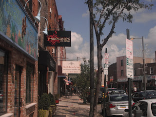
A few years ago, I surveyed storefronts across the downtown of Cambridge, Massachusetts, interpreting their various placard signs as a proxy for the evolution of a city whose demographics and character have changed significantly over the years.  As Cambridge has morphing from a tired, intermittently gritty bohemian college town into an upscale tourist destination, the few local establishments that have clung to their now primo locations stand out like “a Chevy Malibu parked among all the Volvos and Audis”, to use my apt analogy from a few years ago.  Many of Cambridge’s retail newcomers have been national upscale chains like Talbot’s or Crate and Barrel.  As a contrast, the remaining local stores have ardently retained their aging faded signs as an icons of distinction, no doubt hoping to inspire a particular reaction among visitors to Cambridge: “That place must me a local institution; look how old the sign is!”

I would never claim to say that Cambridge’s transformation is complete or fully-realized.  Cities are perpetually volatile, and its next phase may invoke something that no one can anticipate, reflecting the tastes of a consumer contingent that does not yet exist.  Whatever the future of Cambridge, its gentrification is unambiguously more pronounced than East Passyunk, the South Philadelphia neighborhood featured in this blog post. 
Long a stronghold of the region’s Italian-American community, South Philly has evolved considerably over the last three or four decades—from an overwhelmingly working and lower-middle class stronghold of the region’s Italian-American community to a patchwork of varied demographics: impoverished African American and southeast Asian neighborhoods, Mexican vendors in the formerly exclusively Italian market, a small (and shrinking) Irish enclave clinging valiantly to survival along the Delaware River, a tsunami of young professionals surging from the north, and, yes, quite a few squares in the quilt that remain resolutely blue-collar Italian.  When I lived in Philadelphia in 2004, the East Passyunk corridor was one of them.  Just a few blocks away from the economically disadvantaged Point Breeze neighborhood on the other side of Broad Street, East Passyunk no doubt looked very much the same as it did in the 1950s.  The storefronts featured family-run dry cleaners, hardware, bakeries, tailoring, convenience stores, and so forth.

Not anymore.  In the ensuing eight years, the infantry of yuppies that had aready stormed the affluent Bella Vista neighborhood decided to push their front line further south.  They probably found East Passyunk more affordable, more relaxed, maybe a tiny bit easier to park the cars.  Home values have tripled in the last decade, and quite a few of those mom-and-pop establishments I recognized have morphed into fair trade coffee shops, pilates studios, sushi bars—you know the drill.
Interestingly, several of the standby Italian eateries remain in the neighborhood but have themselves gentrified, offering a few more gourmet menu options as a response to the more moneyed demographic (or, more likely, the same beloved specialties as before but at a higher price).  Take this one, for example, which I don’t believe is anything fancy, but apparently it recently spruced itself up considerably:
Some of these old standbys now offer valet parking, which would have seemed ridiculous along East Passyunk twenty years ago, but again demonstrates both a response to a clientele that is not only more likely to own cars, but they would also have no qualms shelling out an extra Andrew Jackson to shift the burden of parking that vehicle onto someone else.

Many of the long established Italian-American families remain, and not all of the traditional retail has fled or capitulated to yuppie encroachment.  A quick scan across the commercial corridor at any point reveals the bifurcated income levels, and all it takes is a look at those signs.  Take, for instance, this very typical view along the sidewalk at a more southerly portion of East Passyunk Road:
And the storefront on the opposite side of the street:
In contrast with downtown Cambridge, I cannot detect very much conscious interplay between the old and new signage here.  The old signs in East Passyunk offer less untapped semantic content than the vintage marquees of Harvard Square; the elder businesses here in South Philadelphia don’t need to distinguish themselves from upmarket national chains, because, at this point, virtually nothing in the neighborhood is a chain.  So in East Passyunk, the age of signs connotes one obvious distinction: income.  Old signs equate to old businesses, which are the domain of the working class families who have lived here for generations.  Only very recently have these households sat cheek-by-jowl in rowhomes filled with affluent professionals.

The income/education disparity manifested by these signs does not at this point seem like a heated kettle ready to boil over.  They seem to co-exist peacefully in general.  But one sign in particular demonstrates the chasm in consumption patterns between neighbors better than any of the others.
It’s hard to find an online reference to King of Jeans that doesn’t feature such adjectives as “iconic”, “landmark”—even “spectacular”. The size of the sign doesn’t hurt.  As the woman in pink at the lower-right of the photo indicates, it’s huge—it spreads across three full stories and a cladding that conceals four buildings cobbled together.  But the content of the sign is what makes it truly irresistible for some.  Part roller disco, a little greaser-rebel, a soupcon of S&M, and a healthy dose of now broadly-known Guido culture, the sign’s ability both to bewilder and offend has elevated it to the level of a South Philly meme.  If King of Jeans intends to evoke something, the owner sure ain’t telling, but that’s part of its mystique.  In fact, the owner might not be doing much besides fighting his or her way through court: evidently King of Jeans is seriously tax delinquent, which may explain why the conspicuously old-time vendor (confirmed by the signage) is closing the store after so many years.  Is the inevitable demise of King of Jeans a further symptom of considerable gentrification?  Perhaps the combination of low sales (shrinking old-school South Philadelphian clientele) and high costs (more taxes due to escalating property values) stymied the long-profitable business.

The real indicator of things to come: a local developer hasbought the property and has proposed to transform it into apartments, offices, and retail.  Now the East Passyunk fan base has begun rallying behind that sign.  While everyone seems to concede that it can’t remain at its current location—a building whose upper-level fenestration got sheathed decades ago (just as it did across American commercial districts in the 1950s, and I blogged about it recently http://dirtamericana.blogspot.com/2012/08/nostalgic-for-future.html) --most agree that it should never leave Philadelphia.  The developer has agreed to salvage it, and ideally it will remain in South Philly.  But all this buzz merely demonstrates the polyphony of taste cultures who ostensibly feel a certain degree of stewardship over neighborhood relics such as King of Jeans.  Nobody who patronizes the street’s new sushi bars and acupuncture studios genuinely believe the sign is awesome or spectacular.  Rather, the yuppie/hipster denizens (whose consumer tastes merge more often than either constituent is willing to admit) share a fondness for irony, which does not preclude them from mocking the potentially more lowbrow tastes of the working-class families who’ve lived in the neighborhood for decades.  Yet the swirl of opinions and emotions surrounding this simultaneously sleazy/kitschy sign is more complicated than this, because no evidence exists that the long-established Italian American families cherish the sign or the establishment any more than the yuppies do.  Sure, the two stakeholders here might find common ground at a quality, long-familiar restaurant or bakery, but tastes in apparel are simply too ephemeral and too demographically precise for a store such as this to adapt very easily.  Restaurants often suffer if they deviated from long-proven model; clothing stores will die if they fail to change.  It’s likely that the King of Jeans was ready to descend from his throne, regardless of tax delinquent status.

One final rumor further beclouds any further analysis of the-sign-that-nobody-loved-until-now: several native Philadelphians can attest that it isn’t even that old.  Thirty years tops, but possibly only twenty.  Nowhere near as old as some of the legitimate institutions that have survived the encroachment of the creative class on East Passyunk.  If the rumors are true, the sign for the King of Jeans warrants an entirely new aesthetic reconciliation.  Did the proprietor deliberately design it to look old and faded, so it would appear as old as some of the mom-and-pops nearby?  Were the owner’s promotional sensibilities so tongue-and-cheek that he could anticipate a market hungry for ironic cultural references, for cheesy vintage signs?  Was the owner trying to stimulate nostalgia among the working class Italian American demographic that exclusively lived there at the time, or is the sign merely trying to provoke them?

More likely than not, I’m imposing a level of consciousness into this collision of cultures by interpolating a conflict that doesn’t actually exist.  In a matter of weeks, King of Jeans will be gone, and the building that houses it will undergo a complete facelift.  No doubt the first floor will eventually house a slow food kitchen, a Cambodian gastropub, designer apparel for dogs, vegan cheesesteaks, or similarly themed retail catering to the neighborhood’s cadre of bourgeois bohemians.  All with brand-new signage further shifting the old-to-new balance in favor of the latter.  Unless these stores’ proprietors choose a deliberately old-fashioned, outdated, or unfashionable type of signage (I’m thinking tungsten filament lightbulbs—not green but still worth as a retro hat-tip) to meet the newcomers’ insatiable appetite for cheeky irony.  And the appreciation and commodification of irony—more than educational attainment, income levels, or number of children—may ultimately prove the wedge that divides the two camps here in Philadelphia’s least heated class war.

Wednesday, September 26, 2012

Street slimming.


My latest post went up last night on UrbanIndy.com.  The issue it features is fairly parochial: a minor collector street on the east side of Indianapolis is far wider than it needs to be.  Ritter Avenue, barely four miles long in its entirety, offers a reasonable accommodation for a segment south of East 10th Street, looking more or less like this:


It's not perfect--no sidewalk for much of the west side of the road, few crosswalks, the southern portion has utilities poles blocking much of the existing paved space for the sidewalk--but the bike lanes are clearly striped with good signage, and the remaining sidewalk has a good setback from the street.  The neighborhood around it (mostly Irvington) is also fairly walkable.

Ritter Avenue north of 10th Street is a different story:


The street received a serious widening and exists solely to serve cars.  Speed limits have increased.  The hard curbs eliminate a safe shoulder for cyclists to ride on.  Why did the City do this?  Most likely it was to accommodate Community Hospital East, a major hub that sits at East 16th Street and Ritter.  (North of East 16th, Ritter reverts to essentially a country road).  Maybe Community Hospital needs somewhat wide streets to cater to emergency vehicles traveling at high speeds.  But East 16th, the other street that the hospital fronts, is not as wide as Ritter, despite being longer, more prominent, and having an overall higher average daily traffic volume.  (Ritter isn't even a prominent enough street to justify a traffic count.)

If anything, this segment of Ritter Avenue would be a prime candidate for a road diet: reducing it from four lanes to two, or even reducing it to three lanes with a shared central turn lane (the same level of services that East 16th Street offers).  Both options would allow for larger shoulders that could accommodate both bike lanes and sidewalks.  Narrowing the width of the lanes might even allow for on street parking on one side of the street, further calming traffic and promoting a safer environment for a variety of users.

I explore this situation in much greater detail and with more photos on UrbanIndy.com.  Comments as always are welcome.

Saturday, September 22, 2012

One road—two bodies politic.

Inevitably, communities evolve to reflect the personalities of their inhabitants.  Such an assertion may come across as glib, and it probably is, but it’s far better than the opposite—when a character of its community seems at odds with its constituents’ goals.  A fundamental goal of an effective representative democracy is that local governments allow people to articulate what they want out of their communities.  Obviously the ethics behind this practice can come into question, such as when a town like Mt. Laurel, NJ essentially restricted the construction of housing that would accommodate families below a certain desirable income level, or when several entire states levied poll taxes with the de facto goal of disenfranchising an entire subset of the population which generally lacked financial wherewithal and was overwhelmingly African American heritage.  But these dramatic negative examples are the exception to that lazily flowing stream of the provision of local government services.  Most of a town’s personality manifests itself in the most mundane of ways.

Nonetheless, two municipalities will usually reveal a few distinctions in how they choose to fund infrastructure, even if it comes down to inconsequential differences in design.  The obvious best way to witness these differences is to stand along a border such as this one in the suburbs of Cleveland:


For about six blocks, South Taylor Road forms the boundary between Cleveland Heights and University Heights, two older, racially integrated, mostly affluent inner-ring suburbs on the eastern side of Ohio’s largest metropolis.  As is often the case, the municipal boundary rests on the crown of the road, so that, from this angle looking northward, the left-hand side is Cleveland Heights and the right-hand side is University Heights.

The differences are often subtle—nothing here as obvious as contrasting paving surfaces for the two sides of the road.  But the cities’ public works departments clearly pull from different catalogs when purchasing some of their basic streetscape elements.  Notice the road sign on the right-hand side of the street:


And then across the street, on the Cleveland Heights side of South Taylor Road:


The “Cedarbrook” is no longer in all caps and it is missing the “Road” suffix.  Another visible contrast is in the style of the streetlights.  On the University Heights side of the street, the mast that projects the light further into the street is thicker and looks to be of a similar metal as the sheath that encloses the bulb:


By contrast, on the Cleveland Heights side of the road, the mast is of an apparently different material that is thinner and with a narrower diameter, and it appears to be fairly rusted:


Obviously these distinctions demand a keen eye, and by most considerations they hardly matter. But review that first photo of both sides of the street yet again, and now the differences between the streetlights should pop out.
Municipalities enjoy a wide berth in the array of designs they are able to employ for a number of roadside features, particularly those for which a motorist’s ability to see is important but not essential.  Streetlights can obviously assume a variety of configurations, and signs indicating the name of local roads are a common method of municipal branding—most communities consciously seek out different road name signs to distinguish themselves from their neighbors.  Given the options available, the differences between Cleveland Heights and University Heights are relatively modest.  I’m surprised they don’t even use different colors.

The same flexibility can’t be said for signs regulating speed limits.
The safety of roadways depends on a clearly recognizable indicator of the maximum (and sometimes minimum) allowable speeds.  During the first half of the 20th century, speed limit signs assumed a variety of guises (some of them particularly wordy) to the point many drivers ignored them.  The release of the Manual on Uniform Traffic Control Devices (MUTCD) in 1948 by the Federal Highway Administration (FHWA) set a standard of black lettering on a white shield, looking like the one on the University Heights side of South Taylor Road, seen in the above photo.  This design has remained more or less unchanged ever since, despite many new editions and updates to the MUTCD.  We’ve all seen exceptions, most likely in the grassy median of a subdivision or the entrance into an affluent community.  But these customized speed limit signs nearly always apply on local roads—not important collector streets like South Taylor.

Despite a federal mandate for uniformity in the appearance of speed limit signs, municipalities are generally left to their own devices when it comes to traffic control.  In the case of these two Cleveland suburbs, one of the key regulations seems to place them at odds with on another.  The photo above, with the speed limit of 25, looks northward on South Taylor Road, viewing the regulation from the University Heights side.  When I pivoted 180 degrees, looking southward, this is what I see at the exact same location on the Cleveland Heights side of the road:


Depending on the side of the street one is traveling, the speed limit is different.  Northbound traffic in University Heights must travel 10 mph slower than southbound traffic in Cleveland Heights.  Whether intentional or not, such a regulation could easily serve as an embedded speed trap, much to the frustration of passers-by who, not knowing the idiosyncrasies of individual suburbs, would probably never expect such a thing.  Obviously all it takes is reading the signs as they pertain to the respective direction of travel, so a motorist would be hard-pressed to make a convincing claim of entrapment.  Perhaps University Heights, with John Carroll University at its hub, has recognized the need for lower speeds to protect the safety of a heavy pedestrianized student population.  Or maybe the city is deliberately trying to moderate the notoriously speedy younger drivers.  After all, Cleveland Heights is an equally pedestrian friendly suburb.  I’m sure other neighboring communities have attempted similarly eccentric methods of enhancing the distinctions of the regulatory environment between them; the results aren’t always as innocuous as a specialty vintage road sign.

Monday, September 17, 2012

MONTAGE: Connecting the dots with used car lots.


Just last night my latest article posted on Urban Indy, and apparently it also earned a mention on Streetsblog.  I’m not going to double-post, so allow me to paraphrase here.

An often-overlooked opportunity for infill development is a ubiquitous land use across disinvested inner cities: the mom-and-pop, unlicensed used car dealership.  We’ve all seen them before: names like “R&W Auto Sales” (pick your favorite two letters and separate with an ampersand), prices never into the five digits (and sometimes not even four), no website, and signage along the lines of “buy now and take home”.  It isn’t a particularly bold statement to suggest that small used dealerships flourish in low-income neighborhoods.  They are a cue that land values in the area are low: aside from the fact that they are more likely to locate close to their demographic base, these dealerships need cheap land to operate. Obviously they require more space than a convenience store or a tax filing service in order to run the business; their inventory occupies a parking lot.  And since the inventory is already significantly devalued, the best way to guarantee a secure profit margin is to operate on land where the per square foot costs are rock bottom.

The montage of photos below shows the propensity of used car dealerships in some near southeast neighborhoods in Indianapolis.  The Virginia Avenue corridor runs through three neighborhoods: Fletcher Place, Holy Rosary, and Fountain Square, all of which have begun gentrifying quite a bit in the last decade.  The used car lots prevail, but it’s clear that some of the owners are sitting on a potential development gold mine, and they know it: many of them are for sale, and it is inevitable that the others will likely go in the near future.  If anything, land values have increased enough that it’s hard to operate such a low-end business, so if R&W or any other owner chooses to cash out, they very well could relocate to another part of town where cheap, highly visible land is still abundant.

Below is a photo series of used car lots along Virginia Avenue, starting from the heart of Fountain Square and working northwesterly through Fletcher Place toward downtown:

(Note: the last of these pictures is an automobile broker, which is a different operation altogether, but it no doubt sought cheap land because, quite simply, cars take up a lot of space.)

The second photo series is in the Bates-Hendricks neighborhood, which is experiencing gentrification at a much slower pace, but it still has its share of properties that could attract infill development in the next decade.  These photos are particularly interesting because they all sit within a block from one another, at the intersections of East Street and Morris Street or East Street and Prospect Avenue, so it’s quite a cluster.

It may be hard to tell from this angle, but four used car lots are visible within the frame of this photo below:

I’m not going to go into any detail further here (I already did that at Urban Indy) but feel free to review that post, which explores the economics behind this land use in greater detail and provides quite a few more photos.  As always, comments are welcome.


Thursday, September 13, 2012

Stripping the bark.

I hate to write on the same topic for two consecutive blog posts, and I have covered plenty of ground with retail in the past, including the often-maligned strip mall.  But this photo opportunity was too good to pass up, and it the construction in progress probably won’t look like this for much longer.  From time to time, I get to see how the landscape has changed when I return to the south side of Indianapolis where I grew up.  And I’ve featured material on the environment around the prosperous Greenwood Park Mall back when this blog was but an infant (or a toddler, at least).

The Greenwood Shoppes strip mall in the photo below sits directly to the west of the Greenwood Park Mall, just across busy U.S. 31.  My apologies for the duskiness of the photos, but it should still be obvious that it is undergoing a sort of renovation.
Any strip mall that receives an extensive facelift such as this has clearly struck a grand slam, as suburban retail goes.  A huge number of strip malls—I suspect more than half—never benefit from any cosmetic changes: their tenants downgrade as they age, until they can’t lease their space at all, and then they retreat further, from neglect to complete abandonment.  They become so obsolete that an investor won’t touch them, possibly because the surrounding neighborhood has declined economically, but more likely simply because there are just so many fresher, newer strip malls that have risen out of pasture land in the ensuing years; the one that is already a generation old no longer offers just the right location, the right traffic patterns, or the perfect building design.  We’ve all seen them before.  A strip that remains successful for 20 years is an anomaly.  Many don’t survive even that long, as proven by a completely vacant one in the otherwise healthy suburb of Plainfield that I wrote about a few years ago.  The array of dying strip malls that dot the landscape of Houma (also hardly a struggling city), featured last week, are not likely to be much older.  An anucleate metropolitan settlement pattern exacerbates the short life cycles of strip malls, but here in Greenwood Shoppes we have an unusual exception.


It’s not particularly remarkable in any other way: the tenants are hardly high-end.  But they range from national chains like Half Price Books and Men’s Wearhouse, which have been at the location at least a decade (possibly two), to local institutions like McGee Jewelers.  During my periodic visits to Greenwood over a handful of years, this strip mall has never been less than 90% occupied.  Thus, the property owner is confident in the shopping center’s continued viability to invest some money for a facelift.  One section of the strip mall is farther along in the process.


It doesn’t look like the changes are going to be that dramatic.  No improvements to landscaping in the parking lot that I can tell, and clearly no fundamental changes in the massing or floorplate.  The businesses can continue operating—nothing more than a skimming.  But stripping away the shell used to mount the illuminated signs revealed a surprisingly rich history to this strip mall.


The current tenant is Half Priced Books, but a sign painted on the brick says “Bedding Liquidators”.  The bedding tenant obviously predates the used bookstore, but how old is it?  I have no memory of this location hosting anything but a Half Priced Books, but that doesn’t mean much.  More telling is the fact that the store used a painted sign to identify itself.  Virtually no strip malls use this technique anymore.  If we witness illuminated signs these days, they usually involve floodlights mounted below, shining directly onto a wooden sign—not one painted directly on the side of the brick.  This old sign cannot help but evoke the faded old five-and-dime advertisements painted on the side of commercial buildings in a more urban area—only this one, after being concealed for two or possibly three full decades, is in superior shape.


In a matter of days, the construction team will probably slap up a new wall to hide this old painted sign, and in a few weeks the renovations will be complete.  The tenants will remain, confident that they claim one of the best locations within this large regional shopping hub, and they’re probably right: visitors can look out at the Greenwood Park Mall from inside just about any storefront.


The plastic surgery performed on Greenwood Shoppes only seems to emphasize how much this particular strip mall defies the standards—even within the Greenwood Park Mall area.  While the mall itself is healthy, the strip malls surrounding it in all directions are a very mixed bag.  Just to the north, on the other side of County Line Road (and therefore in the Indianapolis City Limits), sits the much larger County Line Mall that hosted a Target in decades prior.  Since the Target sought a new location about ten years ago, the County Line Mall has struggled with an occupancy rate from around 50 to 70%, even after it received a major facelift of its own.  Meanwhile, directly to the east of the mall, across from it on Madison Avenue, sits a strip mall similar in scale to the Greenwood Shoppes, but its fortunes have taken a different turn:
Though Greenwood Crossing isn’t completely vacant, the pockmarked parking lot and faded signs demonstrate that it isn’t a top draw.  It even hosts a church, which is usually a sign of a strip mall that is desperate to recruit tenants.   But it is the exact same distance from the Mall as the Greenwood Shoppes, as evidenced from the final of these photos, in which the water tower and Dick’s Sporting Goods are visible at the horizon to the right.  Although a major arterial, Madison Avenue just doesn’t quite command the traffic volume that U.S. 31 does.

Greenwood Park Mall and the adjacent Greenwood Shoppes demonstrate little more than the oft-proven notion that retail developers are at the mercy of their tenants.  Suburban retail, generally lacking a great deal of design innovation, rarely gives its developers more than it can expect: a conservative, adequate ROI over a pathetically short life cycle.  Then it rots, leaving its residential neighbors to complain to the City to intervene on the blighted appearance.  Every developer thus weighs the odds that its own product will be an exception to this rule, generating revenue for multiple generations.  But the odds are slim enough that the process of converting greenfields to strip malls has become a race to the economic bottom: low returns incentivize builders to skimp on hard costs in order to maximize revenue across a forecasted slim profit margin, while the persistently low budgets for these shopping centers almost insures that they will look deteriorated and old-fashioned once enough cheap new developments two miles have away have displaced it from its hierarchy.

The same could happen here, and Greenwood Shoppes could easily tank—the income levels of the housing directly surrounding it (mostly aging apartments) are significantly lower than the norm for both Greenwood and the south side of Indianapolis.  It could also fail to the newer, much ritzier shopping plaza/strip mall directly to the southeast, on the opposite side of Fry Road.  But both retail typologies (the enclosed mall and the strip center) have endured through a first and now a second renovation, and, baring a major change in the economic base of this part of town, they are likely to remain in this condition for years to come…at least until the next facelift buries another generation of outmoded signage or architectural details.

Thursday, September 6, 2012

Big boxes: keeping all the ducks in a row.

I have chronicled the tireless migration of retail across metropolitan landscapes several times in the past; it formed the central topic of one of my earliest blog posts.  Unfortunately, most of my posts have focused on the blight left by outdated retail typologies: the dead malls, pockmarked parking lots, blighted strip malls, or (at the very best) the once widely coveted destinations that are now dominated by check cashing centers and pawn shops.  I’m not trying to dwell on the negative, but the fact remains that focusing on the less prosperous retail centers helps to substantiate an already manifest assertion: retail in the US is more or less always soft.  The supply of new retail options always far exceeds the demand; some have even argued that developers’ ambitions to construct retail has become completely untethered from consumer demand, to the point that they are no longer related.  Retail locates where the investors see fit, and those investors can range from experienced developers to an elderly couple hoping to build a strip mall to provide a nest egg for the grandkids.

Thanks to the almost exponential proliferation of shopping centers over the last half century, the rules for straight-line depreciation of a retail outlet tend to employ estimations of about 15 years, meaning that the average commercial plaza will need a thorough renovation in that time frame if it is to retain a lucrative market.  In fast-growing metropolitan areas, that number could even be smaller.  But suburban growth patterns, where decentralization is the primary force acting upon new settlements, are fairly predictable in nature: an auto-oriented shopping plaza that still lures top-dollar tenants after 40 years is the exception, not the norm.  I have covered the topic of metropolitan retail periodically over the years, and at the moment I’m not sure I have anything new to offer.

But smaller communities are another story altogether.  Many of them are static in population; quite a few are shrinking.  Presumably their retail landscapes would echo these patterns by demonstrating very little change, right?  An evaluation of the small Louisiana city of Houma (50 miles to the southwest of New Orleans) would suggest that this is not the case.  The region itself is not particularly depressed; consistent growth in the fishing and petrochemical industries kept the unemployment rate among the nation’s lowest in the spring of 2009, during the peak of the Great Recession.  It’s unemployment has inched up to above 5.0% since then, but it still remains well below both the state and national rate.   It’s relatively vigorous economy, however, is exerting only a modest impact on population change. Houma itself grew 4.1% from between the 2000 and 2010 Census, and the surrounding parish of Terrebonne grew 7.04%—not bad, considering Houma suffered through four hurricanes in the last decade, and even better considering Louisiana’s anemic population growth of 1.4% over this time frame.  But these figures hardly indicate an oil boomtown comparable to the many that have sprouted like mushrooms in Texas, or the more recent equivalents in Williston, ND and Gillette, WY.

Despite relatively modest growth, the retail developments have relentlessly shifted away from Houma’s town center.  This pattern isn’t merely referring to the hegira of downtown businesses to auto-oriented shopping centers—that obviously happened decades ago.  The latest phase shows a move from those neighborhood strip malls to a marginally different automobile oriented typology.  The side of Houma west of the Intercoastal Waterway that bisects the city is both higher income and more heavily populated.  Nonetheless, most of the shopping centers that hug the main street look a bit like this:
Granted, this isn’t an altogether fair example, since this tired old shopping center sits just a half-mile west of downtown Houma, in what is visibly the lowest income part of town.  But a mile further down State Road 24 is wealthier, and the strip malls still look the same.
The hobbled giant K-Mart has been in decline for decades now, to the point that surviving branches only occupy that faded strip malls that Wal-Mart would have jettisoned from its portfolio long ago.  (I blogged about this trend in K-Mart a few years ago.)  The only other major retail neighbor to K-Mart?
A boarded-up dollar store.

Continuing further down State Road 24, the subdivisions are conspicuously middle class, but tenants suggest low leasing rates in all the strip malls.  The Southland Mall is hanging on and still boasts some major chains like American Eagle and Bath and Body Works, but it’s not exactly thriving:


From my observations during an August visit, the mall is barely 60% occupied, with particularly high vacancy levels in the wing adjacent to the long-atrophied department store Sears (a frequent occurrence in malls with Sears that I blogged about earlier).   Many of the other remaining tenants are mom-and-pop stores; nothing wrong with this in theory but clearly an indicator that the mall isn’t commanding high rents.  The outside strip mall across the street looks better from a superficial visit; at least it’s heavily occupied.
But the tenant mix is hardly lucrative: temp agency, tax filing, gold/silver exchange, and not one but two Armed Forces Career Centers.  (Both are in operation.)  I have no objections to any of these tenants, but Michael Moore observed almost a decade ago the tendency for military recruiters to seek low-rent retail space.  This relatively large strip mall does not host a single nationally recognized tenant.

East Houma, with a mostly older housing stock and a smaller, less affluent population, predictably shows much of the same trend in terms of its shopping centers:
Most of the centers are either surviving in poor repair, struggling with high vacancies, or completely abandoned.  East Houma residents still have access to several reasonably large grocery stores, fast food restaurant chains, a smaller Wal-Mart, and a handful of basic services, but not a single strip mall would could be considered flourishing.

My favorite example, however, is the old shopping center just a few blocks from Houma’s partially revitalized Main Street.  It’s proximity to city and parish government offices fostered an idiosyncratic reinvention:
Yes, a former shopping center with one large anchor has transformed into administrative offices for city government.  However, the City of Houma does not seem to have renewed its latest lease:

This photographic array of shopping centers at various levels of neglect does not intend to paint a negative portrait of Houma.  Frankly, few onlookers have demonstrated much sentimentality about the decline of automobile-oriented shopping centers from the 1960s to the 1980s.  But up to this point, nothing I’ve revealed has suggested a small metropolitan area with unemployment far below the national average.  A map of Houma is essential to distinguish the Houma’s flourishing retail corridor from its various struggling pockets.

Almost all of the shopping centers photographed up to this point have rested within the Houma municipal boundaries; if they haven’t, they at least were close to large residential developments.  (The last photo series, showing the grocery store converted to City Hall, sits almost exactly where the Red “A” stake rests on the map.)  But the thriving retail corridor does not intersect with any major subdivisions; it is removed from the grid.  It largely sits on what was probably cheap land outside the city limits, and it represented by the red ellipse on the left side of the map: State Road 3040, called either Tunnel Boulevard or Martin Luther King Boulevard, depending on the location.  Along this arterial, the commercial landscape looks more like this:

 
It doesn’t win any awards for aesthetics or pedestrian accommodation, but it is a prosperous retail corridor by almost every measurement.  It carries some of the most ubiquitous national brands: Books a Million, Target, Applebee’s, Chili’s, Best Buy, Hobby Lobby, as well as some emerging brands that fastidiously avoid sub-par locations, such as a Charming Charlie’s.  Predictably, the corridor also contains a Wal-Mart.   I counted only one sizable (over 20,000 s.f.) vacant storefront across the entire strip of more than a mile in length.  This stretch of State Road 3040 has become the official commercial/retail hub for the 100,000 residents of Terrebonne Parish.

What this proves is that a city with the size and relative prosperity of Houma can sustain a diverse array of retail that befits its status as a minor metropolitan area.  (It earns this label through shared economic activity with the smaller city of Thibodaux, in Lafourche Parish 20 miles to the north; the Houma-Bayou Cane-Thibodaux Metropolitan Statistical Area contains around 200,000 people.)  Empirical evidence suggests that the retail typology has shifted significantly over the years; using definitions provided by the Urban Land Institute’s Dollars andCents of Shopping Centers, the standard in Houma has evolved from several smaller neighborhood centers (averaging 60,000 s.f. in Gross Leasable Area) to a more metropolitan scale.  Like beads on a string, a series of loosely connected community centers (averaging 150,000 s.f.) function in aggregate as a regional center of well over one million square feet, allowing all the national names to stand rank-and-file in an easy display as motorists cruise by in their vehicles.  Meanwhile, any smaller shopping center that doesn’t fall along this corridor has kissed national names goodbye, with the exception of perennial laggards like K-Mart.

While I’d hardly assert that a single community like Houma can operate as a microcosm for similarly sized metros across the county, it is not entirely difficult to find other examples in otherwise culturally unrelated municipalities.  My home state of Indiana has two smaller cities, neither of which can boast an economy as strong or stable as Houma but are more populous (at least for now).  Anderson and Muncie have witnessed a similar migration of all major retail: in Anderson, most all retail hugs a two-mile stretch along Scatterfield Road, running just to the east of the older parts of the city.  And the smaller shopping centers not abutting Scatterfield are typically dying or dead.  In Muncie, the commercial main street is McGalliard Road, an arterial north of the old city center.

Houma and Muncie at least share indications of a reawakening interest toward specialty retail in their historic downtowns; Anderson cannot claim such a renaissance at this point.  While the trends on display in these smaller cities may not shed much light on what’s happening in metros over one million inhabitants—metros with an extensive network of discretely incorporated suburbs—they at least provide some added texture to our understanding of the omnipresence of decentralization forces at work.  Automobile dependency is ostensibly so great that neighborhood shopping isn’t necessary; in a small city, it is just a convenient to line all the retail up in a row on a busy high way on the more prosperous side of town.  One could critique the thriving commercial corridor of Houma as mindless sprawl for its appearance and utter disregard for transportation alternatives, not to mention its apparent avoidance of municipal boundaries that would require it to contribute to the city’s tax base.  But retail supply has long pursued the latest locational trends to save money and capture a broader clientele, while leaving the blight of obsolete older typologies in its wake.  Whether the shift in Houma is sprawl or part of a broader regionalist way of thinking (opening the visibility of these storefronts to all of Terrebonne Parish and not just those who live in Houma), really depends on how planners and economists contextualize their data.