Saturday, April 27, 2013

Salvaging St. Louis, Part II: Planting the seeds for repopulation.

In the previous part to this study, I explored the similar population trends of two major Midwestern cities, St. Louis and Detroit.  Both cities have endured significant losses since their peak in the 1950 census.  Interestingly, Detroit seems to absorb the lion’s share of critical attention for its persistent economic malaise, yet St. Louis has actually suffered a slightly greater loss: 62% within its historic city limits, compared to Detroit’s 61%.  How has St. Louis evaded much of the stigma of decline that persistently dogs Detroit?  I offered a few big-picture speculations in the previous post, not the least of which is that, by and large, the St. Louis Metropolitan Statistical Area (consisting of 15 counties and St. Louis as an excluded city, or 16 counties if one considers the even larger Consolidated Metropolitan Area) has remained stable or grown slightly over the last few decades, while in Detroit, even many of the suburbs are shrinking as well.  In addition, St. Louis does not owe its population explosion to the emergence of a single industry: it began growing into a prominent city decades before Detroit, and for a short time in the mid 19th century, it was the largest city in the Midwest—bigger even than Chicago.  Detroit, meanwhile, was still a humble town in the 1800s; then, after a surge of over 1,000,000 persons from 1910 to 1930 (the fastest growing city in modern history at the time), it enjoyed about 20 more years of unquestioned prosperity.

Most compelling for a person guided by empiricism as I am, St. Louis fundamentally looks better than Detroit.  While it clearly manifests its population loss, particularly in the impoverished northern half of the municipal boundaries, the Missouri city doesn’t harbor nearly as many broad swathes of vacancy as its Michigan counterpart—and the southern half of St. Louis boasts a number of perfectly stable or even fashionable, recently gentrified old neighborhoods. I identified one other major influence that gives St. Louis an edge: its housing stock was older and suffered obsolescence to a greater degree than Detroit.  While this may seem counterintuitive, it indicates that St. Louis owes its population loss much more to a housing typology that fell out of favor—people abandoned housing in St. Louis less because it depended on a collapsing industry and more because of how easy it was to construct a comfortable modern home outside the city limits.  The housing stock in St. Louis is on average much older; when St. Louis began to decline, people were abandoning 80 to 100-year-old brick rowhomes and duplexes because it was easier to start over than upgrade.  Conversely, much of the housing stock in Detroit was only 50 years old when the desertion process began.  While both cities suffered, postwar deindustrialization contributed far more to Detroit’s exodus than it did in St. Louis.

I have no doubt I am going out on a limb on this assertion, especially since St. Louis in particular can currently boast some aged brick attached housing that commands a fairly high price, since a few of these older neighborhoods have enjoyed a recent renaissance.  And, of course, all the industrial cities of the north suffered the same outmigration concomitant with the decline in industry.  But clearly some suffered more than others: in the Northeast, no one would question that Baltimore and Philadelphia’s attached housing stock have proven more prone to complete abandonment than, for example, Boston’s triple-deckers.  The remainder of this article will scrutinize the character of St. Louis’ housing, particularly in light of what I would consider one of the leaders in repopulating disinvested neighborhoods: the firm McCormack Baron Salazar, Inc., a pre-eminent owner and developer of affordable housing.  While every major city claims at least a few prominent affordable housing developers, MBS has almost singlehandedly restored some neighborhoods in St. Louis that otherwise would undoubtedly bear the same devastating scars we can witness in Detroit.  And it consistently ranks as one of the largest affordable housing developers in the country.

Lest this article come across as a promotional campaign for this specific firm, I attest now that I intend merely to use McCormack Baron Salazar as a method of winnowing a reasonable travelogue through the city’s vast and diverse array of housing stock, by directing attention on a handful of the firm’s developments in the city limits.  I intend to evaluate their success at balancing current demands for housing amenities with a respect for St. Louis’ distinctive vernacular architecture—the style that fell so heavily out of favor but now enjoys a palpable if uneven resurgence.  Not surprisingly, a preponderance of the major developments rest in the more devastated northern half of St. Louis.

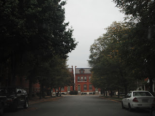
This first, known as Murphy Park, stretches across several blocks centered at the intersection of Cass Avenue and North 19th Street, just a few blocks west of the former site of Pruitt-Igoe, one of America’s most infamous public housing projects—and among the first to face demolition after persistent failure to offer its low-income residents an adequate quality of life.  To this day, the neighborhood (formerly known as DeSoto-Carr) is overwhelmingly African-American and low-income, though it holds a fraction of the population from its 1950 peak.


Murphy Park replaces Vaughn Towers, another public housing development that had fallen into serious disrepair by the mid 1980s.  Across three phases, MBS built over 400 units of new, low-rise housing, providing individualized entryways and private yard space, along with park facilities, a swimming pool, and a community center.
While it bears the trademarks of relatively new construction through the lack of the patina of “traditional” St. Louis housing expected from this district in the city, it also eschews the suburban multifamily typology, particularly the type one would expect to see in the 1980s.  Notice that the front doors all address the street, rather than turning toward the interior of the block with a centralized parking lot, as one might expect in the suburbs.  MBS did not alter the original grid, as the high-rise public housing developers did in prior decades.  And because different sections of Murphy Park adopt different styles, the community does not look like a development conceived from a uniform source or a single site plan.
Compare the photos above to the neighborhood that surrounds it.  Here’s a photo with some older surviving housing nearby:
And some other new construction in the area, which looks every bit like something one might see in suburbia.
There’s nothing wrong with the housing in the above photo, unless you are vigorously anti-suburb.  (I'm not, if that weren't obvious already.) To be frank, such housing may very well align with what these moderate-income families are seeking, more than the conventionally urban townhome style promoted before.  However, the more authentically urban Murphy Park development shows evidence of greater staying power: it is in consistently good condition.  Meanwhile, some of the suburban stuff has fizzled.
Judging from the grayness of the wood, this conventional house has sat in semi-built limbo for at least a couple years.  Since I don’t know the history behind this development, I will withhold further judgment.

Needless to say, however, the adjacent Murphy Park project shows no evidence of aborted construction; the entire initiative bespeaks of a unified vision that loosely conforms to the archetypes of an urban neighborhood will still providing sophisticated modern housing.  The fact that it displays some stylistic variance helps mitigate the effect of looking “over-planned” or factitious.  The success of Murphy Park ostensibly prompted HUD to conceive of the HOPE VI model for integrating affordable housing into an existing urban neighborhood context, based largely on the design principles applied here.

Approximately the same age as Murphy Park, the Brewery Apartments sit just a few blocks away and apply an entirely different development approach: meticulous historic preservation and adaptive reuse, in order to deliver particularly high-density multifamily housing in a neighborhood that otherwise would be bereft of residents.
The development consisted of the rehabilitation of three buildings that had belonged to the Falstaff Brewing Company, ten rowhomes directly across from 20th Street, and two new infill buildings.  The total complex offers 140 units, with 75% of the units open to households earning less than 60% AMI (Area Median Income).  Here’s a more comprehensive picture of the brewery complex:
And here are the adjacent rowhomes:
And a more distant view, peering through the trees from an intersecting streetscape:
It would take far more scrutiny than I allowed myself in order to identify the two infill buildings, which the development effectively integrates with the much older building stock.  At the time of this publication, leasing rates for the market-rate apartments at the Brewery range from $700 to $940, from one to as many as three bedrooms, though no market-rate three-bedroom units were available.  And it is easy to see why the brewery can lease to a market-rate clientele: redeveloped old breweries have flourished as fashionable residential real estate, especially for the urban young professional population that is less concerned with crime or struggling public schools.  Based on my phone inquiry, the Brewery Apartments rarely struggle to find market rate tenants, indicating their desirability despite the general impoverishment of the neighborhood.  

Most of McCormack Baron Salazar’s other St. Louis developments rest in more economically mixed areas than the aforementioned two.  The Westminster Place Apartments sit squarely in Midtown St. Louis, an area that remained fashionable up through the mid-1960s.  Just a stone’s through away sat Gaslight Square, a hub of taverns, cabarets, and, eventually, St. Louis’ counterculture movement.  But the area declined steadily in the 1970s, and, although never upscale, it fell victim to particularly acute desuetude, to the point that by 1990, the City had demolished virtually all the structures in Gaslight Square.  Westminster Place belongs to a series of public and private initiatives aimed at repopulating the 90-acre area.  Like Murphy Park, it offers a diverse array of housing to accommodate a variety of demographic groups. 
The end result stretches across several blocks in Midtown, with three developmental phases completed from 2007 to 2012, amounting to 392 new apartments and 80 homes.
Note the decorative brick street signs, which distinguish the neighborhood from the more conventional signage in the purlieus.  Westminster Place itself—the actual road—features a mix of townhomes and single-family detached housing flanking a landscaped traffic circle.
Some of the apartment buildings adhere to the same archetype used in Murphy Park.  Though their appearance may deviate from the structures of the Gaslight Square era, they still provide an above-average population density and a pedestrian orientation directly to the street—two characteristics that would be unheard of if MBS had abided by a more suburban vernacular.  Tucked into the heart of the Westminster Place development is McCormack House, an assisted living apartment for low-income seniors, visible in the photo below:
Interestingly, the same block of Olive Street that hosts McCormack House also completely intermingles features more Westminster Place apartments with old commercial/industrial structures that remain largely vacant and decaying.  Here’s one of the standard new buildings:
And here’s a relic from days past just a bit further down:
One of these dinosaurs sits directly across from McCormack House.
I would speculate that the above building is a sheath for concealing a menacing electrical sub-station, if it weren’t for the masonry scar to the building’s right, suggesting that a similarly sized building used to sit immediately adjacent to it.  Who knows what’s going on here?  These aging behemoths could belong to a stubborn landowner refusing to sell until the market it too hot, or it could be part of an eventual adaptive re-use that will attempt to salvage the façades.  Regardless, the juxtaposition of old and new provides a needed anomaly.  Otherwise, far all the artistry involved in integrating a variety of housing styles and types, Westminster Place still looks like exactly what it is: a new development to replace a completely devastated old neighborhood.

In order to avoid this article extending to uncomfortable length, I’m going to push the pause button.  Part III will conclude the essay with an exploration of a few more McCormack Baron Salazar projects, along with a final analysis on the implications for intensive housing provision as a means of inducing repopulation.

Friday, April 26, 2013

Bear with me.

Two days ago I published the second part of my analysis on St. Louis housing.  It was available for a very brief time, but for some reason it is no longer visible.  My apologies as I investigate the problem; I should have the blog re-posted within the next 36 hours.  Thanks for your patience!

Wednesday, April 17, 2013

Spurs that fail to stimulate.

My latest post is at Urban Indy.  Though the focus is on case studies in Indianapolis, the situation exists in cities across the country.

This seemingly unremarkable photo of traffic in downtown Indy shows the easternmost "spur" of Maryland Street, a primary downtown road that was converted to one-way eastbound in the early 1990s.  In order to make it compatible with the adjacent Washington Street (which is now westbound), engineers designed this spur so that the lanes would diverge and converge to form two complimentary one-ways, easing in the flow of traffic during peak hours.  The map below provides better evidence.

Maryland Street, normally east-west, veers at a 45-degree angle to merge with Washington Street to the north.  The result is that, for one block, Maryland Street functions more as an exit ramp than a downtown arterial.  As for the block that it bisects--

--virtually nothing but surface parking.  The presence of this street engineered for unimpeded traffic not only creates an unappealing pedestrian environment, it precludes any further development by carving the parcels into shapes that would be difficult to use.

This blog article focuses both on this and another spur in central Indianapolis, offering considerable more photos and a speculation of what, if anything, could put these blocks back into marketable use as viable real estate.  Neither are likely to happen, barring a major change to the design of the streets.  But one can always hope!  I encourage readers to offer feedback, and perhaps to conceive of similar spur street segments in other cities, most of which inevitable yield similar results.

Sunday, April 14, 2013

Salvaging St. Louis, Part I: the macro influences that keep it afloat, if not flourishing.


In the most decentralized of American cities, much of the urban fabric that prospered until at least the Great Depression (if not later) suffered such devastation in the second half of the twentieth century that one could claim it was wiped off the face of the earth. Huge swathes of what were once densely settled neighborhoods are all but gone, having lost more than half of their population since 1950.  When one ponders the type of city that has suffered this fate, chances are it sits in either the industrialized Northeast or Midwest: places like Cleveland, Buffalo, Philadelphia, Baltimore, and even Chicago.  In Detroit, the condition of nearly complete depopulation may afflict as much as half of the land within the historic city limits.

Another Midwestern city that has endured almost as profound of a loss as the Motor City—but mercifully manages to escape the damning headlines most of the time—is St. Louis.  At its population peak in 1950, it had 850,000 people.  As of 2010, that number had plunged to 320,000—an over 62% drop in population, and, amazingly even a bit greater than Detroit’s 61% loss over that same time frame.  In stark contrast with Detroit, where the depopulation stretches in all directions from the city center, in St. Louis the majority of population loss has exclusively afflicted the north side of the city.  Many of the neighborhoods south of I-44 are as intact and manicured as they were in 1950, like the serene Italian-American neighborhood on the near southwest side of town known as The Hill:

Conversely, a disproportionate number of neighborhoods north of I-64 are pockmarked with scrappy lots and widespread evidence of long-term abandonment.

The map below, from the city’s Land Reutilization Authority, pinpoints properties owned by the city due to unpaid taxes.
Obviously, a preponderance of these properties rest in the northern half of the city.  And yet, by many other metrics, greater St. Louis has stemmed its economic misfortunes, reflected in part through a modest but stable population growth of 4.2% across the metro area from 2000 to 2010.  Thankfully, the bleak era from 1960 to 1980 has long since passed, when the city limits plunged over 15% between each decennial census—a true nadir for St. Louis.  Nonetheless, the City of St. Louis continues to shrink: during the same ten years that the metro grew, the city lost another 8.3% of its population—smaller than any previous decade since 1950, but still enough that city leadership can hardly dismiss it as statistically insignificant.  A fairly recent article by Wendell Cox in New Geography explored this dichotomy, noting in particular that greater St. Louis appears reasonably stable, despite a core city that has consistently withered now for over 60 years, due at least in part to its low domestic out-migration rate of only 35,000 people.  Cox compares this rate to that of San Diego, a metro of comparable size to St. Louis but with domestic out-migration of 127,000.  Even if St. Louis cannot attract newcomers to its historic city limits, the festering urban problems are not repelling people from the suburbs, nor is it prompting too many long-term residents to emigrate.

Detroit, by comparison, could only be so lucky.  Within the city limits, it lost 24.9% of its population over just the last decade (2000 to 2010), making St. Louis’ loss of 8.3% seem meager.  It’s difficult to assess greater Detroit’s population change, because the varying definitions involve different combinations of counties, and greater Detroit features strong economic links to other prominent cities nearby, while metro St. Louis sits in relative isolation.  The conventional Detroit MSA involves six primary counties, which, if assessed for population change over multiple decades, also demonstrate an abysmal performance: from a 1970 peak of 4.5 million, the entire metro has declined in population in every ensuing decade except for a moderate gain during the 1990 to 2000 period.  (Current estimates place the metro below 4.3 million.)  Between the last two censuses, the Detroit MSA lost 3.3% of its population—a fairly uncommon phenomenon, as indicated by this Brookings Institution study, which reveals that most US metros maintain positive growth trends, even when the core city is shrinking (as is the case for St. Louis).  Metro Detroit’s numbers seem a little less depressing if the Combined MSA serves as the primary measuring tool.  The CMSA involves an agglomeration of counties that includes the previous six, along with three additional outer-belt counties that also house their own core cities to independent metros: Ann Arbor, Flint, and Monroe.  Nonetheless, the Detroit-Warren-Ann Arbor CSA also reported population loss over the last two censuses—only not as severe, at only 2.5%.  Whatever gains the prosperous Ann Arbor metro enjoyed, they have not been sufficient to offset the serious losses absorbed not just in the city limits of Detroit but in many of its inner-ring suburbs.

In short, both of the Midwestern cities of St. Louis and Detroit have suffered incredible population losses over the last sixty years.  But only Detroit’s struggles have also permeated the entire metro; by and large, metro St. Louis has persevered despite the City of St. Louis’ vicissitudes.  The real heart of this blog article is forthcoming, and in the second half I will focus much more pictorially on St. Louis’ efforts to stem its loss through some of the most proactive affordable housing construction in the country.  But before delving into that subject, the macro-level influences that have shaped St. Louis current condition are worthy of consideration, particularly in relation to how the city has escaped the profound economic malaise of Detroit.  Here are the two factors that I think are most critical at keeping the spirit of St. Louis alive and kicking:

1)    St. Louis has benefited from a more mature growth trajectory. Until Chicago exploded in population due to the proliferation of railroads, St. Louis was the largest city in the Midwest, surpassing Cincinnati during the Civil War.  It edged out Chicago in population in the 1870 census, but by 1880, Chicago had 150,000 more people (even despite the devastating 1871 fire).  Detroit was barely a dot on the map at this time, and it didn’t make the top 10 largest cities until 1910, when the automobile industry had finally emerged as a key contributor to the American industrial economy.  Detroit more than doubled in the next decade, and throughout the Depression Era, it was the fourth largest city, and twice as large as St. Louis.  Seventy years later, the population ratio for Detroit and St. Louis remains around 2:1, but, of course, both cities have plunged approximately the same amount.  Only Detroit, however, owes most of its population growth to the explosion of a single industry; with that industry’s subsequent domestic decline, the employment base could no longer justify so much population nearby.  St. Louis’ more conservative growth pattern—in addition to a head start in urbanization—has helped keep its raison d’etre from ever suffering the same automatic association with a single industry as in Detroit.  Still, despite its broadly different growth pattern, the city limits of St. Louis lost population at the same rate as Detroit’s.  Why?
2)    The housing stock in St. Louis fell out of favor more dramatically than elsewhere in the Midwest. Any outsider who visits St. Louis today is likely to find the inordinately high percentage of brick houses a bit disarming, at least in comparison to other Midwest cities.  The legacy of brick construction evokes Mid-Atlantic cities such as Baltimore or Philadelphia, which, to a certain extent, makes sense: some of St. Louis’ strongest population gains parallel those of its East Coast counterparts, which also enjoyed steady growth through mid-19th century industrialization.  And St. Louis shares with those aforementioned cities a housing typology that is otherwise rare in the Midwest:
That’s right—St. Louis has rowhouses.  While not all housing in St. Louis is attached (and the duplex is far more common in St. Louis than the Philadelphia/Baltimore rowhouse), the city has far more attached housing than, say, Chicago or Detroit.  However close in proximity the homes in Detroit are to one another, they are almost always detached.  With the emergence of the Levittown suburb by 1950, the attached house fell almost intractably out of favor.  Families abandoned the rowhouse typology in droves in Philadelphia and Baltimore; no doubt the same pursuit of detached housing and small side yards prompted families in St. Louis as well.  In addition, the brick construction, typically perceived as a desirable characteristic for its survivability, also seriously hindered families from making alterations or additions to their homes.  The wood houses of other Midwestern cities proved far less constraining.  Thus, in St. Louis at least, much of the flight from the city had less to do with a struggling industry and more just about a housing typology that was on the wane.  In Detroit, people fled the detached wooden houses as well, not because they were passé but because the entire composition of employment was moving along with them.

These external forces collapse several decades of nuanced socioeconomic considerations into some sweeping generalizations.  Obviously both St. Louis and Detroit have far more at stake than just historic population trends and housing stock, but the interplay of these two influences helps to shape what may prove the Missouri city’s lifeblood: its vigorous and unprecedented culture of widespread affordable housing provision, not just through restoring old homes or filling in vacant lots, but through the comprehensive reintroduction of entire neighborhoods.  Part II, to be published at some point in the near future, will explore the St. Louis advantage through some of the key projects implemented by the city’s (and perhaps that nation’s) foremost private developer of low-income housing.  While I urge my readership to stay tuned, I also welcome any comments on this First Part of the series—an ambitious, and, for me, particularly broad subject of analysis.

[Both this and subsequent sections of the St. Louis study owe a great deal to Heather Milton, without whose assistance I’d probably be fishing for answers and ideas.  Many thanks for all of her help.]

Thursday, April 11, 2013

When a "road diet" removes not just the fat but the bone.

Long perceived as one of the most automobile-dependent major cities in the country, Houston has made considerable strides in recent years toward diversifying its transportation options. The METRORail line, first proposed (and rejected) in 1983, took decades to develop, largely due to persistent political opposition.  However, with a 2001 groundbreaking, the 7.5-mile line, spanning from the University of Houston’s downtown campus toward Fannin South, opened on the first of the year in 2004, relieving Houston of its dubious distinction of being the largest city in America lacking a rail system.

The double-tracked, standard-gauge line operates using infrastructure that adheres to most contemporary light-rail standards; the entire route runs on city streets.  For downtown visitors, the most widely visible segment of the route stretches the full downtown length of Main Street, one of the primary north-south corridors bisecting the innermost of Houston’s three-tiered interstate loops.  By most observations, the physical system appears as slickly contemporary one would expect given its age—at least in consideration of this country’s extremely modest standards for mass transit.

To elaborate further on the trains themselves would be disingenuous of me.  During my latest, brief visit to the city, I confess that I didn’t even ride the line.  But I did walk much of its length through downtown, and I was particularly intrigued by the method by which engineers utilized part of the old vehicular right-of-way along Main Street for the at-grade placement of the track.  The photo below, from just south of the intersection with Dallas Street and looking northward, offers a good example:
I was standing on the side of the street that hosts southbound traffic, and the narrow lane next to me features minimal separation between pedestrian, vehicle, and train.  Small bollards separate the rail from the traffic, and a minor grade change distinguishes the sidewalk.  There’s nothing wrong with this per say, since it allows the ROWs for vehicles and rail to cross one another at conventional intersections with no inherent impingement upon their respective levels of service.  But check the other side of the street, where a few pedestrians are standing in the distance: it hosts the train platforms where the vehicular lane would otherwise be, then transitions directly into a generous sidewalk.  This condition means is that, although the METRORail clearly is bidirectional, Main Street is only one-way southbound.

But is it?  Here’s a view in the opposite direction, looking southward toward Main Street’s intersection with Polk Street, the next block down.
The pedestrians enjoy a spacious walking environment on the opposite side of the street, complete with generous landscaping.  But on the far right of the photograph, south of the intersection with Polk, notice a vehicle (partially obscured by a traffic light) stopped at the intersection, resting on the ROW of Main Street—northbound.  Though my photo does not indicate it, the northbound cars can travel on the block of Main Street from between Polk and Dallas, but north of Dallas, it becomes one-way southbound.

After crossing to the opposite side of Main Street and continuing northward, I discovered that the dedicated ROW for vehicles reveals further eccentricities in the layout.
Midway between Lamar Street and McKinney Street, the ROW for the light rail dominates the overall streetscape, and the tracks themselves merge with a reflecting pool, which in warmer weather (when the pool is full) looks like this.  Here’s a more direct view of the Main Street streetscape looking southward, at a point just south of its intersection with McKinney.
As the photograph proves, Main Street here is a complete pedestrian zone on both sides of the street.  But, on the north side of McKinney, vehicular access resumes.
The grade change between sidewalk and street, coupled with the bollards separating the cartway from the rail, indicates another narrow lane for vehicular access.  But this time, Main Street is only open to northbound traffic, while the METRORail platforms occupy the former southbound ROW.  A block further, north of Main Street’s intersection with Walker Street, the division of roadway uses changes yet again—back to a street with rights-of-way in both directions.  North of Texas Avenue, in the Main Street/Market Square Historic District (and once again on the southbound side of the street), the streetscape looks like this:

While Main Street continues to offer bi-directional vehicular travel all the way to its northern terminus at the downtown campus of the University of Houston (and beyond), it still pulls a few sneaky tricks on the unsuspecting driver.  Looking laterally at the Main Street bridge over the Buffalo Bayou, the configuration is fairly straightforward:
I’m standing in the pedestrian right of way, then comes the southbound rail, then northbound rail, then southbound vehicle, then northbound vehicle, then the opposing sidewalk.  But a southward view of this same street segment (on the bridge) reveals that the pattern shifts.
Notice the dark vehicle stopped in the foreground (near the left of the photo).  It is headed southward, and both sets of tracks are to its right.  But, on the other side of the intersection, the same southbound lane continues on the other side of each of the tracks (where an SUV is turning, partially blocked by a man in a blue shirt).  So, as Main Street passes through the heart of downtown, its order is as such: northbound vehicle, northbound train, southbound vehicle, southbound train.  And if the vehicle on the north side of this intersection (with Commerce Street) were to continue straight ahead, it would directly confront traffic.  It has to veer sharply right, then veer left again almost immediately in order to continue on southbound Main Street.

If that sounds confusing based on my description, you can imagine what it would be like to a driver unfamiliar with the city.  In fact, records show that, despite a year-long education campaign prior to the METRORail’s opening, the line’s crash record measured at over 20 times the national average per track mile, helping the system to earn the nickname of “Wham Bam Tram” among mass transits most ardent opponents.  It would be unfair for me to delve any further into the politics that had long delayed the development of this train, and I have to measure my words even on the critique of the infrastructure, since my knowledge does not extend much beyond the research I have included in this essay.  But the majority of people navigating through Houston’s downtown, by foot, wheel, or rail, will form judgments empirically.  Bearing in mind how few people possess enough transportation engineering wherewithal, the executive decision on how to thread this bidirectional rail line across Main Street seems baffling.  If my photos didn’t get the job done, perhaps this Google Map can better demonstrate the confusion.
The street of focus runs from a southwestern to northeasterly direction, in keeping with the general orientation of downtown Houston’s grid.  If it’s still unclear, my altered version of the map reveals northbound (or northeastern-bound) traffic flow in a purple line, with southbound (or southwestern-bound) traffic in red.
Thus, between Dallas Street and Walker Street, three blocks of Main Street offer a mix of vehicular traffic patterns: one-way north, one-way south, or none (pedestrian and train only), all on a street which through the remainder of its downtown trajectory is two-way.

This ROW strategy effectively diffuses the primacy of this north-south artery in the city’s downtown.  How long would it take even for locals to grow accustomed to these quirks?  While most of the research on METRORail collisions over the years reveals that they have been due to error of private vehicle drivers (not the train operators), it is impossible to know whether the profound problem the system has had is due to a motorist culture unacquainted with maneuvering around trains (as many have understandably asserted) or if the system itself is inherently confusing.  While Houston is hardly the first city in America to remove vehicular rights-of-way in order to provide at-grade light rail, its choice of which lanes to remove seems particularly capricious.  The problem only appears more salient when one views Main Street in the full context of its downtown surroundings:
It’s not particularly easy to tell, but within the general downtown area (framed on three sides by limited access highways and by Buffalo Bayou to the north), the city has virtually no other two-way streets.  Parallel to Main, only Bagby Street on the far west and, to the east, Avenida de las Americas and a segment of Jackson Street share this distinction.  Perpendicular to Main, only part of Commerce Street along Buffalo Bayou is two-way.  None of these streets completely transects downtown.  No streets in the central portion of Houston’s approximately 200-block downtown—aside from Main Street—in are two-way.  Thus, the city’s engineers have ostensibly gelded the only two-way axis, all during a mere three-block segment.

Perhaps the road’s width varied from block to block, and this method proved the only way to introduce light rail and the requisite downtown embarkation platforms without sacrificing critical pedestrian space.  Perhaps the goal (particularly on the vehicle-free Lamar-to-McKinney block) was to foster the pedestrian mall culture prominent throughout European cities, and that the presence of light rail would adequately substitute for the absence of cars.  Perhaps it was purely due to the lobbying of the property owners of the skyscrapers that front these segments of Main Street.  I’m hardly one to denigrate any city for finding ways to calm traffic in what should be the pedestrian-rich downtown.  And frankly, if a city is intending to integrate an urban rail transit system at street level, superfluous car lanes are usually the first that should go. Regardless of the intents, after nearly ten years in operation, the foot traffic along Main Street on a typical weekday afternoon in the early spring scarcely portends an up-and-coming commercial, retail, or entertainment corridor.  It has moments of discernible energy, but large expanses of vacant real estate linger.

Regardless of the propensity for collisions, few outside of the diehard partisans are condemning METRORail’s ability to meet long-term transit goals.  Overall usage has generally met or exceeded expectations: the line achieved its 75 millionth boarding in December of 2010, four years ahead of schedule.  And, after the completion of a 5.3-mile extension of the existing line, coupled with the introduction of two new lines, the Metropolitan Transit Authority of Harris County will have an identifiable, multi-axis system.  At that point in time (estimated 2015), the system will start adopting colors for the routes (red, purple, green) and distinct names to the new stations, as recommended by the public.  Superficial as they seem, these naming strategies are helpful in asserting the rail network’s identity as a uniform brand, which in turn can only escalate its aggregate visibility.  And visibility may remain the single strongest argument favoring a fixed-rail system over something more malleable like buses: the permanent presence of rails and catenaries offers a bold signal announcing TRANSIT for even the most unacquainted. (This explains why visitors to a large city will always gravitate toward both above and underground train systems before they will seek out a bus route.)  Clean, lucid visuals may in turn help to bolster passenger use even further on the METRORail (future Red Line), helping to downplay the symbolic clutter fostered by those shifting rights-of-way.

Thursday, April 4, 2013

A modest new Gateway Arch.

My latest post is available on Urban Indy, featuring a work in progress: the South Gateway Arch in Indianapolis, at the point where Madison Avenue and U.S. 31 diverge.  It is the first phase of an extensive plan to improve the streetscape for a part of town that has seen considerable flight of businesses to the more southerly suburbs over the years.  The initiative is in its early stages, but it great promise to create an important visual landmark for an area that lacks it.  Here it is at this point in the development:
 And here's how it should look by the end of the summer:
 
The promise at upgrading the pedestrian environment through improved (and often first-time) sidewalks is less clear at this point, but we can remain hopeful.  No doubt this initiative will take place over many years, and I encourage the leaders behind it to take their time, if that is necessary to ensure comprehensiveness and quality in the streetscape enhancements, rather than a rushed, half-assed job.

The full article features plenty more photographs, including some already complete pedestrian enhancements near the University of Indianapolis campus.

Monday, April 1, 2013

Treating hemorrhaging retail with a tourniquet.


It’s a topic I can rarely avoid for long: the ups and downs of the American retail landscape.  Originally, I had planned to combine this essay with the previous one, on the aged Venture department store in a tired community not far from East Saint Louis.  Then I realized that, while not a meaty topic in and of itself, it’s still worthy of a discrete post.

One of my first lengthy articles on American Dirt scrutinized a completely blighted, vacant strip mall in the otherwise booming Indianapolis suburb of Plainfield.  During my first “reconnaissance”, back in July of 2009, the strip mall looked like this:

The gray-blue color scheme offers a none-too-subtle cue of this strip mall’s past: an earlier generation of Wal-Mart, dating from before the world’s largest retailer embarked on a nationwide expansion of the gross leasable area of its stores by adapting the Supercenter typology.  Not surprisingly, Plainfield’s busy Wal-Mart Supercenter stands less than a mile away from this sad relic, which probably lost all of its ancillary tenants within a few years after the Wal-Mart relocated.  The result is a sprawling facility that in 2009 was 100% vacant.  Such blight is far more reflective of a struggling, impoverished community—the last words anyone would use to describe Plainfield, a municipality that grew over 50% between the 2000 and 2010 censuses.  So why does Plainfield have such a forlorn-looking commercial property when, by almost every metric, the suburb is booming?

The answer, as always is simple: an oversupply of retail.  My speculation in 2009 was that this strip mall would continue in this state of desuetude until a developer demolished the entire property and started anew.  It would be quite a waste, since the structure was probably less than thirty years old, but such is the life cycle of American commercial/retail real estate.

I’m pleased to announce that time has proven me wrong: a more recent visit reveals that, at the very least, the anchor tenant space formerly belonging to Wal-Mart found a new lessee.
That’s right: the persistently successful Burlington Coat Factory, a national chain that has found its way into the content of several of my blog posts over the years.  While economic development leaders in Plainfield no doubt saw the opening of Burlington last summer as a godsend, it’s hard to conclude that it led to any spillover benefit.
In fact, visual evidence suggests the exact opposite: the rest of the strip mall is just as vacant as it was four years ago.

My previous posts have alluded to a strange phenomenon regarding Burlington Coat Factory that distinguishes it from many other national retailers: even as the company’s brand name continues to expand, it only manages to galvanize its association with depressed real estate.  The reputation has escalated to the point that even those who aren’t dorks about this sort of thing have begun to notice it; I don’t know who first coined the phrase “the Grim Reaper of the Retail World”, but it certainly wasn’t me.  (Though I admit I have helped to perpetuate the nickname.)  Think of any dying mall.  Chances are good that, even if 80% of the GLA is vacant, the property still can claim a Burlington Coat Factory.  One shopping node that I featured recently, the old Bannister Mall area in Kansas City, flourished until the mid-1990s but is now completely devastated.  It is a virtual wasteland, with millions of acres of vacant strip malls, pockmarked parking lots, and piles of rubble where the Bannister Mall once stood.  Yet, amidst this desolation, the Burlington Coat Factory lingers as one of the few surviving retailers.  Across the country, this discount retailer conspicuously seeks long-vacant big-box outlets as part of its conservative expansion plan.

What’s interesting about Burlington Coat Factory is that its primary competitors—T.J. Maxx and Marshall’s come to mind—share much of the same inventory and attract a fairly similar clientele, but they lack the same association with blight.  The expansion strategy of these two alternatives to BCF is simply a little less transparent.  Interestingly, BCF has been owned since 2006 by Bain Capital, LLC, the private equity firm most broadly associated with presidential candidate Mitt Romney.  I’m not going to swat at a political hornet's nest by elaborating upon this potentially illuminating connection, except to indicate that the firm and its portfolio (Dunkin’ Donuts, AMC Entertainment, Clear Channel Communications, Staples, among many others) have weathered the turbulence of the recession from the last few years without any widely publicized missteps.  While Burlington Coat Factory’s approach doesn’t seem to be hindering its steady growth from year to year, the company consistently fails to elicit any in-line businesses in the vacant space nearby.  It’s completely ineffective as an anchor tenant.  Most of the dying malls that host a Burlington Coat Factory fail to resuscitate the remaining leasable space, sometimes to the extent that BCF may be the sole survivor.  And yet Burlington trudges on.

I would hardly begrudge Burlington Coat Factory of its business model.  Since distressed strip malls are only likely to grow in number over the upcoming years, it’s refreshing to find a successful business willing to lease space in properties that most other major brands won’t touch.  At the same time, such a company could easily cajole a guileless public official into forging a partnership in order to revitalize a huge swatch of long-vacant commercial real estate, which would be about as quixotic of a contract as a subsidy to locate a server farm in south Florida.  The multiplier effect—a principle that helps to account for spillover economic activity generated when a major new employer breaks ground—simply fails to materialize wherever a Burlington chooses to locate, so tax incentives are likely to flop uniformly, as far as generating any real ROI.  Hopefully most civic leaders know better than to try to lure a BCF to their town with public dollars.  But I could see a desperate, white-flight, revenue-starved inner-ring suburb with housing from the mid 20th century and a giant dead mall right in the middle (think of Cleveland’s suburb North Randall or Birmingham’s suburb Bessemer) making such a foolhardy move.  Then again, it might even take place at the state level: apparently the New Jersey Economic Development authority approved granting Burlington Coat Factory $41 million in tax credits last year, in order for it to keep its corporate headquarters in Burlington County.  But hey—it’s a well-run company, so who am I to judge?  The torso, at any rate, appears a lot healthier than its extremities.