Showing posts with label flags. Show all posts

Tuesday, June 26, 2012

Economizing and downsizing a city’s landmarks.


When navigating through an unfamiliar place, either urban or rural, we tend to seek visual points of reference to aid us in further wayfinding.  It is as instinctual of an action as folding the corner of a book.  Across the countryside, visual cues assume a variety of incarnations: a distinctive geological form, an unusual sign, an anachronism (particularly old-fashioned or unexpectedly contemporary), or an anomalous color or shape.  Rural reference points are frequently large, nearly always tall, but only occasionally are they part of an intentional effort to “stand out” as an explicit reminder of a particular location.

By contrast, urban reference points are nearly always manmade and deliberate, sometimes bordering on the point of ostentation.  In his famous 1960 book, The Image of the City, Kevin Lynch includes landmarks among his five fundamental elements people deploy in order to assimilate visual information that helps them navigate in an urban setting; the other four elements are edges, paths, nodes and districts.  Landmarks may be the least subtle because they are particularly geographically contained—neither linear nor planar and thus essentially uni-dimensional.  Distinctive height and appearance usually endow an edifice with an advantage as a landmark: it could be the tallest feature in a city, or, in a metropolis with numerous skyscrapers, it may simply be a monument of considerable size with a unique appearance.

In most Midwestern towns and smaller cities, the landmark fits both of these characteristics: namely, the architect conspired to give a certain structure both superior height or massing as well as a distinctive look.  It should come as no surprise that these landmarks tend to be county courthouses: in Indiana, Ohio, and just about anywhere else in the former Northwest Territories, the courthouse occupies the town’s central square, surrounded by other commercial buildings on most, if not all, four sides.  (The only exceptions are when the county/community is too small to justify enough commercial buildings to surround the square, or when town leadership has demolished a preponderance of these aging structures.) The clock tower, spire, or cupola typically ensure that the courthouse will be taller than anything else in the community, augmenting the building’s visual prominence and transforming the square into the town’s unquestionable center—the “node” by Lynch’s definition.

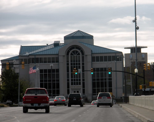
Anyone with more than a passing familiarity of Indiana landscapes can envision a county seat with its venerated central courthouse square.  For me, Crown Point, Greensburg, and Noblesville are among the first that come to mind.  However, despite being larger than any of the aforementioned cities, Muncie does not have a courthouse square that embeds itself in the typical visitor’s memory.  For the time being, this image from Google Streetview of the Delaware County Courthouse will have to suffice.  If this structure fails to convey the conventional image of a Midwestern county courthouse, that is quite obviously because it isn’t one.  The 19th century building that housed most Delaware County government functions met the wrecking ball in 1966, replaced shortly thereafter with this structure, now the Delaware County County Court administrative offices.  Here are some recent photos I’ve taken at approximately the same southeast corner, showing that landscape architects have spruced up the grounds since the above Flickr photo was taken, reducing the imperviousness of the plaza by adding rainwater gardens and a prominently located state/national flag.


By most estimates, it’s still not a very inspiring structure.  I’m hardly one to denigrate all of the brutalist architectural influences that this contemporary building evokes—after all, Muncie’s First Merchants Plaza is, in my opinion, a respectable brutalist building--but it’s hard to summon a great deal of love across the web for the new building: a simple Google Images search reveals far more links for the 19th century building that formerly stood at this site.   Quite simply, hardly anybody even cares enough about this building to photograph it.  And the actual courthouse, now called the Delaware County Justice Center and sitting a block north of this concrete structure (which is the actual original site for the historic courthouse), is hardly any better.


It, too, seems heavily fortified and uninviting, though at least it make some sense: this building also hosts the county's jail.

Aside from brutalism’s obvious precipitous fall from grace by the mid 1980s, what else is wrong with the first of these two buildings, which stands at Muncie’s implicit dead center?  Even with the flagpole or landscaping, it doesn’t convey the monumentality needed to make an identifiable landmark: not only is the court admin building the same height or smaller than some of the surrounding structures, the fenestration is fundamentally introverted and uninviting to passers-by.  The massing of the upper floors obscures any first-floor entrance in the shadows, so that the plaza is the only way to discern that this might be the building’s façade.   Not only does this new court lack a prominent apex that could attract the eye from a distance, but its intrinsic reticence nullifies any grandeur that could at least turn the courthouse plaza into a central node.  Here’s a view from the western side of the building:

Nothing more than a blank wall.  No lawn, no sculptures, no flags.  Visitors could walk or drive right by the courthouse without even noticing this building, and as a result, Muncie lacks the perceived core to its downtown that we have come to expect in most Indiana county seats.

The next contender for a central landmark, Muncie City Hall, built in 2005, achieves a certain stature as it looms over the bridge to the White River, directly to its northwest.

But it only functions as a hub by proxy: it is the next best thing, given the absence of the prominent central courthouse that visitors would expect.  Where does this leave a city in search of a landmark?  The Shafer Bell Tower at Ball State University certainly could function as a rallying point within the campus, but this relatively new structure belongs to the university, both de jure and metaphorically. 
It is virtually meaningless to the at least 60% of Muncie residents who have no affiliation with the school.

Not surprisingly, the community itself has attempted to place the crown on what it perceives to be the city’s presiding head, and two of the strongest contenders are particularly ironic.  The first, the Muncie Pole at the intersection of S. Tillotson Avenue and W. Jackson Street, has its own Facebook page, a Twitter feed, and it received media attention from as far away as Texas--all of it due to an engineering mistake during street and sidewalk improvements.  The utility pole actually sat in the right-of-way, with three reflective strips emblazoned along the lower part of the stanchion to keep vehicles from colliding into it.  Sure, Muncie has dozens of other poles to hoist traffic lights, but when locals referenced “The Muncie Pole”, everyone knew which one they were talking about: The Pole had earned its capital letters.  It was a landmark in itself, at least to the locals, and, due to its distinctiveness in a landscape that lacks prominent features, it may very well have stood out enough that visitors unfamiliar with Muncie could use it as a spatial mnemonic device.  The Muncie Pole gets the past tense treatment though; within the last month, city engineers and the public works department corrected their error and the pole was removed, leaving only a conventional traffic light pole, shielded from traffic by a grade separation and curb.  

Another oddly situated traffic light in the city may already qualify as a successor to the Muncie Pole, inheriting the name from its predecessor as it becomes this city’s most effective landmark and reference point.


Seeing a utility pole shellacked with postings is hardly uncommon, but this one doesn’t include want-ads, solicitations, meeting locations, missing pets or miracle weight loss strategies.  It’s devoted almost exclusively to decals reflective of the local “scene”, a region extending out to and including Indianapolis.  Local bands, festivals, breweries and non-profits all feature heavily.  Semantically, the content of this pole is a world apart from what one might expect to see in such a location: these stickers don’t carry precise, distinctive notifications intended to mobilize passers-by; instead, they tout brands which, in aggregate, appropriate far more visual significance than they would in isolation.  The pole is a repository for alternative culture—the touch-and-go pastiche approach is critical to its appeal, even as it might alienate others who merely see this as an act of vandalism.  (Eliciting a polarizing response is nearly always a good thing—fewer people are ambivalent, and the display thus becomes more memorable.)  While the earlier Muncie Pole earned its meme status through a variety of exogenous referential material (Twitter and Facebook, inter alia), this pole is a meme because of what it possesses and displays: that is, hands that have slapped the metal with adhesives have enhanced its role as a cultural signifier.

But why is this specific pole a contender for the NEW Muncie Pole when alternate poles abound?  What makes it so special?  It helps that it’s in a central location, near the heart of downtown Muncie.  But why not another downtown stop light pole?  Yet again, this pole earns its distinction through a probable error in calculating the point of installation, which is manifested by stepping backward several 

Usually a stanchion for a traffic light sits closer to the corner of the block; not at the halfway point of a storefront’s primary window.   Pivoting a bit to the right—
--it doesn’t remotely align with the handicapped ramp that connotes the crosswalk location.  It strangely hugs the building instead of the curb.  My estimate is the more practical location would be directly to the left of the manhole cover that sits closest to the building’s cornerstone.  But it clearly wasn’t meant to be.
The photo above suggests that the complementary pole on the other side integrates much better with the streetscape: it sits on a bulb-out in the sidewalk and enjoys a reasonable setback from the structure at this corner.  In fact, the photo below shows that this pole does not impinge upon either a building view or a pedestrian right-of-way along the sidewalk.
 
This pole--coincidentally in front of the bland, windowless court administration building--also lacks any of the stickers; it’s just another pole in Muncie, but certainly not the Muncie Pole.

The pole in front of Savage’s Ale House has already achieved enough salience in a small city like Muncie that it functions as a minor downtown meme.  If Ball State University students decide that it is the ideal point of reference downtown (“Let’s meet at the pole and decide where to go from there”), then it has, in the context of Kevin Lynch’s urban semiotics, essentially become a landmark—the substitute for the Delaware County Courthouse demolished decades ago, and ironically standing directly across from the forgettable modern courthouse of today, as the photos indicate.   Here below, is a view looking northward, with the intersection featuring the New Muncie Pole in the background and the modern Delaware County Courthouse in the foreground to the right.
And here's a close-up on the building with the Muncie Pole.  Although on the left in the above photo, in the photo below the three-story building is in the center.


Urban landmarks tend to include at least a little bit of architectural bombast; normally they are very deliberately the most prominent visible element from the built environment.  The architect intended nothing less than a centerpiece.  The Muncie Poles (both the deceased one on Facebook and its slightly more urban successor) owe their existence to what is most likely an unconscious err in calculation, but that is enough to make them an anomaly in a landscape riddled with sameness.  And for Muncie, a previously mundane metal pole has the potential to become the epicenter of pedestrianized student culture…at least until one of those sites of former buildings that are now parking lots becomes gets developed into bigger, better, more visually distinct landmark than a stop light post.  Economy notwithstanding, a hip, stickered pole shouldn’t be tough to outdo.


Friday, December 24, 2010

DUST: What does the flag capture?

My suspicion is that I have less to say on this subject than I’d like to think, but I’m still feeling my way around in terms of the appropriateness of featuring certain material on this blog, so in the meantime it is best that I linger on the fluffier subjects. And I can’t help but indulge in my love of flags and all their expressive content while I live on a multinational military base. As my previous Afghanistan post indicated, they’re everywhere. They are less prevalent in their original, fluttering cloth form on an American base like Bagram Air Field. But the other two bases in which I have lived, Kandahar and now Camp Marmal, lack a single nation’s dominant military presence, and flag poles stand sentinel at various points across both bases.

The above photos, both taken at Kandahar, are hardly the greatest at capturing the semantic properties of flags. In the first photo, the flag—possibly German—projects just to the right of the street sign with “Illinois” misspelled, and in the second photo, a Danish flag (if I recall correctly) spears the sky in the distance on the left, slightly higher than the power lines. I never intended the flag to be a focal point in these photos. But they do at least suggest the flags’ power to serve as monuments in a base setting, primarily through two different expressive tools. When propelled on poles or stanchions, they punctuate the landscape by simply being taller than most structures amidst a flat, treeless terrain. And the banners themselves achieve prominence through their hues: bold colors contrast to the sepia tones of dust and particulate matter that veils the horizon, even when low wind levels keep the flag furled. The example below in Camp Marmal with a Norwegian flag gets the point across somewhat better, thanks to cleaner air and the relative absence of power lines.

These contrasts help to explain how flags engage with their surroundings at the sensory level, but the question remains how they operate spatially. In short, how do they govern the area around them, if they have any control at all? Obviously the devices used in display of the flag matter critically here. Within the context of a coalition base made up of multiple national armies such as this, the flag most clearly connotes two seemingly paradoxical territorial ideas: 1) that the area below the flag is part of that nation’s compound and “belongs” to it, so that the flag presides over that portion of the base; and 2) that the particular nation has a presence on this base and is a “team player” in the Afghanistan conflict as a whole. It’s quite simple. It operates much the same way when flags project from a particular movable object, such as the Croatian flags on the MRAPs below:

The red white and blue (also an adhesive on the side of the vehicle) is the national flag; the other one pertains to a particular mission. Obviously these vehicular flags serve primarily to identify the nationality owning that vehicle, which means they do not appropriate the same amount of space as the ones tethered to poles planted in the ground. But these flags can venture outside the wire and still effectively indicate Croatia’s participation in combat.

The use of words “govern”, “preside”, and “appropriate” only effectively applies, though, to flags in isolation. Throughout many of these coalition bases, flags are grouped in a formation of multiple poles, like the one below in Camp Nidaros, a Norwegian compound nestled within Camp Marmal:

Despite the fact that Marmal is a German-owned base and is the headquarters for Northern Regional Command (led by a German General), these flag formations tend to be as egalitarian as possible, most likely in an effort to demonstrate that no one country’s forces are hierarchically superior to another. The formation in the above photo seems particularly self-abnegating, because the banners attached to the poles are not even national flags: they are narrow streamers with a different configuration of each country’s respective national colors. They diffidently reference the country without proclaiming it. If I can interpret them correctly, this display shows, from left to right, the colors of Norway, Finland, Latvia, Sweden, and Germany. All of those nationalities with the exception of Germany have troops stationed in this particular compound Camp Nidaros; billeting for Germany is scattered elsewhere across the base. One would think that either the compound’s commander (Norway) or the base commander (Germany) would occupy the central flag pole to show ownership. Instead, that pole belongs to Latvia, while Norway and Germany occupy the peripheries. I have no doubt that this configuration was conscious. Place a flag in the company of others and the aforementioned territorial paradox—that of simultaneous individual ownership and operating as a team—immediately collapses, because the ability to denote “owning” a portion of the base evaporates. Here’s another formation at Camp Marmal that coyly dissolves hierarchy:

The flags of the United States, Germany, Afghanistan, and the U.S. Navy all hang at half-mast. The deployment of an even number of flags clearly avoids placing any one flag at the center, and in this case, the host nation, Afghanistan, gets equal representation with two countries and one branch of the military of that same country. The building to the left houses exclusively US forces, predominantly associated with the Navy, yet two other nations’ flags wave out front.


The half-mast configuration, nearly always intended to show mournful deference for the recently deceased, assumes a new poignancy with the next photo, taken just minutes after the previous, as dusk had set in:

This event comprises an unannounced visit by German Chancellor Angela Merkel on the evening of December 18, 2010, speaking at the memorial of a German soldier who had died in an accident the preceding day . Notice that in the first of those two photos, the German flag is half-mast. But here as elsewhere, the presentation soon diverted to the shared responsibility, as Merkel continued her brief speech about Germany’s involvement in Afghanistan. By the conclusion, the flag was full-mast along with the others.

Again, the flag formation avoids placing any nation in a position of primacy. Germany, the owner of the base, stands at an unremarkable position of third from the left. The United States, the second largest presence, sits on the far right. And while there are an odd number of poles (21), allowing the potential for one pole to take center place, the framing of the poles around a central memorial places eleven on the left and ten on the right; no nation takes the center stage. Here are some close-ups of the memorial in daylight without the crowd:


Protocol for the display of the US flag requires that it observe international standards when juxtaposed with other nations, and none should rest above another at a time of peace. Obviously the existence of Camp Marmal is predicated on this precisely not being a time of peace, and yet the coalition nations (including the euphemistic “host nation” Afghanistan) still observe the peaceful display here as in every other location where more than one national flag presides over the space. Yet every time the flag waves in isolation, it proclaims its territory. The difference, it seems, is the level of conscious thought invested in the display: asserting national presence and ownership requires demands very little additional scrutiny, and, cheaply fluttering from the back of a Hummer, almost seems like an afterthought. Conversely, the assembly of a group of national flags in mutual respect requires serious deliberation.


The semiotics that underpins any display of multiple flags operate differently when the display takes place indoors. The pictures below take place in a DFAC (Dining Facility) at Kandahar Air Field:

It seems to be common practice to decorate the dining halls in the larger bases with national flags. But the flags preside over clearly bounded space here; any assertion of territoriality simply adds a dimension to the message already communicated by four walls. The display of flags indoors does not convey the potentially contentious air of imperial entitlement that it has the potential to suggest when outdoors; the flags address an enclosed space and not the open air, or the land itself. Perhaps it’s just me, but flags also lose expressive impact when they are limp and static; the fluttering of a flag from wind, however mild that wind may be, projects authority that it is hard for a motionless flag to muster. So while the exterior display of flags seems particularly sensitive to the fact that these nations collectively occupy a land with which they are waging war against a certain faction, all the rules fall by the wayside when flags hang indoors. No one seems particularly sensitive of who owns what. The PAX terminal at Camp Marmal is an excellent example:

Near the back of the building on the right is a colossal German flag—the country that owns the base. The other flags in the photo represent the three nationalities with the next largest presence on the base: in the far distance (with the checkered shield) is Croatia; to the right of the German flag is the American flag; to its right (partly cut off by the picture’s edge) is the Norwegian flag. All of these flags occupy a noticeable second tier to Germany. Pan to the right, however, and the message becomes a bit more muddled.

From left to right, the picture shows Norway again (same flag as the previous photo), Sweden, Finland, Belgium, Montenegro, Slovakia, Latvia, and part of Turkey. The positioning, size, and even the choice of nationalities here seem to be based more on expediency than any sort of conceived arrangement. The spacing between them seems inconsistent, the size does not fit with either a hierarchy or an egalitarian coalition, and while Turkey and Slovakia may be part of the coalition, they have yet to show any presence at Camp Marmal, while other nations clearly berthed here have had their flags omitted. Anyone plunked into this facility while blindfolded would draw the conclusion, upon removing the blindfold, that it is a German-run building. Provided that he or she knows the German flag, the enormous mural makes it obvious. But the participation of these other nations and how they fit into the system on this base is completely undefined. The flags help add color to an otherwise sparse terminal; otherwise they might as well be garland.


The DFAC at Camp Marmal has a similar configuration on one of its walls, with even more diluted semantic results:

Again, we see a row of thumbtacked flags used as decoration, with little regard for placement. Is this display trying to show a hierarchy, with the NATO flag (the white compass on a blue field) taking precedence in the middle of all the participating partners? That doesn’t work, because the NATO flag is not in the middle; there cannot be a middle position with twelve flags. Are the participants all on equal footing? Perhaps they are, but the disparity in size of the flags would not suggest it:

Montenegro and Latvia are huge compared to Bosnia and Herzegovina, the United States, and NATO. Again, it seems the decorators bought whatever size flag was available (and whatever relevant nationality they could find) in order simply to decorate, without intending any other message. Compare this to the precision and thought that they applied to the adornment of another wall, with photos of the Afghan countryside:

It’s much easier to get away with a sloppy flag display in an indoor setting, where there is less at stake.


No doubt this analysis may come across as one of my much-ado-about-nothing posts. After all, they’re just flags, and it is possible that I’m projecting my own fascination with the topic by inferring more out of it than anyone ever intended. But flags are also a powerful diplomatic tool, and they may be the most widely available, transportable material to clearly convey both a nation-state’s government and often the very essence of the land. Witness the recent global coverage of burnings of the American, Danish, or Israeli flag and it would be hard to shrug aside its potency within a broader understanding of semiotics. In a multinational setting rife with the potential for a serious imbroglio, a blasé display of a nation’s flag could set tempers flaring.


The use of flags on these bases suggests that the outdoor display has significant political ramifications, but indoor displays do not matter so much. Maybe it’s true that an indoor display will never carry the same territorial weight, but it can still result in a transnational contretemps. A recent meeting of the Association of Southeast Asian Nations, hosted by President Obama in New York City, aroused some ire and international press when the Philippine flag was accidentally displayed upside-down, indicating the nation to be in a state of war. The problem with the indoor settings at the PAX and DFAC in Camp Marmal isn’t that they’re purely hierarchical or egalitarian; it’s that they’re neither, or a little of both. National flags might be beautiful to some, but they are too semantically rich to serve a purely aesthetic purpose.


I conclude with one particularly interesting flag that can serve on its own as a microcosm for what a carless flag display loses semantically. The national flag of Croatia has already graced this blog post a couple of times; they constitute one of the largest forces at Camp Marmal.

This brief analysis constitutes a bit more of what I know about vexillology, the study of flags as semiotics, which I covered at much greater length in a blog post on the Maryland flag many moons ago. The Croatian flag is by no means a particularly bad flag; it certainly looks far more elegant than the contrived, deer-on-hind-legs antiques that constitute many of the US state flags. But the real core of the flag is the checkered shield, serving as the flag's central charge; this escutcheon pattern predominates on a lot of the exercise gear that the Croats wear around the base in their down time. I particularly like the way the checkers align with the bottom blue fess (stripe). The decorative "flair" sitting in the place of a coronet above the checkers might help to embellish the shield, but they erode the symmetry, suggest hierarchy (some emblems might be more important than others), and they complicate the entire presentation, thereby diluting the message and the overall readability of the flag. The North American Vexillological Association asserts that the key indicator of an effective flag is that a child should be able to draw it from memory. Its impact should be immediate and unforced. By no means is the code of the NAVA the Gospel on flags, but I cannot imagine most six-year olds reproducing the Croatian flag after just a few minutes. Most 40-year-olds wouldn’t do a great job either.


The weaknesses in the Croatian flag echo the problems with the display of national flags in the interior public spaces of Camp Marmal, or many other situations where they serve an ornamental purpose. The display of flags to convey either hierarchy or egalitarianism is fine; there are no inherent faults in either of these organizing principles. The deficiency lies in when the display blurs the line between the two—when it is ambiguous as to which entity, if any, should stand out—which is precisely the problem with the array of symbols in the Croatian flag and the panoply in the DFAC. Ambiguity serves a distinct aesthetic purpose, but a flag’s communicative intent should always be clear. We don’t make light of the most prominent proxy for nationhood, whether in an Olympic natatorium or in a war zone.

Monday, November 29, 2010

DUST: Never mind the bollards.

Readers and friends have been nagging me for another, more detailed article on Afghanistan. I wanted to get a blog post out before the end of the month, and tomorrow I leave for an indefinite amount of time to explore yet two more bases (my fourth and fifth since I’ve been here in the Afghan theater). Internet access for my personal computer—where I store all my photos—is still limited but improving, little by little. The biggest hindrance now, though, is that I have not been able to vet my observations for national security concerns. I have learned that photography of some things on base is strictly verboten, but I haven’t learned exactly what may compromise Department of Defense internal information—and it’s possible that something seemingly innocuous all of a sudden becomes classifiable when subject to further analytical scrutiny.

Which is why I’ve chosen something for my first real essay which is so mundane that you can find it anywhere in the US. And I’ve clearly always had a penchant for the mundane. The subject is bollards, and my most recent home base, Camp Marmal outside the city of Mazar-e-Sharif in northern Afghanistan, has them everywhere:


I realize that “bollard” isn’t exactly part of common parlance, so if the photo above didn’t make it clear, a bollard is any short post or impediment, usually of concrete, that restricts vehicular movement. Apparently it's more of a British term; “bollard” in the American sense is mostly nautical, referring to the post at a wharf to which mooring lines from vessels are tied. Typically bollards shield pedestrians from cars, and that was most likely the intent of the German engineers who built the original infrastructure at this base six or seven years ago. Unlike some of the other bases I’ve visited, Camp Marmal has made a conspicuous effort to accommodate pedestrians. It would seem foolish not to do so: nearly everyone on a base gets around by foot, and only the largest ones can justify a shuttle that would comprise the equivalent of mass transit. In addition, most bases are almost completely unlit at night, so it is incredibly dangerous to walk alongside a road without sidewalks. Yet the much larger, NATO-managed Kandahar Air Field in the south of the country has virtually no sidewalks. Everyone is forced to walk in a bed of rocks—they’re too big to be considered gravel—similar to the groundscape visible in the photos above. (Nearly everyone at Kandahar also wears reflector belts at night; you could receive a fine if you don’t.) The bollards at Camp Marmal also severely restrict parking, since a vehicle cannot park on the side of the roads, all of which are only two lanes wide. Kandahar, conversely, lacks bollards for the most part, and drivers park willy-nilly with little consequence. The bollards here aren’t aesthetic, like one might see in a public square; they are as coldly utilitarian as virtually everything else in the austere landscape of an Afghanistan military installation.

They get the job done, but are they fully necessary? I regret now that my photos don’t capture it as well, but a closer look reveals that the pedestrian environment on the opposite side of the street is not quite the same.

No sidewalk there. For the most part, Camp Marmal has only invested in sidewalks on one side of the road, which is better than nothing, but much of the space at the verge on the other side is devoted to an open drainage ditch, to accommodate the water during the rare but violent Afghan thunderstorms.

But wouldn’t these drainage ditches serve as an impediment to vehicles in themselves, and are the bollards really necessary on that side of the street? The truth is, I don’t entirely know the answer. My guess is that these ditches would restrict virtually all cars in a non-military setting, but nearly a third of the locomotives on an Afghan base are the gargantuan MRAPs, whose tires could easily negotiate a mere drainage ditch. Then again, MRAPs are among the most top-heavy vehicles in existence, so even if they can handle the groove, it could disrupt their center of gravity enough to cause a rollover. Ideally, a careful consideration of the necessity of bollards at each location—rather than just installing them en masse as a precaution, could have saved a great deal of money, if it turns out that stormwater management infrastructure genuinely serves much the same purpose.

Elsewhere in the base, some construction managers with a more artistic bent have tried to improve a different type of bollard, this time at a bridge crossing.
The colors of the German flag clearly evoke a patriotic gesture imparted upon the bollard in the foreground. But what about that striped object in the distance? Could Dr. Seuss’s Cat in the Hat have met its demise in a bed of wet cement?


No, it’s another painted bollard, this time apparently referencing the American flag, with clearly less successful results. I suspect that the artist chose these two flags because the countries represent the overwhelming majority of the troops bedded at Camp Marmal (the remaining 20% consist largely of Scandinavians and Balkans), but the aesthetic gesture clearly wasn’t as well thought out. I had to pass by this multiple times before I determined it was a flag, even though I should have known, since it leads to the entrance of the American compound. But the artist clearly didn’t refine his or her space management skills.


At least all 47 states are accounted for.

Sunday, June 27, 2010

Civil unrest along the highway.

It is easy to attribute The Great Recession to the increasingly visible decision among many states to cut long-standing social services. In a good portion of the country, publicly supported interstate rest areas have lost much of their reason for being; with so many other options at the exit ramps along our many limited-access highways, it has been hard for them to compete. The average rest area may have much better maintained restrooms than the typical gas station, but food options rarely extend beyond the content of a few vending machines. Picnic areas are a nice touch, but they often rely on visitors packing their lunches and eating them at the site, as well as comfortable weather. These days, most interstate exits leading to a town of at least 5,000 will have at least a couple full service restaurants immediately after the exit ramp. And it’s impossible to recognize the offerings of gas stations without conceding that gasoline may be the most critical commodity that rest areas—outside of the occasional travel plazas on toll roads—typically lack.

Thus, a number of states, in an effort to slash the budgets of their Departments of Transportation, have begun shuttering rest areas. USA Today reported last year that Virginia has been among the most aggressive, slicing nearly half. New Hampshire and Vermont have cut quite a few. Georgia has targeted its rest areas that are close to large cities (where those same services are available in spades), as have Maryland, Michigan, and New Jersey. The aforementioned states, though, are all situated east of the Great Plains, where the distances between settlements are relatively short. However, when Arizona followed suit later in the year, closing an astounding 13 of its 18 rest areas, the action elicited particularly emotional dissent from residents, no doubt attributable to the fact that, throughout the west, the roadside towns spaced between the major cities are few and far between. A state like Arizona may be reasonably well populated, but a disproportionate number of people there call metro Phoenix or Tucson their home, while vast stretches of the Arizona back country are neither inhabited nor serviced with most infrastructure. It’s far tougher in the Mojave Desert than in Connecticut to find an exit with gas and a McDonald’s and a Subway. Truckers, in particular, depend on a secure place to pull off and rest, since many carry their cargo over several nights. Within just the past few days, Arizona’s Department of Transportation announced it was reopening five of the thirteen rest areas that it had previously closed.

This Arizona reprieve suggests that, in at least some parts of the country, the decommissioning of rest areas may manifest itself in a tug-of-war directly paralleling the periods of economic hardship. Clearly a number of states have carefully evaluated the necessity in recent years of these roadside oases—are they the sine qua non for weary travelers that they were in the past? Two bordering southern states offer the most profound contrast regarding how their governments value these once-cherished public services: Louisiana has been implementing austerity measures to its interstate travelers for quite some time, cutting more than two-thirds of its facilities, some of them as long ago as 2000. Conversely, Texas—consistently demonstrating greater resiliency to the recession than most other states—has been using its share of stimulus money to refine its inventory of rest areas. After closing a few of the older ones, the State has also built new facilities, enhancing the amenities offered in the most frequented existing structures, from children’s play zones, pet walking areas, and wireless internet access. The level of investment manifests itself at the Texas-Louisiana border along Interstate 10, near the City of Orange:

Even the most tight-fisted of states would concede that a service station at a boundary should be among the last to get cut. After all, these facilities are often the first structure a motorist encounters after crossing the state line—they aren’t necessarily mere rest areas; frequently they’re welcome centers, and they routinely refer to themselves as such, or in this case, a Travel Information Center. The air-conditioned facility includes interpretive displays, a professional travel counselor, diaper changing stations, a panoply of promotional material for tourist activities in southeast Texas, and a video theatre. Even more impressive is the facility’s back yard, which directly overlooks a vast swamp filled with bald cypress and water tupelo.


This handsome elevated pathway extends about one-tenth of a mile and features educational displays about the ecology of the swamp. The front of the facility shows a comparable level of investment.


The small plaza features a display of flags that loosely encompass Texas’ history as a territory, sovereign nation, and state: the lone star flag, the US flag, flags of Mexico and Spain, and even the French coat-of-arms flag from the 18th century (the northern part of Texas was part of the Louisiana Purchase). But most significant is the Lone Star sculpture in the background of that photo.


From its position immediately to the north of I-10, visible on the right as one crosses the Texas line, this emblem almost achieves landmark status. It’s not quite big or boldly colored enough to stand out from a great distance, but the flags in the plaza puncture the sky and draw the eyes to the site, where they will immediately shift toward the approximately 30-foot sculpture—an effective piece of minimalist pop art that succinctly embodies the spirit of Texas. During my brief visit, several other visitors had their pictures taken in front of the sculpture, and the decision to bury one of the star’s five points has made it appear sturdier and more approachable as a playground feature for children, manifested in the above photo. The flags and the Lone Star sculpture harmonize to form one of the most eye-catching gateways at a state boundary; they more than compensate for the rest area/welcome center facility, which is situated far enough off the road that it would not easily stand out without a prominent fixture poised directly off the highway. The monumentality of the flag/sculpture combination also completely overpowers this far more conventional gateway sign, a little further down the road:


With all these allurements, it’s no surprise that Texas rest areas rate highly among motorists, judging from the array of comments visible online. And having such a comfortable facility right at the boundary is an excellent way of rolling out the welcome mat. But the Department of Transportation has also come under fire for what some would argue is an irresponsible use of stimulus/taxpayer money for the construction of unnecessarily lavish facilities.


Louisiana has taken an opposite approach: the state’s Department of Transportation and Development (DOTD) has virtually no remaining rest areas. The few that remain overwhelmingly sit at state border crossings, like this one on southbound I-55, at the Louisiana-Mississippi line.
It’s well maintained, and the 24-hour bathrooms (in the detached facility to the left of the arcade) are simple but clean. The grounds are small but feature elegant renditions of the amenities we have come to expect at most rest areas.
It does not have any walkable nature trails with educational displays; the rest area’s property lines are relatively small.

Though by no means a disaster, the primary landmark is less effective.
I hate to assert something as shallow as “bigger is better”, but this replica of the shape of Louisiana only stands about 7 feet tall, and while it announces the entrance to the state, it lacks the sublime monumentality of Texas’ flag and sculpture combination. It’s just not big enough to stand out. The absence of any metaphoric content to compare with a proud lone star means this sculpture/sign is semantically almost identical to the blue “Welcome to Louisiana” metal sign that preceded it 300 feet before the rest area (seen in a photo above). The redundancy of these two markers weakens their individual impact. This concrete replica of the state boundaries also sets several yards off from the entrance to the facilities, so it is not integrated into a plaza. Thus, it neither catches the eye nor attracts visitors to take their pictures in front of it when they park at the rest area.

The primary structure to this Louisiana pit stop, employing a full wrap-around portico currently popular in new housing construction throughout the South, hosts the welcome center.

It was not open at the time of this visit, but I’ve been to one in the past, and they feature at least a few of the same amenities as the Travel Information Center in Texas: free wireless in most locations (including the one pictured), maps, tourist activity guides, and trained specialists. They are also under management by the Department of Culture, Recreation and Tourism (CRT).

This placard on the side of the building indicates construction in 2002, a few years after the state began closing its rest areas. Thus, the Foster administration most likely decided to cut the aging, infrequently used, low-service rest areas and consolidate the rest of the activities by building these new rest area/welcome center combos, nearly all of which lie on interstates as they cross into Louisiana boundaries. Despite the enhanced programming at these welcome centers, the cut from 34 rest areas to around 10 (depending on what you count) has surely saved significant operational costs, particularly freeing some of the DOTD’s budget as part of the staffing/programmatic burden has shifted to CRT. Among the few rest areas in Louisiana not at the boundary is the Atchafalaya Welcome Center, at Mile Mark 122 on I-10. I have visited this as well, and it has the same amenities as the welcome centers at state lines, but both directions of traffic flow are funneled to one facility through an exit ramp that passes beneath the highway; again, another device to cut operational costs.

It may appear from this essay that I am singing the praises of the Texas approach of bold and monumental. The state has decided to expand and enhance its artillery of rest areas to wow all the passers-by. But is the Texas approach really that wise? Rather than simply letting businesses take over, it would appear that the State has decided to try outdoing the private sector. The rest area on I-10 at Orange, TX is less of a visitor information center and more of a small museum, which means the State is trying to entice visitors through unique features that the private sector is unlikely to provide. But visitors will still go elsewhere when looking for food or gas—two services which it is unlikely the State could ever justify providing at taxpayers’ expense. In this country in particular, the public sector is nearly always on shaky ground when it attempts to compete with a service the private sector can provide: many Americans perceive that it would be an unnecessary intrusion on private sector territory. In fact, federal law prohibits the privatization of rest areas, based on a 1956 law that intended to protect small businesses when a limited access highway passing through potentially diverted their customer base. (Toll roads were largely exempt because they pre-dated the Interstate Highway Act, which is why the travel plazas on the Pennsylvania Turnpike etc are chock-full of national chains.) Arizona’s DOT has pushed for a change in this federal law, further distancing states from the responsibility of furnishing and maintaining rest areas. Should the federal law be repealed, Texas taxpayers could be in for a rude awakening, having used so much federal stimulus money on extravagant rest area enhancement projects.

Louisiana’s approach is clearly more modest, and it surely elicited grumbling from truckers or locals who now find they have significantly fewer options on the highways. But the State has smartly packaged its formidable cuts on rest areas through the veneer of enhanced tourism: motorists just entering the state still can enjoy 24-hour restrooms, and, during normal business hours, a welcome center committed to optimizing their visit to the state. Meanwhile, new chain restaurants, gas stations, and hotels spring up (and shut down) every day at various exits, creating an overwhelming monotony to the interstate highway traveling experience. Run-of-the-mill rest areas were just another part of that tired rhythm. Whether they’re bold, lavish, and monumental like Texas or modest, sensible, and dull like Louisiana, they reflect the widely divergent cultural attitudes toward a government service which has become almost an institution in itself—but one that clearly needs a reinvention in the wake of our increasingly cluttered transcontinental landscape.