Wednesday, June 16, 2010

No surer sign of Texas envy.

Unfortunately job commitments continue to prevent me from devoting the time to assemble pictures and a credible analysis for the second half of my blog post on neighborhoods in Baton Rouge, but the end is in sight! In the meantime, I can at least briefly explore a topic which may already be widely known among the readers here, but it certainly seems to be common knowledge among the folks from the state who claim this as their own:


Yes, the Lone Star flag flies high in national prominence and proudly among Texans—no doubt they brandish it a bit more boldly than most states would; it is Texas, after all. But from almost any semiotic angle, it’s just a good flag. As I blogged about many months ago when looking at the Maryland flag (waved equally ostentatiously), the communicative properties of flags claims an area of study all its own, known as vexillology. And your average vexillologist would assert that the best flags possess some or all of the following features: simplicity of imagery; direct correlative meaning through colors and patterns; and a scarcity of text or direct illustrations. The Texas flag can claim all of these, and it has helped make the flag among the most memorable state flags in the nation.

But Texans have elevated theirs to an even higher status than most, if not all, other states. It is not uncommon for car dealerships to wave American flags, or even some other promotional flag. But where else besides Texas could one see a flag of this size? The one below (and in the first photo) sits along Interstate 45 at a car dealership slightly north of Galveston.

Equally striking is the absence of an American flag nearby on the dealership’s property. Such deference to a state—at the implied lack of recognition of the nation—would raise an eyebrow elsewhere in the country, but is a common sight in the Lone Star State. Equally routine is the flying of the flag on a separate pole as the US flag, but at the same height.

This image has fuelled the widespread myth that Texas, as a formerly independent nation, is the only one permitted by federal law to fly at the same height as the US flag. Not true. While federal codes do prescribe standards for the handling and display of state flags, they do encourage a variety of approaches beyond conveying that the state flag is superior. Such a notion would also carry an undeniable whiff of favoritism out of Washington DC, and lawyers may argue that preferential treatment for a single state would implicitly violate the Equal Protection Clause.

So maybe it does come down to vexillology to explain the pre-eminence of the Texas flag. The symbols are bold, spartan, and clearly evocative of Texas’ history as a briefly independent nation. The fact remains that Texan pride is only a small component, and the ease for conveying the messages implied by the flag helps it transcend all the lousy state flags out there. New Yorkers, Floridians, and Californians also claim sizable populations but their respective flags are hardly as wedded to the state identity. Maybe if Texas’ flag were as cluttered and unmemorable as that of New York, the state’s residents wouldn’t have it plastered across any feasible flat surface. But the fact remains that they do have this advantage (as do Maryland, and South Carolina, and New Mexico, and all the other places with unambiguously good flags) and when 25 million people can claim it as the banner for their state’s identity, it’s hard for people in the other 49 to overlook it.

Thursday, June 10, 2010

Getting from A to B via Z(ig-zags).

I’m in the midst of a particularly intense period at work right now, and I have had literally no time to post. A computer slow-down at the moment is all that’s giving me a breather to squeeze a quick observation in. The second part of my dissection of the neighborhoods/subdivisions in Baton Rouge will have to wait until this crunch time ends—hopefully within a few days.

In the meantime, I offer a reflection on a topic of considerable interest to me—the engineering of spaces to accommodate the disabled. For the most part, the infrastructure that aids mobility for the vision-impaired or wheelchair-bound has blended in with the surroundings fairly effectively. Phone booths, rendered non-compliant with the 1990 Americans with Disabilities act, have become a rare sight—all we generally encounter today are pay phones poised on metal poles. (And how much longer will we even see those?) In a matter of years, audible “chirping” pedestrian crossing signals will be commonplace. Nearly all public restrooms serving a facility over a certain minimum size have at least one double-wide stall with support bars. Most fire alarms in buildings feature flashing lights for those who cannot hear. And the novelty of wheelchair access ramps has worn down, so chances are we don’t even notice them most of the time.

But not always.


This small college in West Virginia features a central foyer in its principal lecture hall, and the seating for the two large lecture rooms on either side is just as heavily sloped. As anyone who has been to West Virginia knows, it is a state of great topographic variety—the most consistently rugged core of Appalachia. It is not uncommon for the north side entrance to a structure to be at an entirely different grade from the south side. The slope upon which this building stands is unsurprising; the prevalence of the handicapped ramp is unsurpassed. Regardless of which side a person enters, it is the only thing that stands out.


Though the appearance of the building does not suggest it to be particularly old, I would venture a bet that it still predates the Americans with Disabilities Act—it is almost certainly a retrofit. I can think of no other reason why an architect would design a ramp (or why the University’s facilities planners would approve of it) so that it becomes the only means of negotiating a grade change. Clearly the slope is severe enough that this was the only way of integrating a usable handicapped ramp into the relatively limited space that still falls under maximum incline standards, but it is visual obstruction as well as a physical one for the 99% of people who would be perfectly content with using stairs. They have to use the ramp as well.

The problem at this school represents a strange inverse of the predicament I blogged about a few weeks ago at the Memphis Airport, in which the absence of ramps along a concourse means that stairs are the principal option for managing a grade change. Wheelchairs can negotiate through a neighboring elevator, but what about an emergency evacuation when elevators may be down? Ramps provide the best option. Meanwhile, here in West Virginia, the absence of stairs at the buildings primary arterial could cause far more congestion for the majority of students, who would otherwise use stairs to evacuate.

These dilemmas demonstrate more vividly the challenges of accommodating extreme situations, for which external constraints are often formidable. Is it reasonable to plan for highly unlikely evacuation scenarios? Clearly the introduction many decades ago of fire codes and mandatory exit signage suggests that the public has continuously respected alterations in building construction that favor as close to a universalizing of safety as possible. But the continued introduction of new safety mechanisms also proves that universal design—the closest means of articulating the goal—is an incremental process, and it perpetually pursues the metric for perfection (i.e., universality) that will continue to dwell out of reach of engineers and designers as new demands for safety and accessibility pose increasingly diverse constraints. As cynical as this may sound, imperfection is a fact of life and will always stimulate human ingenuity to strive for improvement. The humble little building in the above photos is part of a medical school, and no sensible physician would ever claim to go into the profession with the goal of curing all disease. An irritant for one person may be the anodyne for another; solutions to the built environment are no different.

Thursday, June 3, 2010

There goes the neighborhood, Part I: Separating the Typologies.


I have long wondered what forces were at work that spurred the transition from using the term “neighborhood” to the more contemporary “subdivision” when referring to residential communities in metropolitan environments. One could easily rattle off some widely held assumptions that more often than not distinguish the two, and I’m bold enough to assert that many of my readers would probably agree with me. What is the difference between a neighborhood and a subdivision?

- Neighborhoods are older; subdivisions are new.
- Neighborhoods are urban; subdivisions are suburban.
- Neighborhoods support walking through high density in order to meet daily needs; subdivisions sprawl and require a car to get even a can of Coke.
- Neighborhoods are interconnected to the surrounding area through a grid; subdivisions tend to end in cul-de-sacs.
- Neighborhoods feature small lots and pocket parks; subdivisions offer abundant green in the form of huge private front and back yards.
- Neighborhoods use very subtle signage (if they have any at all); subdivisions announce their names loudly at the very entrance.
- Neighborhoods emphasize a community and shared experiences more than the private residence; subdivisions commodify the housing so that the buyer’s goal is the domicile filled with the most amenities.

All of the above points are obvious glittering generalities, and most of them have a tenor that tacitly sneers upon the subdivision. This line-in-the-sand dichotomy does not escape the radar of those who value urban living, many of whom are seeking something that fits the above rigid standards for a neighborhood. If it lacks a certain je ne sais quoi, somehow it isn’t a “real” neighborhood. Communities without an urban scale, old housing, or walkability far too often suffer the broad dismissal of lacking neighborhood-ness (and thus being a mere subdivision) by the lovers of cities. Meanwhile, those who live in the suburban developments that city-lovers deride often quietly avoid the “subdivision” appellation as well, as though it were a pejorative. People are far more likely to promote their community as a real neighborhood rather than a subdivision, and virtually no civic groups have referred to themselves as a “Subdivision Association”. The term carries a vague whiff of exurban blandness. In short, our cultural perceptions often cause us to infer that neighborhoods are to subdivisions what main streets are to strip malls.

Though it is easy to draw the conclusion that subdivisions and neighborhoods have different cultural backgrounds, it’s nearly impossible to learn where the semantic territory to one begins and the other ends. Could they essentially be the same, but with vaguely different connotations? An examination of one of Baton Rouge’s most prestigious districts/communities/enclaves—to pull a few more words from the lexicon—reveals how that terminology may evolve over time.


The city’s Garden District (subtly revealed to passers-by though the wooden sign) may be the one most closely associated with old money, even by this relatively young city’s standards. According to the neighborhood’s Civic Association, the area essentially began as three independent smaller residential developments dating initially from the 1910’s: Roseland Terrace (colored in red), Drehr Place (colored in blue), and Kleinert Terrace (colored in green).


Interestingly, the Civic Association refers to Roseland Terrace as Baton Rouge’s first subdivision, platted in 1911 by the Zadok Realty Company—at a time when it was largely perceived to be a risk because the property was too far out in the country, a little over a mile away from the city center. The developers clearly understood the market as they tailored it to a middle- and upper-middle class population, with a diversity of housing sizes and styles, generous planting of trees along the streets, concealed utility poles in the rear alleyways, and larger lots than was custom at the time (though still small by today’s standards).

Below is the most commonly visible architectural typology, the Louisiana bungalow:


Other homes in the area, lining the stately Park Boulevard, are a bit more grandiose, such as this one taking proud advantage of the visible corner:


The narrower residential streets often mix styles and sizes.


The broader streets routinely feature a wide median—or “neutral ground” in South Louisiana—lined with the regions archetypal tree, the broadly canopied live oak (apologies for the blurred quality):

The subdivision to the east, Drehr Place, features some particularly stately homes, among the most valuable residential real estate in all of Baton Rouge.


And then Kleinert Terrace echoes the street configuration, with its diligent intervals of live oaks in the neutral ground, stretching across to the front yards.


The truth is, all of these communities—introduced to the National Register over the past 30 years—began as the dreaded subdivision. Only as their identities fused through their proximity to downtown and shared affluence did they assume the name the Garden District, perhaps borrowed from the opulent counterpart in the neighboring city of New Orleans 70 miles to the southeast. By today’s standards, the Garden District is a neighborhood, but it was—like virtually every residential development for more than one family since codified land title began—a subdivision from a single large parcel, divided into much smaller lots during the platting and site planning process. Today the Garden District—comprised of Roseland Terrace, Drehr Place, and Kleinert Terrace—is one of Baton Rouge’s elite neighborhoods, but it followed more or less the same administrative proceedings as your average vinyl village in the exurbs.

So how did the Garden District elevate itself from a group of subdivisions into a neighborhood? Was it a conscious decision? I’m not sure it was, but it took several smaller evolutionary intervals to get there, some of which were quite conscious, including the very conspicuous name change. Those aspirational steps may illuminate the process by which this community adopted the characteristics that one stereotypically associates with a neighborhood, and it requires a far better understanding of the brand—the Garden District name—and its boundaries, both patently visible and undefined. Stay tuned for the cultural implications behind neighborhood naming in the second part.

Monday, May 31, 2010

Pioneering waterfronts: extending the Indianapolis Canal Walk.

Approaching the end of the month, the blog is due for another photo-centered post, and this one is particularly telling because images are about all there is to offer. An Indianapolis revitalization initiative announced in 2007 had two primary goals: 1) intended to introduce streetscape improvements to the Martin Luther King Drive; 2) it proposed an extension of the Central Canal Towpath, carrying it southward from its current terminus near Riverside Park down to 16th Street. While it is possible that the sour economy stalled the plan, more likely than not it was just incubating, as leaders from the Martin Luther King Business Revitalization Association and the Department of Metropolitan Development finalized details to the design. At any rate, press coverage was scant, and even the Indianapolis Business Journal archived article only seems to survive through a reference by a suburban Indianapolis mayoral candidate’s webpage.

At any rate, the two-part proposal involved spending $3.8 million in proceeds from a TIF (Tax-Increment Financing) district that had been accruing funds since its establishment in 1997 by then-Mayor Bart Peterson. The structuring differed from the usual TIF district in that revenue accrued before the planning of any clear revitalization initiative—in most cases, the redevelopment or reinvestment transpires within the district before the revenue has been collected. At its most basic, the fundamental nature of a TIF is that the anticipated increase in revenue from improved property values and commerce helps to pay off the bonds issued for the initial development. But the project explored under this TIF district has clearly experienced delays since the initial announcement. At long last, city officials broke ground earlier this spring on the MLK improvements , covering about 10 blocks in one of the most densely populated portions of the corridor, running through the heart of the United Northwest Association’s neighborhood. The map below illustrates the series of plans proposed for the area:


The area outlined in blue indicates the streetscape improvements for Martin Luther King Drive, currently underway. The area in green indicates the proposed extension of the Central Canal Towpath from its current terminus at 30th Street to its new location at 16th Street, for which little information regarding the proposed extension seems to be available. My focus, however, with this photo montage is on neither of the aforementioned proposals. Rather, I wanted to explore the unresolved lacuna that will remain, even after the Canal Towpath benefits from an extension southward from 30th to 16th. That is, I hoped to explore the no-man’s land between 16th street and the current terminus of the Indianapolis Canal Walk, at 11th Street. I’ve featured several blog posts in the past on the Canal Walk, for which I am not entirely complimentary, but I generally can at least appreciate that the 11th Street terminus at the recently restored Buggs Temple (to the center-right in the below photo) offers some decent vistas and a handsome waterfront hardscape.


But a satellite view of that same area circled in red shows the immense challenges facing any attempt to revitalize or beautify the stretch of the Canal from between 11th and 16th Streets.


In short, the Canal isn’t there. It has been undergrounded to make way for the spaghetti junction of exit ramps at the point where Interstate 65 curves from an east-west trajectory to resume its typical north-south path. My goal with the photos below is to show the northernmost end of the Canal Walk, at the 11th Street locks, pressing northward to reveal the urban environment which has supplanted much of this segment of the Canal. Let’s start at the locks, which at this point are more of a decorative feature signaling the end of the Canal Walk than an actual instrument for regulating water levels.


Crossing 11th Street to stand underneath the Clarian People Mover, the gates to the locks are visible in the background.


Pivoting from this position, I have tried to scan with the camera the path that the Central Canal should take as it negotiates 11th Street.


Then it would continue alongside the interstate ramp, in the grassy area with trees in the photo below.


The gentle swale here most likely captures the former path of the canal, though it is impossible for me to tell exactly where it crosses the high-speed entrance ramp onto Interstate 65, but the third photo below captures the approximate location.


At some point, the culvertized, underground canal crosses under those ramps, buried beneath a series of high-speed lanes that look like this:

And the grassy swale continues on the other side behind a chain link fence.

The following photos are visible while traveling along Martin Luther King Drive, and they form the back yard to some puzzling condos that I blogged about last year.


At this point, the swale—the only remnant of the Canal—is plainly visible.


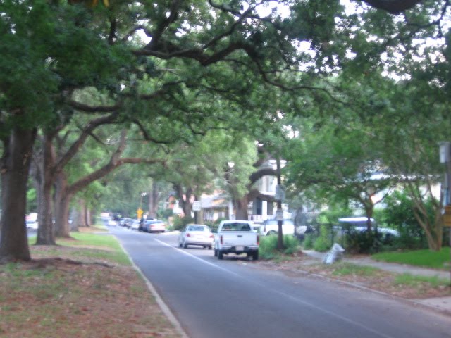
The bridge that is visible in the final of the three above photos leads directly to the intersection of 16th Street and Martin Luther King Drive, which at this point will comprise the southern terminus of the Canal Towpath extension, whenever it is completed. Judging from the photos below, the intersection only stands to benefit from the introduction of new pedestrian amenities.


Looking northward of the 16th Street/MLK intersection, one can see more of the grassy swale which, in this instance, will ideally be reverted to a canal with the towpath at some point. Clearly $3.8 million in TIF money would hardly cover the cost to unearth the canal and add a parallel trail, but at least the contours of the land already hint at an eventual vision of an uninterrupted canal. Here’s the view:


And just beyond the barrier seen in the distance here is the canal—a portion that remains exposed to the sun and generally ignored by the public.


(Note: The above photo series was taken in the late summer of 2009. Since that point, the Glick Eye Institute has experienced considerable construction progress at 16th and Martin Luther King, and will most likely engender some modest pedestrian improvements at the intersection.)

This crude sampling of urban archaeology effectively demonstrates the enormous investment that a City such as Indianapolis was willing to incur decades ago, when it decided that one mode of transportation (car/road) had unambiguously fostered the obsolescence of another (boat/canal). The Indianapolis Central Canal was never a success, and it nearly bankrupted the state when it was first implemented 150 years ago. But its curiosity lingers—so much that artists’ renderings have devised fanciful proposals that actually envision a daylighted canal and towpath, extending underneath the interstate to link 16th street with 11th. For example, the shelved “Circle Truss” proposal from a few years back clearly envisioned an uninterrupted Canal Walk passing under the interstate, manifested in the renderings here, from the Urbanophile’s web link.

Whether the public would ever support the phenomenal expense for this final leg—circles circled in red in my above maps—is anyone’s guess, but the fact that visions exist for such a plan shows the enduring power of introducing water to urban revitalization proposals. My own opinion is that the extension of a path along the canal easement to link 16th and 11th streets would be costly but feasible, and would elicit a high return on investment by creating an uninterrupted greenway that significantly enhances the pedestrian network for the city’s near north side. However, unearthing the buried canal in this stretch may prove far too challenging and troublesome to justify the enormous cost. But big-city redevelopment initiatives over the past thirty years prove that we venerate water much more than we did in the mid 19th Century—the era of urban interstates—so I would hardly rule anything out. Like the Canal Walk itself, improvements should be incremental and perpetual, avoiding any collective complacency that normally accompanies the sensation of having reached a long-awaited goal. Regardless of the outcome of the TIF initiatives on Indianapolis’ near northwest side, the investments will most likely prove but a small component of an unceasing work in progress.

Saturday, May 29, 2010

Scrubbing.

As public and private forces continuously try to repel the contaminants from despoiling the fragile coastline of my temporary adopted state of Louisiana, I can only reflect upon some house cleaning that could benefit this blog. Awkward analogies aside, I always hope to improve the scope of the blog, plumbing new depths through observations of the built and natural environment—simultaneously learning from others and teaching myself. The goal remains to divorce myself from partisanship as I look at things and simply ask, "What does it mean?" As American Dirt approaches its one year anniversary, I will set aside my goals for the blog’s impending toddlerhood:

1) Refinement of earlier posts. In a matter of weeks, you will see repeats of earlier essays—not out of laziness, though I most likely will time these re-runs for moments when I’m particularly busy. Rather, they will always be improvements of writing from before, whether it involves an interview, additional research, or recommendations/observations from the commenters.

2) Greater geographic diversity. I have had people ask if I will ever feature essays outside of the US. I deliberately wanted this to remain an American commentary, so I see that as highly unlikely—and the ground here in the States remains so fertile that I rarely if ever need to look overseas. I may reference observations from trips abroad, or from research that derives from foreign sources, but my goal is for this to remain an American blog. However, I do hope to show a greater geographic spread. Right now the American West is particularly underrepresented, which is more a product of having not traveled there much lately. I am bound to get a western blog post before too long. Indianapolis will remain the hub and will probably dominate the posts, though, as has been clear lately, I have strayed from Indy-based posts lately, mostly out of necessity.

3) Improved photography. This may be my biggest challenge. Clearly I’m not a pro photographer, nor do I have a state-of-the-art camera, and I’ve always wrestled with how much I want to instill artistry into my camera work. For truly distinctive urban photography, look no further than The Heidelberger Papers, whose blogger has also recently expanded his focus to cities well beyond Indianapolis. And Huston Street Racing deftly chronicles urban issues with a much more sophisticated lens than I can hope for. Photography is critical to my blog, but the blog will never elevate photography to the primary focus—as much as I try to improve photos through settings, shutter speed, and framing, far too many of my pics are taken spontaneously, often on the sly, and using an only moderately precise cell phone camera. I will let the readers of the blog know if I have a certain post that emphasizes photography first. And in spite of my often crude photos, I am already getting to the point where I have to be conscious of maxing out the available disc space for my blog. Chances are I will have to shrink the sizes of photos from my early posts, since they were inordinately large.

4) More clearly articulated themes. Aside from the “Terra Firma” sidebar, which is working pretty effectively, I want more of a rhythm to my posts, and I want them to be more obvious. Each month I try to do one photo montage but I don’t quite announce it. It should soon become clear. I may also soon start featuring guest posts, sometimes with a “Point-Counterpoint” approach. I will always make clear when, on occasion, I feature guest photographs, as I already have in the past.

5) More short posts. My early posts were monsters, sometimes totaling over 10,000 words. I was frustrated with so few responses, but I deserved it. Now if I have a long post I usually break it into parts, and I will try to feature many more brief posts as well, often with only one or two pics. (These may be the ones where the emphasis is the photography itself.) Most of my posts average about 1,200 words, and 2,000 has become the understood breaking point. I’ll try to make it abundantly clear whenever I have a mega-post and again will divide it into smaller parts.

Clearly the ultimate goal of all these refinements is to further foster discussion and feedback. I appreciate all the response in the past, and welcome your further recommendations for keeping this labor of love going strong. Thanks again.

Thursday, May 27, 2010

For economic development, is design the tail that wags the dog?

The blogosphere is filled with arguments and examples of how good design can add to the intrinsic value to a building. I’ve avoided such assertions myself, partially because I am not as well-versed in design as many others out there, and largely because I’ve never believed it to be true. So much of what comprises good design today is imbued with an exhaustive self-awareness: not just the designer’s personalized aesthetic language, but the overt references to whatever design tenets are en vogue. The cultural principles that underlie both of these aspirations will inevitably fall out of favor over time—and again, X years later, will most likely experience a resurgence in popularity when the vernacular evokes nostalgia for a particular time period. Such is the cyclical life of a region of individual taste. Thanks to its extreme consciousness of itself, architecture is virtually always meta-architecture—perpetually attuned to the cultural shifts upon which it cannot avoid commenting or outright defying.

So now is just as good of a time as any for me to capitulate—to welch on the design disinterestedness I’ve aspired to for so long in this blog. I have to face the facts. I just love the building in the photograph below!

The S.S. Pierce Building anchors one corner at the heart of Coolidge Corner, an old streetcar neighborhood within the larger City of Brookline, which is itself an affluent suburb just west of Boston. Built in 1897 to house retail and offices for a respected local grocer of the same name, the building is an unabashed example of Tudor Revival, and its organic warmth offers a distinctive contrast from the other structures at this intersection and the surrounding area, such as the Art Deco accents on the building directly across the street.


The comparative height of the building and its timber framing instill it with an unusual, somewhat paradoxical combination of assertiveness and warmth. View it from the façade along Beacon Street to witness how the pitched roof and organic framing material help to mitigate and soften its intended majesty.


Since nearly every other structure in the commercial heart of Coolidge Corner depends almost exclusively on stone or brick—but hardly ever both simultaneously—the S. S. Pierce Building stands out enough to function almost as a landmark. It comes closer than anything else to embodying Coolidge Corner. Whether the building passes muster among the most erudite design scholars is neither here nor there; the fact remains that it catches the attention and diminishes the implicit egalitarianism of a perpendicular intersection—this corner is by almost all metrics the most prominent of the four. It’s the implied center. Considering its stature within this already desirable, pedestrian friendly retail node, it should command an equally lucrative retail mix, right? Perhaps some multi-story department store of premier fashion?


Hardly. Its two first-floor tenants are run-of-the-mill discount national chains. Does this defy expected retail sensibilities? Maybe, if one adheres to the notion that prestigious design attracts prestigious tenants. But conventional retail patterns do not always abide by the ambitions of urban idealists. Corners are always particularly pricy real estate, for the obvious reason of visibility, so it isn’t surprising that national chains with deep pockets would more likely be able to afford the rents than an eclectic local name. Even the tenant one storefront away from the corner undoubtedly pays less for the lease, and in the photograph below it’s a mom-and-pop…

. . .which, incidentally, had closed. The fact remains that it is impossible to calibrate exactly what a structure will house simply through its external appearance. The enduring majesty of the structure might make seem to make it valuable, but the convenient location more than anything ensures that it will rarely confront vacancy. Imagine if the structure sat on a corner in the distressed Roxbury neighborhood of Boston, less than three miles away. It very well could be shuttered on the upper floors with a Payday loan store below; it may still have a Walgreen with significantly higher security; it may have been abandoned and demolished decades ago. My guess is the property manager of the S. S. Pierce Building is perfectly content with these two reliable tenants. A moneyed suburb like Brookline may hope for a slightly more interesting retail mix to reflect the high education and income levels of its consumer base, but when an intersection becomes too prominent, the big names are often the only ones that can afford it. Notice that the other corners also had major brands and franchises: AT&T, Quizno’s, Bank of America, the inevitable CVS (the ubiquitous war between Walgreens and CVS deserves an entirely different blog post). Smaller buildings along Beacon Street and Harvard Street still claim some local retail, but, the big-spending milieu greatly resembles Harvard Square in the nearby suburb of Cambridge (which I blogged about months ago). In both cases, the combination of foot traffic, major transit stops, pedestrian scaled architecture, and high incomes results in a economic development director’s Elysian fields—and a morass of retail volatility.

I’d be willing to venture that Radio Shack and Walgreens are among the most stable elements in Coolidge Corner, while many of the humbler tenants come and go every few years. All too often in the past I’ve witnessed community meetings in which planners lead the constituents to envision both the structures they’d like to see in their neighborhoods, as well as the tenants they hope to inhabit those structures. Aspirational dialogues stimulate creative juices and I would never discourage them, but Coolidge Corner is just one example of many where most or all of the carefully calibrated design elements have come into play marvelously, and the result is a continued demand for further calibration. The dog still wags its tail.


Saturday, May 22, 2010

Even the cows can be crooked.

Across most cultures, the animals that comprise what we would call “livestock” remain remarkably similar. Chickens, turkeys, goats, pigs, sheep, cows, and horses are reliably visible in countries with widely variable climates and levels of industrialization. Some of this may be due to a commonly cultivated taste for the meat, milk, and eggs of these creatures, but I suspect this is a minor contributing factor. The truth is, humans domesticated the aforementioned ruminants and fowl because they proved extremely adaptable—not only to a variety of climates but to varying degrees of co-existence with humans. Centuries of livestock farming have proven that horses and pigs respond comfortably to an environment with a heavy human handprint; deer and moose and wolves do not.

So it shouldn’t have surprised me as much as it did to see a small herd of cows in the setting captured in the photograph below, taken across the Mississippi River and downstream from Baton Rouge:


For those who live in states less dependent than Louisiana on a vast network of flood protection systems, the levee is essentially a magnified earthen berm that protects surrounding lands from a crest in the river. With the exception of bridges, views of the Mississippi in Louisiana are therefore relatively scarce. The quintessential River Roads that parallel the river’s trajectory in Louisiana generally offer this vista:


But cows on the levee? It provides a droll sight the first time around, and raises interesting questions regarding the ownership of these vast structures. Historically the Mississippi River was the lifeblood of agrarian commerce for the interior of the nation, with New Orleans serving as the urban gateway. The first wealthy landowners in southern Louisiana settled along the Mississippi, forming a concatenation of plantation properties with elevated homes that often fronted this mighty current, which of course was unprotected by levees at the time. Roads at this point were crude and inconsistent; the river provided the primary access to larger settlements such as New Orleans, Baton Rouge, and Natchez. Despite the flood risk, settling by the river made sense because of its transportation role. The riverbanks also offered the only arable land for these Creole settlers; anything more than a few miles from the river often dipped below sea level into unusable swamps. The Mississippi River does not form a valley in south Louisiana—it’s the exact opposite. Essentially, the depositing of silt from the Mississippi has created a natural levee system that made settlements such as New Orleans feasible, since the riparian lands upon which the French Quarter and other neighborhoods rest are the highest points in the region. The Mississippi River is a peak, and everything else around it is low.

Now we have superimposed a manmade levee system on top of the one that Mother Nature provided; the most expensive and sophisticated of these come courtesy of the Army Corps of Engineers, while FEMA provides the standards that allow a classification of floodplain status used for the National Flood Insurance Program (NFIP). These elaborate protective barriers have amplified the complexity of levee property ownership, as the world became aware during the exhausting controversy of breached levees flooded New Orleans after Hurricane Katrina. Who owns these steeply sloped strips of land between the River Road and the river itself? It can be a federal agency, but it could also be a State-initiated water management district, a municipality, a district exclusively in charge of levees, or, as is often the case, a private landowner. Maintenance of the levees is always a public responsibility, and in the case of Louisiana the task typically belongs to one of the many levee districts run by each of the parishes (Louisiana’s equivalent of counties) that claims part of the river’s banks. Even if the land is privately owned, the stewards of the levee earned the right of access to the levee top through an easement—various segments of the levee have obliquely angled gravel roads to allow safe vehicular access in a fashion that will not damage the soil or weaken the berm. Some parts of the levee have dirt roads on top. Much of the levee tops in New Orleans and Baton Rouge have pedestrian and bike trails. In recent years, an organization has even sponsored an exhaustive Rouge-Orleans race that stretches the full 124-mile length of the river’s course between the state’s largest metro and its capital.


It’s amazing, considering all these interventions, that private landowners have still found a way to stake their claim on the lands. Clearly this specific one chose to use it as pasture land. Is it healthy for the cows to graze on such a heavy slope? Surely the dairy farms of Wisconsin and California aren’t perfectly flat, so that should not prove a major impediment. And it could very well imply a sort of mutual benefit agreement between the landowner and the levee district: while the district ideally maintains these structures that protect all the abutting lands from floods, the owner of these cattle has saved the district the trouble of using potentially destructive tractors to mow the levees. Why is it necessary to keep the levees mowed? An excellent question, to which I’m not certain I have an answer, though I suspect that a completely unkempt levee may impede access for vehicles that inspect the structure, and it may attract undesirable wildlife: muskrats and nutria are known to pull grasses by the roots that help stabilize the soil of Louisiana’s levees and wetlands. At any rate, whether a landowner, State agency, or levee district is doing the maintenance, a carefully manicured levee lawn remains the norm and not the exception. The landowner in this case seems to have a permanent operation with cows on the levee, as proven by the legitimate fencing and gates.


Perhaps this sight isn’t as rare as I am inclined to believe. A Flickr photo of a much more crowded levee/pasture provides some dialogue that suggests this is a common occurrence. A state institution such as the Hunt Correctional Institute (the women’s prison) may actually employ the cows principally as grazers for maintaining the portion of its property that fronts the river. At any rate, the cattle of sweaty south Louisiana seem as placidly adaptive to this unconventional milieu as they have to whatever climate, topography, or confinement method humans have subjected them. Levees may or may not be difficult on the ankle tendons of livestock, but considering the conditions of the modern industrial cattle farm, the steeply sloped banks of the Mississippi are a bucolic paradise.